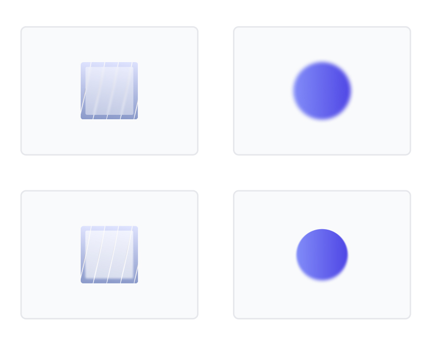
Blurs

The Effect Designers Use When They Want UI to Feel Premium… And the One They Most Often Overdo

Mohan vanjarapu
May 15, 2026
In this articles
<a class="toc-link1" href="#intro">1. Intro</a> <a class="toc-link1" href="#a-small-story-every-designer-has-lived">2. A Small Story Every Designer Has Lived</a> <a class="toc-link1" href="#the-hidden-revenue-reality">3. The Hidden Revenue Reality</a> <a class="toc-link1" href="#the-real-problem-is-not-time">4. The Real Problem Is Not Time</a> <a class="toc-link1" href="#the-origin-of-interfaces">5. The Origin of Interfaces</a> <a class="toc-link1" href="#how-interfaces-evolved-and-why-interfaces-had-to-evolve-too">6. How Interfaces Evolved, And Why Interfaces Had to Evolve Too</a> <a class="toc-link1" href="#what-modern-systems-must-actually-do">7. What Modern Systems Must Actually Do</a> <a class="toc-link1" href="#success-stories-when-systems-quietly-improved-product-outcomes">8. Success Stories: When Systems Quietly Improved Product Outcomes</a> <a class="toc-link1" href="#failure-stories-when-systems-quietly-hurt-the-experience">9. Failure Stories: When Systems Quietly Hurt the Experience</a> <a class="toc-link1" href="#funny-lessons-because-systems-decisions-are-slightly-ridiculous">10. Funny Lessons Because Systems Decisions Are Slightly Ridiculous</a> <a class="toc-link1" href="#what-most-systems-still-get-wrong">11. What Most Systems Still Get Wrong</a> <a class="toc-link1" href="#the-zemryx-system">12. The ZemryX System</a> <a class="toc-link1" href="#theme-tokens-the-foundation-layer">13. Theme Tokens: The Foundation Layer</a> <a class="toc-link1" href="#core-typography-the-foundation-layer">14. Core Typography: The Foundation Layer</a> <a class="toc-link1" href="#component-tokens-real-ui-mapping">15. Component Tokens: Real UI Mapping</a> <a class="toc-link1" href="#all-states-all-surfaces-zero-guessing">16. All States. All Surfaces. Zero Guessing</a> <a class="toc-link1" href="#let-me-say-this-clearly">17. Let Me Say This Clearly</a> <a class="toc-link1" href="#what-the-system-actually-contains">18. What the System Actually Contains</a> <a class="toc-link1" href="#the-real-power-semantic-mapping-and-aliasing">19. The Real Power: Semantic Mapping and Aliasing</a> <a class="toc-link1" href="#alias-component-use-case">20. Alias → Component → Use Case</a> <a class="toc-link1" href="#what-most-people-do-not-realize">21. What Most People Do Not Realize</a> <a class="toc-link1" href="#the-5-second-workflow">22. The 5-Second Workflow</a> <a class="toc-link1" href="#same-scenario-new-reality">23. Same Scenario, New Reality</a> <a class="toc-link1" href="#systems-as-styling-vs-systems-as-infrastructure">24. Systems as Styling vs Systems as Infrastructure</a> <a class="toc-link1" href="#behind-the-scenes-the-zemryx-reality">25. Behind the Scenes: The ZemryX Reality</a> <a class="toc-link1" href="#the-emotional-truth-behind-the-system">26. The Emotional Truth Behind the System</a> <a class="toc-link1" href="#the-real-win-is-not-speed">27. The Real Win Is Not Speed</a> <a class="toc-link1" href="#why-subscription-matters">28. Why Subscription Matters</a> <a class="toc-link1" href="#final-takeaway">29. Final Takeaway</a> <a class="toc-link1" href="#closing-line">30. Closing Line</a> <a class="toc-link1" href="#cta-block">31. CTA Block</a>

Intro

Let’s talk honestly.

Blur is one of those UI decisions that feels small…
until it quietly controls how your entire product feels.

Used well → premium, layered, intentional
Used poorly → foggy, heavy, confusing

And most teams?
They live somewhere in between.

───────────────────────────────────────────────────────────────────────────────

A Small Story Every Designer Has Lived

You add a blur behind a floating card.

Then:

“8px?”
“Hmm… 12px looks more premium.”
“Wait… now it looks washed out.”
“Reduce opacity?”
“Why does navbar feel nice but modal feels weird?”

10 tweaks later:

“Okay… this looks good enough.”

😄

That “good enough” is where inconsistency begins.

───────────────────────────────────────────────────────────────────────────────

The Hidden Revenue Reality

Blur doesn’t look like a “business decision.”

But it affects:

  • Readability → can users complete actions?
  • Focus → do users know where to look?
  • Trust → does the UI feel polished?
  • Conversion → does the final step feel clear?

A foggy modal = hesitation
A crisp overlay = action

Blur is not decoration.
It’s conversion infrastructure.

───────────────────────────────────────────────────────────────────────────────

The Real Problem Is Not Time

Designers don’t struggle because blur is complex.

They struggle because:

👉 Blur is never defined as a system

So every time you design:

  • You guess radius
  • You guess opacity
  • You guess tint
  • You guess context

Again.
And again.
And again.

───────────────────────────────────────────────────────────────────────────────

The Origin of Interfaces

Blur didn’t start as “premium UI.”

It started as a technical trick.

  • Early OS systems (like Windows Vista Aero Glass) used blur to simulate transparency
  • Apple pushed it further with iOS 7 — introducing frosted glass UI
  • macOS menus started using blur for depth separation

Blur was never about style.

It was about:
👉 separating layers without hard borders

───────────────────────────────────────────────────────────────────────────────

How Interfaces Evolved, And Why Interfaces Had to Evolve Too

Modern UI is no longer flat.

Think about:

  • iOS Control Center
  • Spotify player overlays
  • Instagram story UI

They all use blur differently.

Because UI evolved from:

👉 flat screens
to
👉 layered environments

Blur became:

  • depth indicator
  • focus controller
  • readability enhancer

Not just “aesthetic glass”

───────────────────────────────────────────────────────────────────────────────

What Modern Systems Must Actually Do

A real blur system must:

  • Define context (navbar ≠ modal ≠ tooltip)
  • Control intensity levels (XS → XL)
  • Handle readability + tint
  • Support progressive blur (not flat blur)
  • Map blur to real components

Example:

  • Navbar → light blur
  • Modal → medium blur + tint
  • Hero overlay → strong + progressive

That’s system thinking.

───────────────────────────────────────────────────────────────────────────────

Success Stories: When Systems Quietly Improved Product Outcomes

Apple (iOS UI)

  • Control Center blur keeps context visible
  • Background remains recognizable
  • Focus remains on active controls

Result:
👉 Feels immersive without losing clarity

Microsoft (Fluent Design)

  • Acrylic blur used in menus and panels
  • Consistent depth hierarchy

Result:
👉 UI feels structured, not layered randomly

Stripe dashboards

  • Subtle overlays instead of heavy modals
  • Blur used to maintain context while focusing user

Result:
👉 Faster task completion

───────────────────────────────────────────────────────────────────────────────

Failure Stories: When Systems Quietly Hurt the Experience

Over-blurred dashboards

Seen in many SaaS tools:

  • Background fully washed out
  • Text loses contrast
  • Users struggle to read

Result:
👉 “Looks cool… but hard to use”

Gaming UI overlays

Some games overuse blur:

  • Heavy blur + glow + effects
  • UI becomes visually noisy

Result:
👉 cognitive overload

Early glassmorphism trend clones

Dribbble-inspired UIs:

  • Blur everywhere
  • No hierarchy
  • No logic

Result:
👉 aesthetic > usability

───────────────────────────────────────────────────────────────────────────────

Funny Lessons Because Systems Decisions Are Slightly Ridiculous

Let’s be honest 😄

You’ve probably:

  • Copied blur from a modal → pasted into tooltip
  • Reduced opacity by 2% → called it “refined”
  • Increased blur radius → called it “premium”
  • Added blur → then fixed readability for 10 mins

That’s not a system.

That’s blur recycling.

───────────────────────────────────────────────────────────────────────────────

What Most Systems Still Get Wrong

Most design systems:

❌ “Here’s blur. Use it.”

They don’t define:

  • where to use
  • when to use
  • how much to use

So teams go back to guessing.

───────────────────────────────────────────────────────────────────────────────

The ZemryX System

ZemryX treats blur as:

👉 a structured system, not an effect

Organized into:

  • Light Background Blur
  • Layer & Object Blur
  • Progressive Blur
  • Directional Blur

Each with:

  • defined purpose
  • defined intensity
  • defined context

───────────────────────────────────────────────────────────────────────────────

Theme Tokens: The Foundation Layer

Blur tokens define:

  • blur radius
  • opacity
  • tint
  • layering behavior

Example:

  • blur-xs
  • blur-sm
  • blur-md
  • blur-lg
  • blur-xl

No guessing.

───────────────────────────────────────────────────────────────────────────────

Semantic Tokens: Meaning Without Guesswork

Instead of:

👉 “Use 12px blur”

You get:

👉 “navbar-blur”
👉 “modal-blur”
👉 “tooltip-blur”

Now blur has meaning.

───────────────────────────────────────────────────────────────────────────────

Component Tokens: Real UI Mapping

Blur is mapped to:

  • headers
  • modals
  • dropdowns
  • widgets
  • overlays

So designers don’t think:

“How much blur?”

They think:

“What is this component doing?”

───────────────────────────────────────────────────────────────────────────────

All States. All Surfaces. Zero Guessing

Blur behaves differently across:

  • hover
  • active
  • focus
  • disabled

ZemryX defines all of it.

───────────────────────────────────────────────────────────────────────────────

Let Me Say This Clearly

ZemryX does not give you:

👉 blur presets

It gives you:

👉 blur decisions already made

───────────────────────────────────────────────────────────────────────────────

What the System Actually Contains

Inside:

  • multiple blur categories
  • progressive blur logic
  • layered blur definitions
  • real UI mapping

It’s not visual.

It’s structural.

───────────────────────────────────────────────────────────────────────────────

The Real Power: Semantic Mapping and Aliasing

Blur is connected to:

  • states
  • tokens
  • components

Everything stays consistent.

───────────────────────────────────────────────────────────────────────────────

Alias → Component → State

Example:

navbar-blur → Header → Default
modal-blur → Overlay → Active

This is production-level mapping.

───────────────────────────────────────────────────────────────────────────────

What Most People Do Not Realize

Blur is not visual polish.

It’s:

👉 atmosphere control

───────────────────────────────────────────────────────────────────────────────

The 5-Second Workflow

Instead of:

“8px or 12px?”

You do:

  • pick component
  • paste
  • done

───────────────────────────────────────────────────────────────────────────────

Same Scenario, New Reality

Before:

  • test blur
  • fix contrast
  • adjust opacity

After ZemryX:

👉 works instantly

───────────────────────────────────────────────────────────────────────────────

Systems as Styling vs Systems as Infrastructure

Most teams:

👉 Blur as effect

ZemryX:

👉 Blur as infrastructure

───────────────────────────────────────────────────────────────────────────────

Behind the Scenes: The ZemryX Reality

This system is built to:

  • remove micro-decisions
  • scale across teams
  • ensure production consistency

───────────────────────────────────────────────────────────────────────────────

The Emotional Truth Behind the System

Design fatigue is real.

Blur is one of those small things
that slowly drains decision energy.

ZemryX removes that.

───────────────────────────────────────────────────────────────────────────────

The Real Win Is Not Speed

Speed is a side effect.

The real win is:

👉 clarity

───────────────────────────────────────────────────────────────────────────────

Why Subscription Matters

Because you’re not buying:

👉 blur tokens

You’re getting:

👉 a system where decisions are solved

───────────────────────────────────────────────────────────────────────────────

Final Takeaway

You were never bad at blur.

You just didn’t have:

👉 a blur system

───────────────────────────────────────────────────────────────────────────────

Closing Line

Great interfaces don’t feel random.

They feel intentional.

Blur is one of the invisible reasons why.

───────────────────────────────────────────────────────────────────────────────

CTA Block

🚀 Stop guessing blur. Start designing with clarity.

Use ZemryX.

Build interfaces that feel:

  • cleaner
  • more layered
  • more premium

Without tweaking blur 15 times per component.