Practical guides on Figma foundations, typography, color systems, icons, tokens, components, and scalable UI workflows for real product teams.
A few months ago, while building ZemryX, we faced a problem that many product teams quietly deal with.
May 14, 2026
The Icon Problem Designers Face Every Day (But Rarely Talk About)
April 29, 2026
Time. Confidence. Clarity. Revenue. And your sanity.
May 13, 2026
Clarity. Accessibility. Confidence. Speed. And far fewer “which shade is right?” moments.
April 30, 2026
It’s the Shape of Your Product’s Personality
May 1, 2026
The Invisible Detail That Quietly Changes How Professional Your UI Feels
April 27, 2026
The Effect Designers Use When They Want UI to Feel Premium… And the One They Most Often Overdo
May 15, 2026
The Design Decision You Repeat Hundreds of Times… Without Realizing It
May 2, 2026
The Invisible System That Decides Whether Your UI Feels “Pro”… or “Off”
May 12, 2026
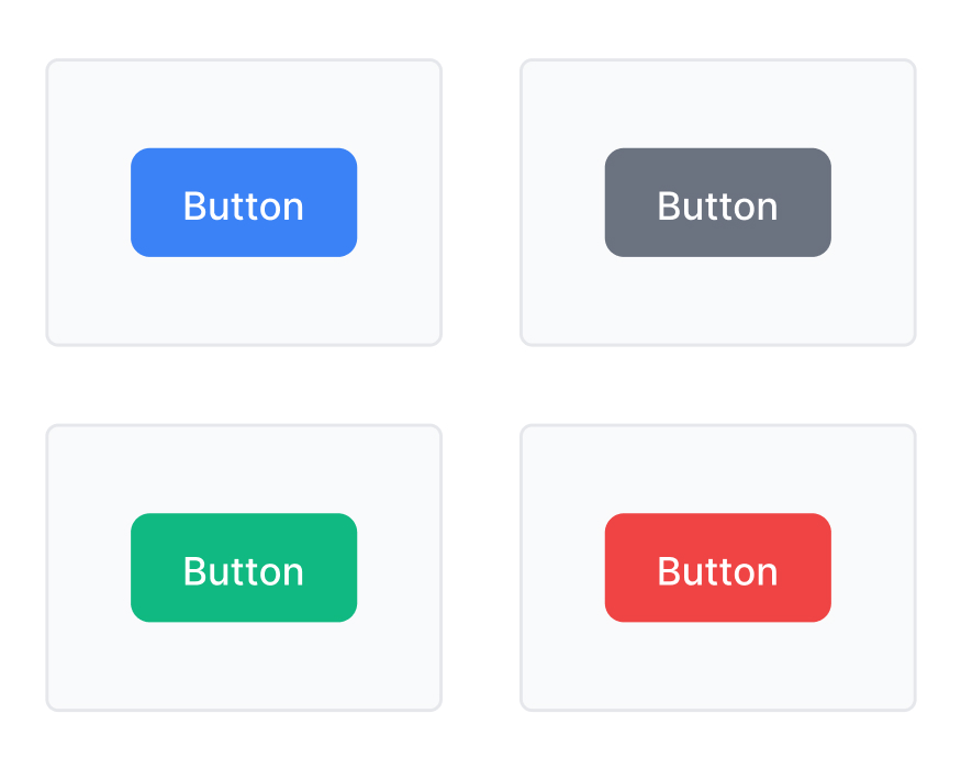
It’s the Moment Your Product Is Judged There is a moment in every product that decides more than most teams realize. It is quiet. It lasts less than a second. And yet it can decide trust, conversion, and momentum. A user fills the form. Uploads the file. Adds products to cart. Reviews the details. Gets all the way to the end. Then they pause. Their cursor hovers over a button. That button. That tiny rectangle most teams draw in a few seconds is suddenly carrying the emotional weight of the entire product. Because at that moment, the user is no longer judging your spacing, typography, or color palette. They are judging one thing: “Do I feel safe enough to click this?” And if the answer is no, the product loses.
May 30, 2026
The Small Control That Quietly Decides How Fast Your Product Feels
May 21, 2026
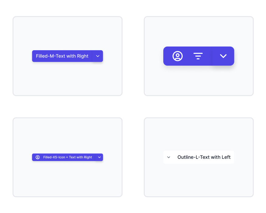
The One UI Pattern That Quietly Handles “What Happens Next”