Grids

The Invisible System That Decides Whether Your UI Feels “Pro”… or “Off”
Mohan vanjarapu
May 12, 2026
In this articles
<a class="toc-link1" href="#intro">1. Intro</a> <a class="toc-link1" href="#a-small-story-every-designer-has-lived">2. A Small Story Every Designer Has Lived</a> <a class="toc-link1" href="#the-hidden-revenue-reality">3. The Hidden Revenue Reality</a> <a class="toc-link1" href="#the-real-problem-is-not-time">4. The Real Problem Is Not Time</a> <a class="toc-link1" href="#the-origin-of-interfaces">5. The Origin of Interfaces</a> <a class="toc-link1" href="#how-interfaces-evolved-and-why-interfaces-had-to-evolve-too">6. How Interfaces Evolved, And Why Interfaces Had to Evolve Too</a> <a class="toc-link1" href="#what-modern-systems-must-actually-do">7. What Modern Systems Must Actually Do</a> <a class="toc-link1" href="#success-stories-when-systems-quietly-improved-product-outcomes">8. Success Stories: When Systems Quietly Improved Product Outcomes</a> <a class="toc-link1" href="#failure-stories-when-systems-quietly-hurt-the-experience">9. Failure Stories: When Systems Quietly Hurt the Experience</a> <a class="toc-link1" href="#funny-lessons-because-systems-decisions-are-slightly-ridiculous">10. Funny Lessons Because Systems Decisions Are Slightly Ridiculous</a> <a class="toc-link1" href="#what-most-systems-still-get-wrong">11. What Most Systems Still Get Wrong</a> <a class="toc-link1" href="#the-zemryx-system">12. The ZemryX System</a> <a class="toc-link1" href="#theme-tokens-the-foundation-layer">13. Theme Tokens: The Foundation Layer</a> <a class="toc-link1" href="#core-typography-the-foundation-layer">14. Core Typography: The Foundation Layer</a> <a class="toc-link1" href="#component-tokens-real-ui-mapping">15. Component Tokens: Real UI Mapping</a> <a class="toc-link1" href="#all-states-all-surfaces-zero-guessing">16. All States. All Surfaces. Zero Guessing</a> <a class="toc-link1" href="#let-me-say-this-clearly">17. Let Me Say This Clearly</a> <a class="toc-link1" href="#what-the-system-actually-contains">18. What the System Actually Contains</a> <a class="toc-link1" href="#the-real-power-semantic-mapping-and-aliasing">19. The Real Power: Semantic Mapping and Aliasing</a> <a class="toc-link1" href="#alias-component-use-case">20. Alias → Component → Use Case</a> <a class="toc-link1" href="#what-most-people-do-not-realize">21. What Most People Do Not Realize</a> <a class="toc-link1" href="#the-5-second-workflow">22. The 5-Second Workflow</a> <a class="toc-link1" href="#same-scenario-new-reality">23. Same Scenario, New Reality</a> <a class="toc-link1" href="#systems-as-styling-vs-systems-as-infrastructure">24. Systems as Styling vs Systems as Infrastructure</a> <a class="toc-link1" href="#behind-the-scenes-the-zemryx-reality">25. Behind the Scenes: The ZemryX Reality</a> <a class="toc-link1" href="#the-emotional-truth-behind-the-system">26. The Emotional Truth Behind the System</a> <a class="toc-link1" href="#the-real-win-is-not-speed">27. The Real Win Is Not Speed</a> <a class="toc-link1" href="#why-subscription-matters">28. Why Subscription Matters</a> <a class="toc-link1" href="#final-takeaway">29. Final Takeaway</a> <a class="toc-link1" href="#closing-line">30. Closing Line</a> <a class="toc-link1" href="#cta-block">31. CTA Block</a>

Intro

Let’s not start with definitions.
Let’s start with reality.

🤝 You open a blank frame
1440px. Clean. Empty.

You’re about to design something.

A dashboard.
A landing page.
A settings screen.

And then…

You place things.

And something feels… off.

Not broken.
Not ugly.
Just…

“Why does this feel messy?”

😄

───────────────────────────────────────────────────────────────────────────────

A Small Story Every Designer Has Lived

You start adjusting:

  • “Let me align this…”
  • “Maybe 16px gap?”
  • “No… 24 looks better”
  • “Wait… why doesn’t this line up?”

You zoom out.

Still feels wrong.

So you fix it again.

😄

That’s not bad design.

That’s designing without a grid system.

───────────────────────────────────────────────────────────────────────────────

The Hidden Revenue Reality

Grids are not just visual.

They affect:

  • Scanability → faster understanding
  • Trust → cleaner layouts feel reliable
  • Conversion → better content flow
  • Retention → predictable interfaces

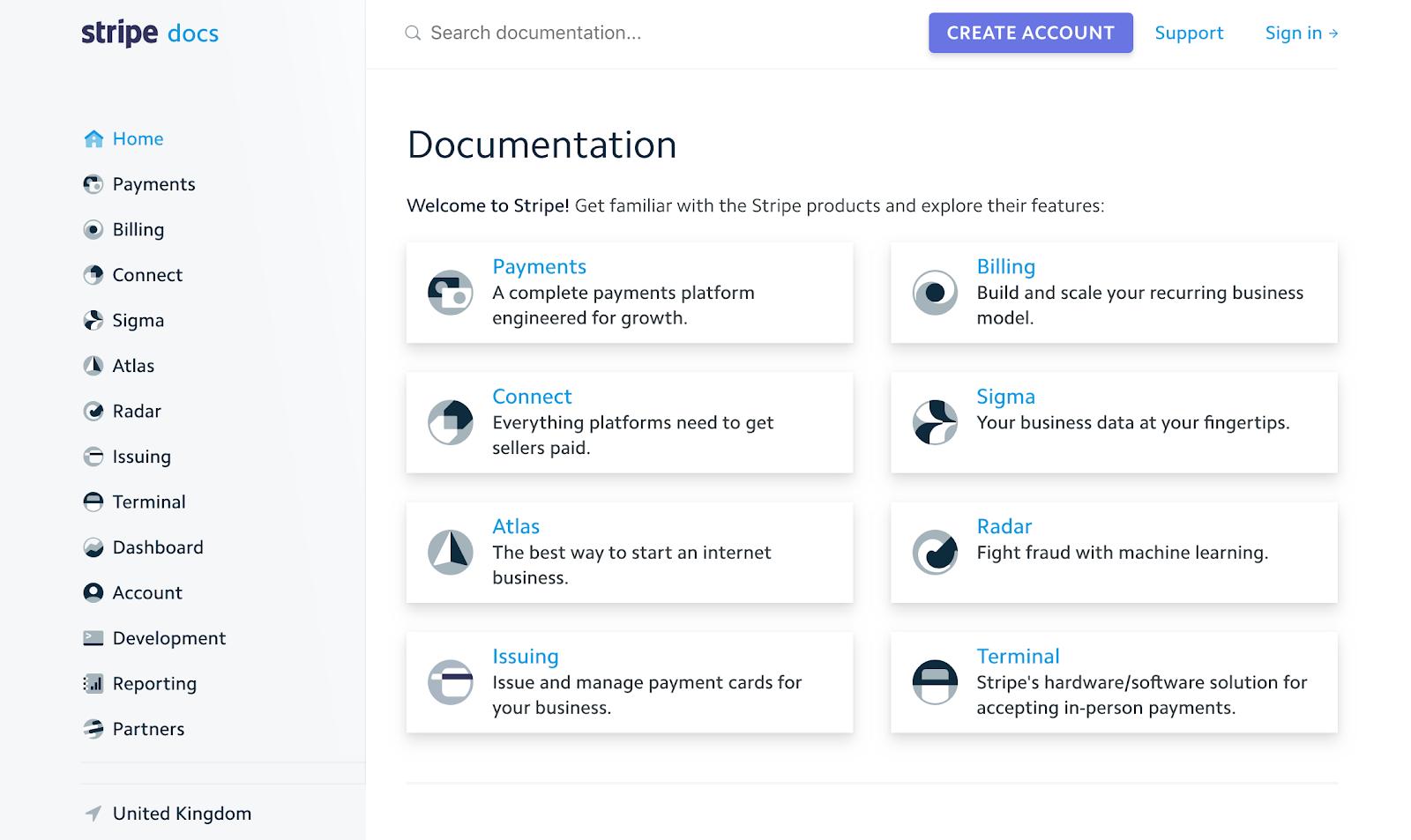
💡 Stripe didn’t increase conversions with colors.
They improved layout clarity.

And layout clarity = grid discipline.

───────────────────────────────────────────────────────────────────────────────

The Real Problem Is Not Time

Designers don’t struggle because they lack skill.

They struggle because they repeat decisions:

  • Where should this start?
  • How wide should this be?
  • How far apart should these sit?

👉 50 times per screen
👉 500 times per project

That’s the real problem.

───────────────────────────────────────────────────────────────────────────────
The Origin of Interfaces

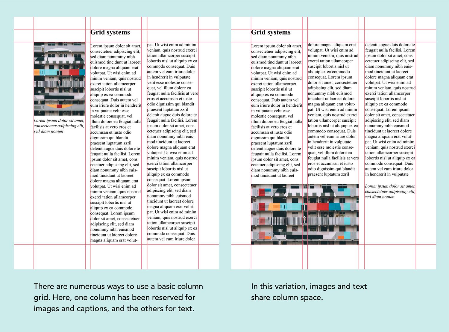
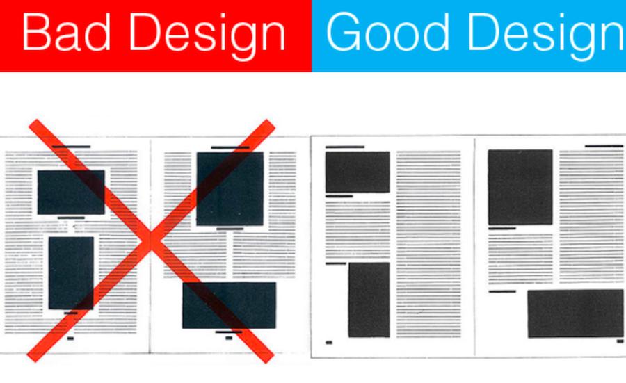
Grids didn’t start in UI.

They started in:

  • Newspapers
  • Magazines
  • Editorial design

Why?

👉 To make content readable
👉 To align everything perfectly
👉 To remove guesswork

Then web design came.

Early websites?
👉 Tables. Chaos. No consistency.

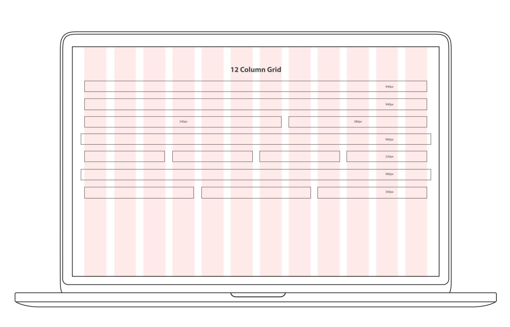
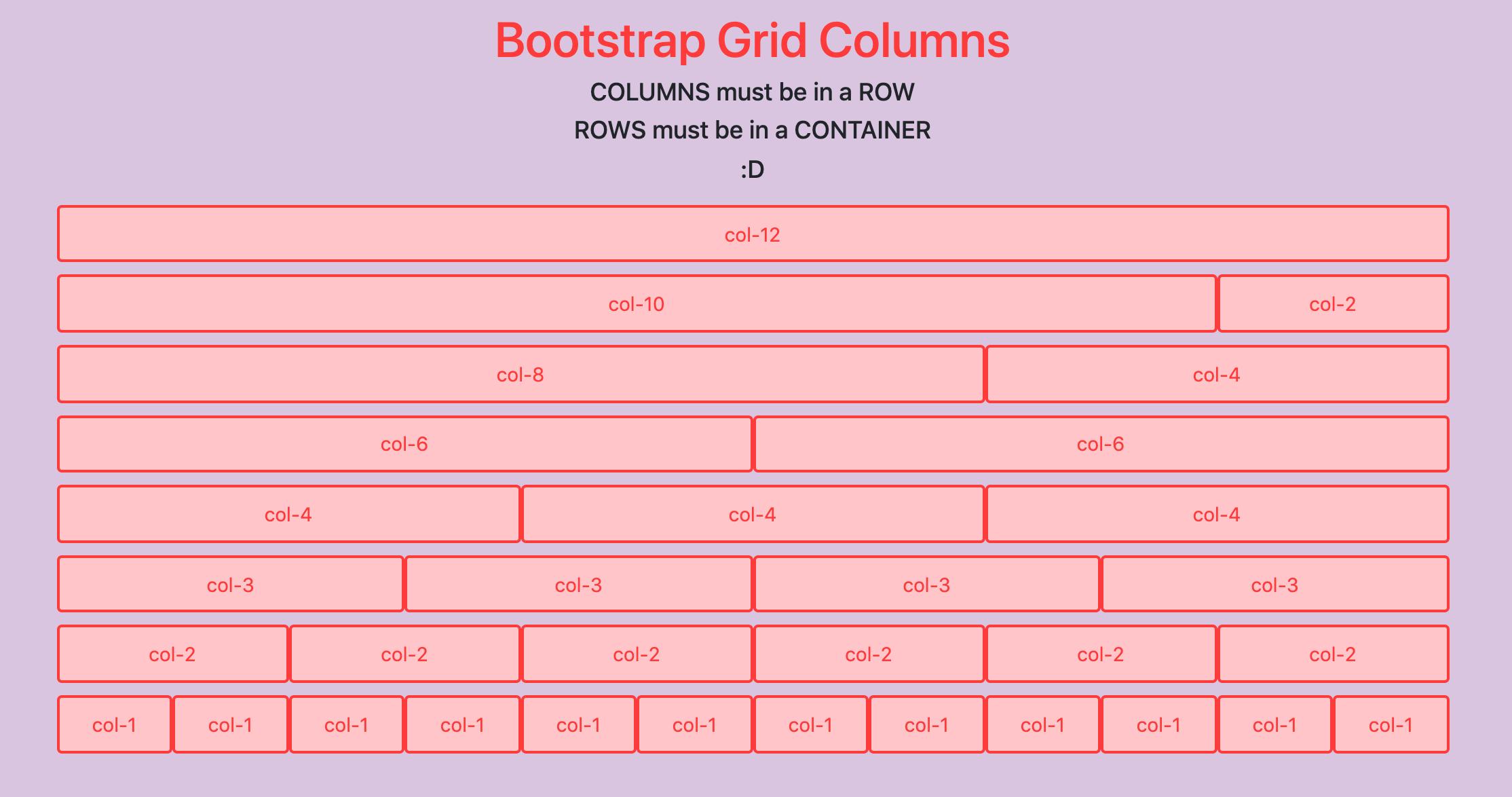
Then came systems like:

  • Bootstrap (12-column grids)
  • CSS Grid / Flexbox

And suddenly…

UI became structured.

───────────────────────────────────────────────────────────────────────────────
How Interfaces Evolved, And Why Interfaces Had to Evolve Too

Old world:

  • Fixed width
  • One screen size
  • One grid

Now:

  • Desktop → Tablet → Mobile
  • Cards → Dashboards → AI interfaces
  • Dynamic content

👉 One grid is not enough anymore.

Grids had to evolve into:

  • Adaptive
  • Fluid
  • Component-level systems

───────────────────────────────────────────────────────────────────────────────
What Modern Systems Must Actually Do

A real grid system today must:

  • Handle multiple screen sizes
  • Support components, not just pages
  • Work with dynamic content
  • Maintain visual rhythm
  • Remove decision-making

💡 Example:

  • Notion → flexible content grid
  • Linear → ultra-precise alignment
  • Apple → perfect visual rhythm

They don’t “use grids.”

They live inside grids.

───────────────────────────────────────────────────────────────────────────────
Success Stories: When Systems Quietly Improved Product Outcomes

Stripe

  • Clean 12-column discipline
  • Perfect spacing rhythm
    👉 Result: high trust UI

Apple

  • Strong margins + baseline grid
    👉 Result: premium feel

Notion

  • Flexible grid + nested structure
    👉 Result: adaptable layouts

Linear

  • Pixel-perfect alignment
    👉 Result: fast scanning UI

───────────────────────────────────────────────────────────────────────────────
Failure Stories: When Systems Quietly Hurt the Experience

You’ve seen these:

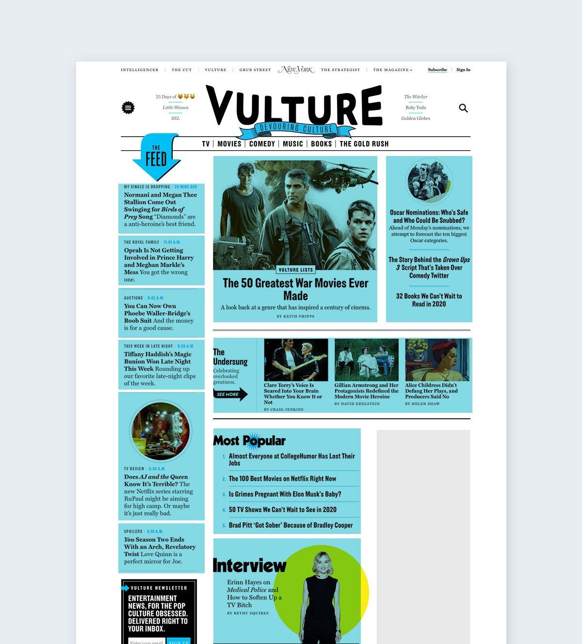
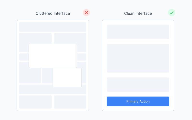
  • Cards not aligned
  • Random spacing
  • Content jumping around
  • No consistent margins

Nothing is “broken.”

But everything feels:

👉 cheap
👉 rushed
👉 confusing

That’s not a color problem.

That’s a grid problem.

───────────────────────────────────────────────────────────────────────────────
Funny Lessons Because Systems Decisions Are Also Slightly Ridiculous

😄 Let’s be honest:

  • You’ve nudged something 1px 10 times
  • You’ve said “this looks fine” (it didn’t)
  • You’ve eyeballed alignment (dangerous move)

And the classic:

👉 “Let me just center this…”

😄

Grids exist so you never do this again.

───────────────────────────────────────────────────────────────────────────────
What Most Systems Still Get Wrong

Most design systems say:

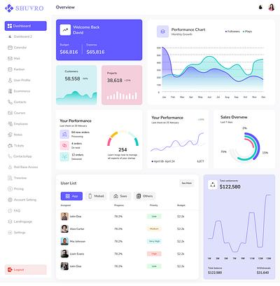
👉 “Here is a 12-column grid”

That’s it.

But reality:

  • You need different grids for different problems
  • You need component grids
  • You need adaptive behavior

One grid ≠ real system

───────────────────────────────────────────────────────────────────────────────
The ZemryX System

ZemryX doesn’t give you:

👉 “a grid”

It gives you:

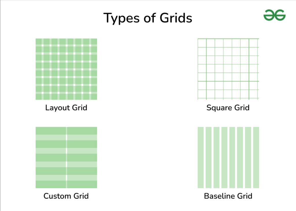
👉 all real-world grids you actually need

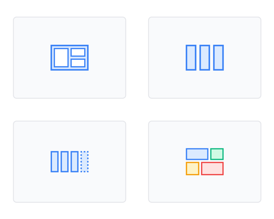
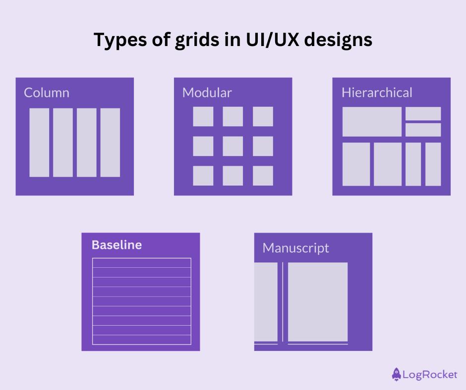
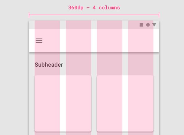
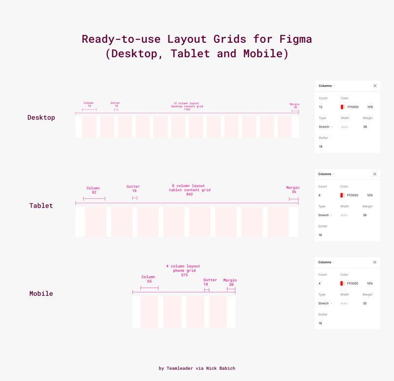
From your image system:

  • Desktop / Tablet / Mobile grids
  • Fixed / Fluid
  • 12-column / 4-column
  • Masonry / Asymmetrical
  • Nested / Component-based
  • Adaptive / Auto-fit

💡 This is the difference:

You don’t decide grids anymore.
You pick the right one instantly.

───────────────────────────────────────────────────────────────────────────────
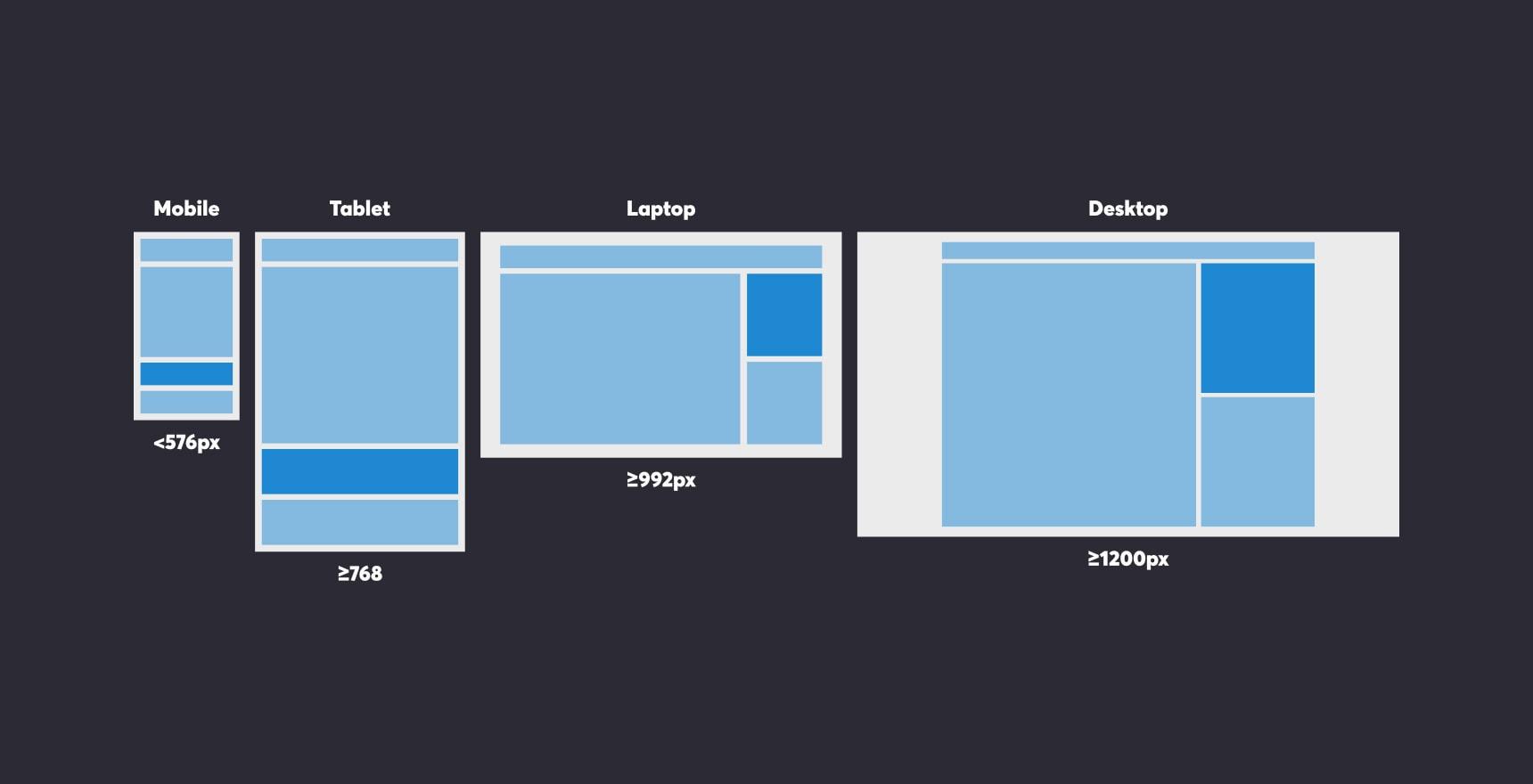
Theme Tokens: The Foundation Layer

Grid tokens define:

  • Column count
  • Gutter size
  • Margins
  • Breakpoints

Example:

Grid/Desktop/Columns = 12
Grid/Desktop/Gutter = 24
Grid/Desktop/Margin = 80

👉 No guessing
👉 Fully consistent

───────────────────────────────────────────────────────────────────────────────
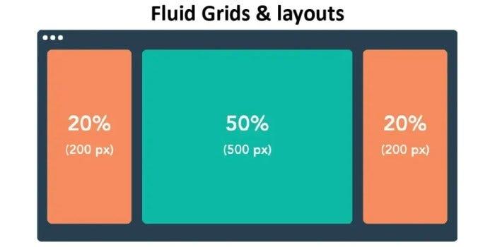
Semantic Tokens: Meaning Without Guesswork

Instead of numbers:

  • layout-primary
  • layout-sidebar
  • layout-content

Now you design with:

👉 meaning
👉 intent

───────────────────────────────────────────────────────────────────────────────

Component Tokens: Real UI Mapping

Grids are not just pages.

They exist inside:

  • Cards
  • Forms
  • Tables
  • Modals

👉 Nested grids = clean components

───────────────────────────────────────────────────────────────────────────────
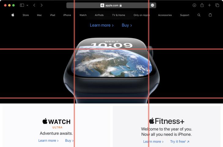
All States. All Surfaces. Zero Guessing

Your grid adapts to:

  • Desktop
  • Tablet
  • Mobile

Not scaling.

👉 Transforming

───────────────────────────────────────────────────────────────────────────────
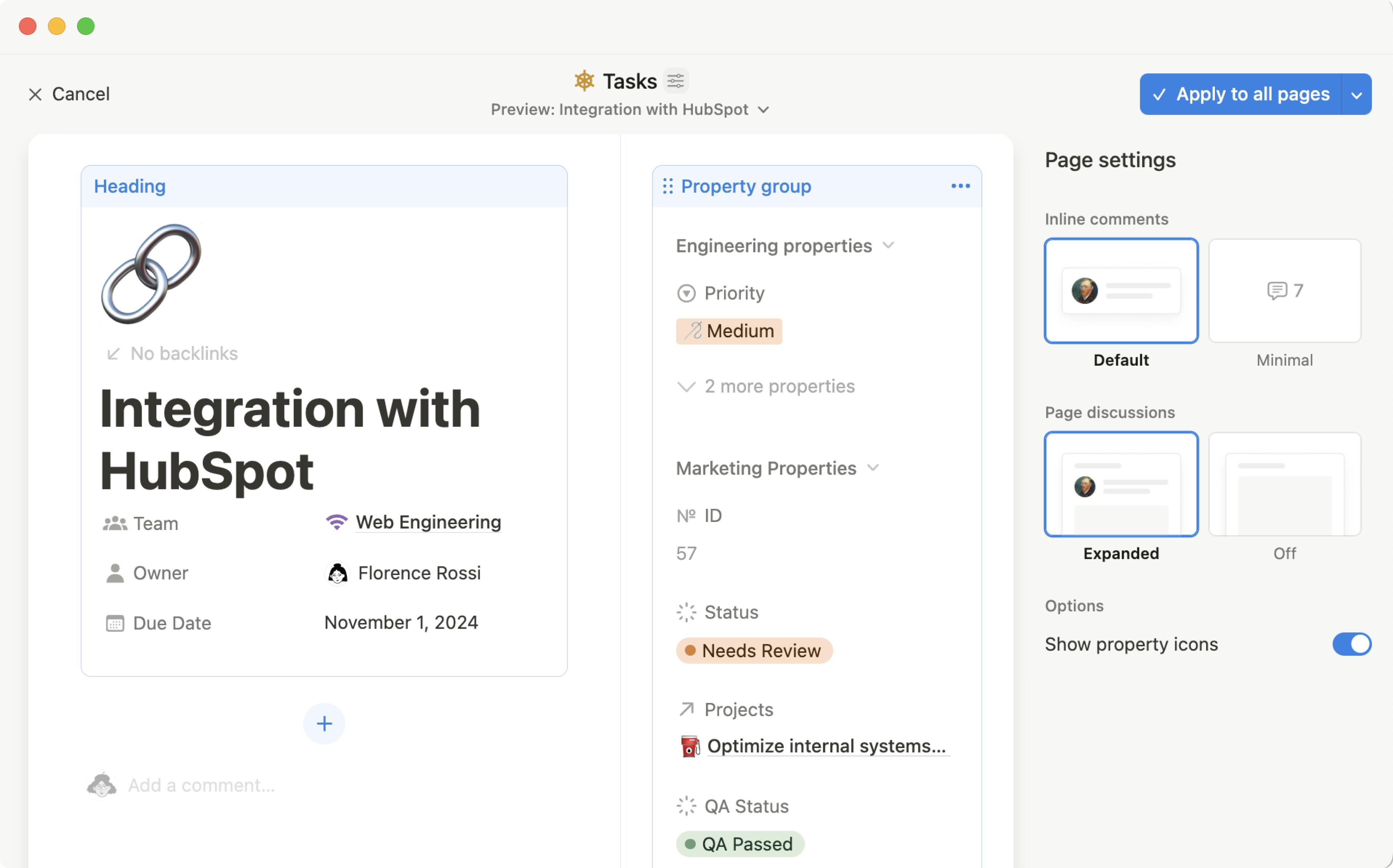
Let Me Say This Clearly

Most UI problems are not:

  • color problems
  • typography problems

They are:

👉 grid problems

───────────────────────────────────────────────────────────────────────────────
What the System Actually Contains

ZemryX Grid System includes:

  • 20+ real grid types
  • Responsive variants
  • Auto-fit systems
  • Nested grid logic
  • Component-level grids

───────────────────────────────────────────────────────────────────────────────
The Real Power: Semantic Mapping and Aliasing

Instead of:

👉 manually adjusting layouts

You get:

👉 predefined structure
👉 consistent behavior
👉 scalable UI

───────────────────────────────────────────────────────────────────────────────
Alias → Component → Layout

Example:

Grid/Desktop/Main → Dashboard Layout
Grid/Mobile/Stack → Card Layout

👉 direct mapping
👉 zero confusion

───────────────────────────────────────────────────────────────────────────────

What Most People Do Not Realize

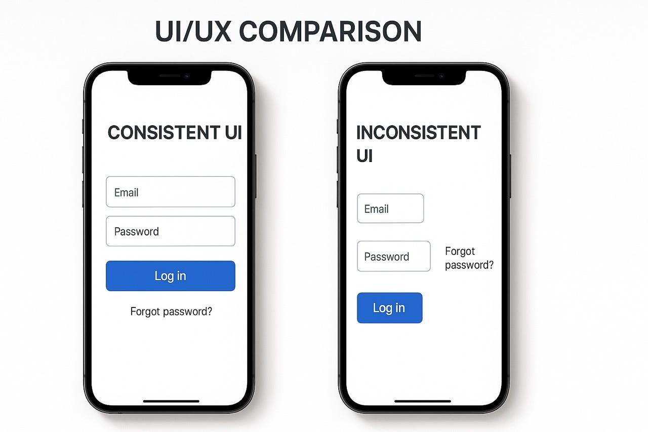
Good UI is not:

👉 creativity alone

It is:

👉 constraint + structure

Grids give that.

───────────────────────────────────────────────────────────────────────────────
The 5-Second Workflow

Without ZemryX:

👉 Think → Try → Adjust → Fix

With ZemryX:

👉 Identify → Apply → Done

───────────────────────────────────────────────────────────────────────────────
Same Scenario, New Reality

Before:

👉 “Why is this misaligned?”

After:

👉 “This uses 6-column grid. Done.”

───────────────────────────────────────────────────────────────────────────────
Systems as Styling vs Systems as Infrastructure

Old thinking:

👉 Grids = layout tool

ZemryX thinking:

👉 Grids = design infrastructure

───────────────────────────────────────────────────────────────────────────────

Behind the Scenes: The ZemryX Reality

Everything is:

  • tokenized
  • mapped
  • structured

So your UI:

👉 never breaks
👉 always aligns

───────────────────────────────────────────────────────────────────────────────

The Emotional Truth Behind the System

When grids are right:

👉 UI feels calm
👉 Design feels easy
👉 Decisions disappear

───────────────────────────────────────────────────────────────────────────────

The Real Win Is Not Speed

Speed is a byproduct.

The real win is:

👉 confidence

───────────────────────────────────────────────────────────────────────────────

Why Subscription Matters

Because this is not:

👉 a file

It’s:

👉 a system
👉 continuously evolving
👉 covering every scenario

───────────────────────────────────────────────────────────────────────────────

Final Takeaway

Grids are invisible.

But they control everything.

Fix the grid…

And suddenly:

  • spacing works
  • alignment works
  • hierarchy works
  • UI feels premium

───────────────────────────────────────────────────────────────────────────────

Closing Line

👉 Great UI is not placed.
👉 It is structured.

───────────────────────────────────────────────────────────────────────────────

CTA Block

🚀 Build with structure, not struggle

Use ZemryX Grids
Design layouts that feel intentional, scalable, and production-ready —
without rethinking structure every single time.

If you want next:

👉 Landing page version
👉 Webflow interactive hero
👉 Figma marketing screens
👉 Grid playground demo

Just tell me 👍