Design Systems
Colour Select
Clarity. Accessibility. Confidence. Speed. And far fewer “which shade is right?” moments.

Mohan vanjarapu
April 30, 2026
The Invisible System That Decides Whether Your UI Feels “Pro”… or “Off”
Let’s not start with definitions.
Let’s start with reality.
🤝 You open a blank frame
1440px. Clean. Empty.
You’re about to design something.
A dashboard.
A landing page.
A settings screen.
And then…
You place things.
And something feels… off.
Not broken.
Not ugly.
Just…
“Why does this feel messy?”
😄
───────────────────────────────────────────────────────────────────────────────
You start adjusting:
You zoom out.
Still feels wrong.
So you fix it again.
😄
That’s not bad design.
That’s designing without a grid system.
───────────────────────────────────────────────────────────────────────────────
Grids are not just visual.
They affect:
💡 Stripe didn’t increase conversions with colors.
They improved layout clarity.
And layout clarity = grid discipline.
───────────────────────────────────────────────────────────────────────────────
Designers don’t struggle because they lack skill.
They struggle because they repeat decisions:
👉 50 times per screen
👉 500 times per project
That’s the real problem.
───────────────────────────────────────────────────────────────────────────────
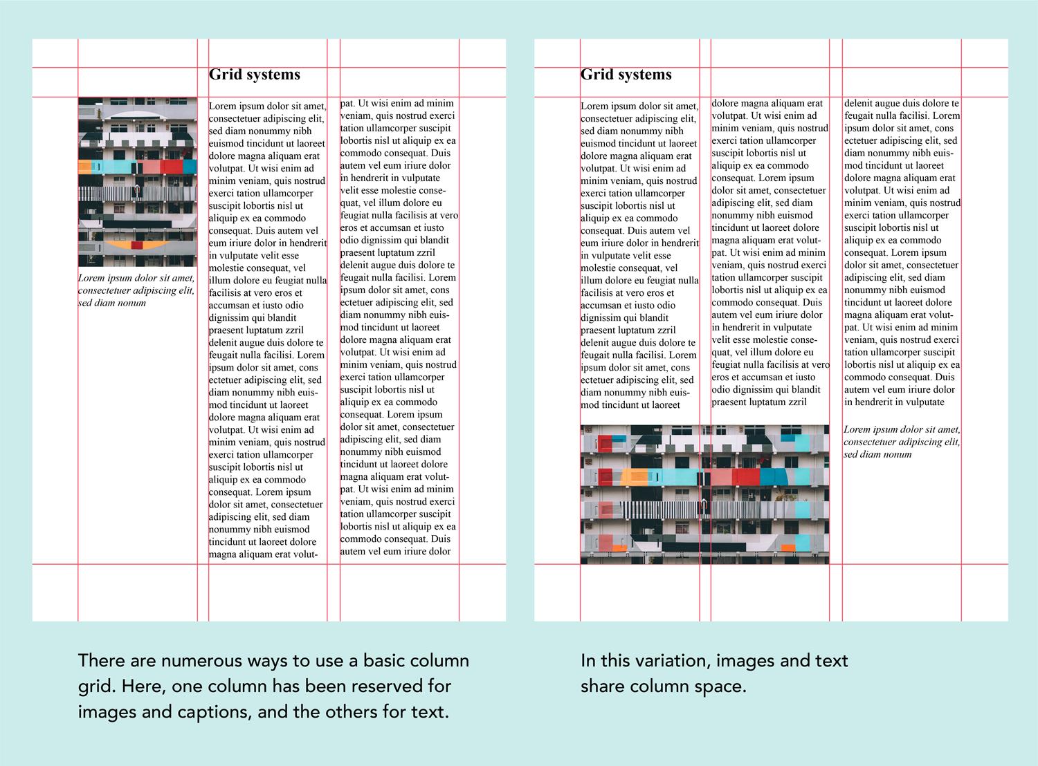
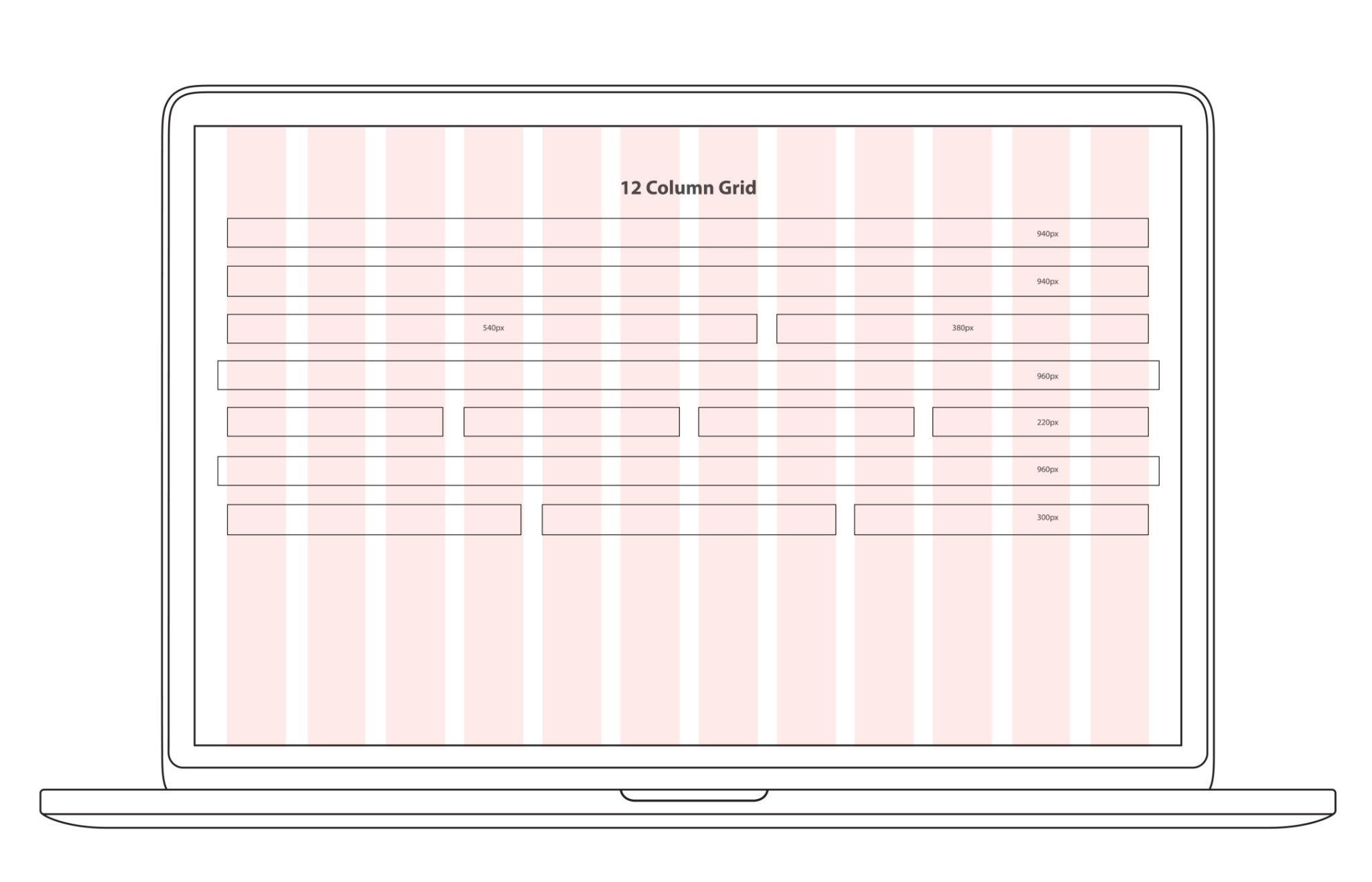
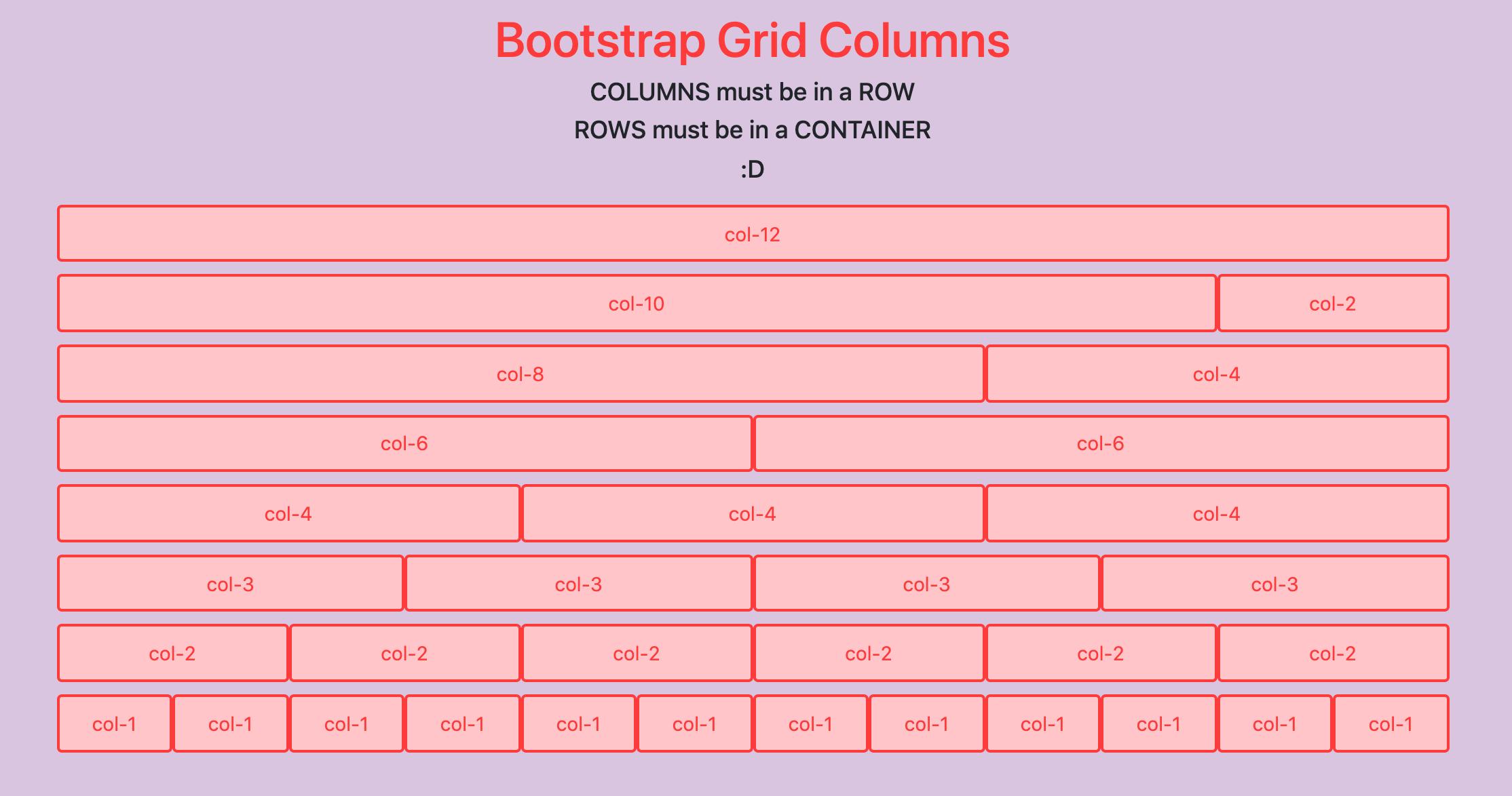
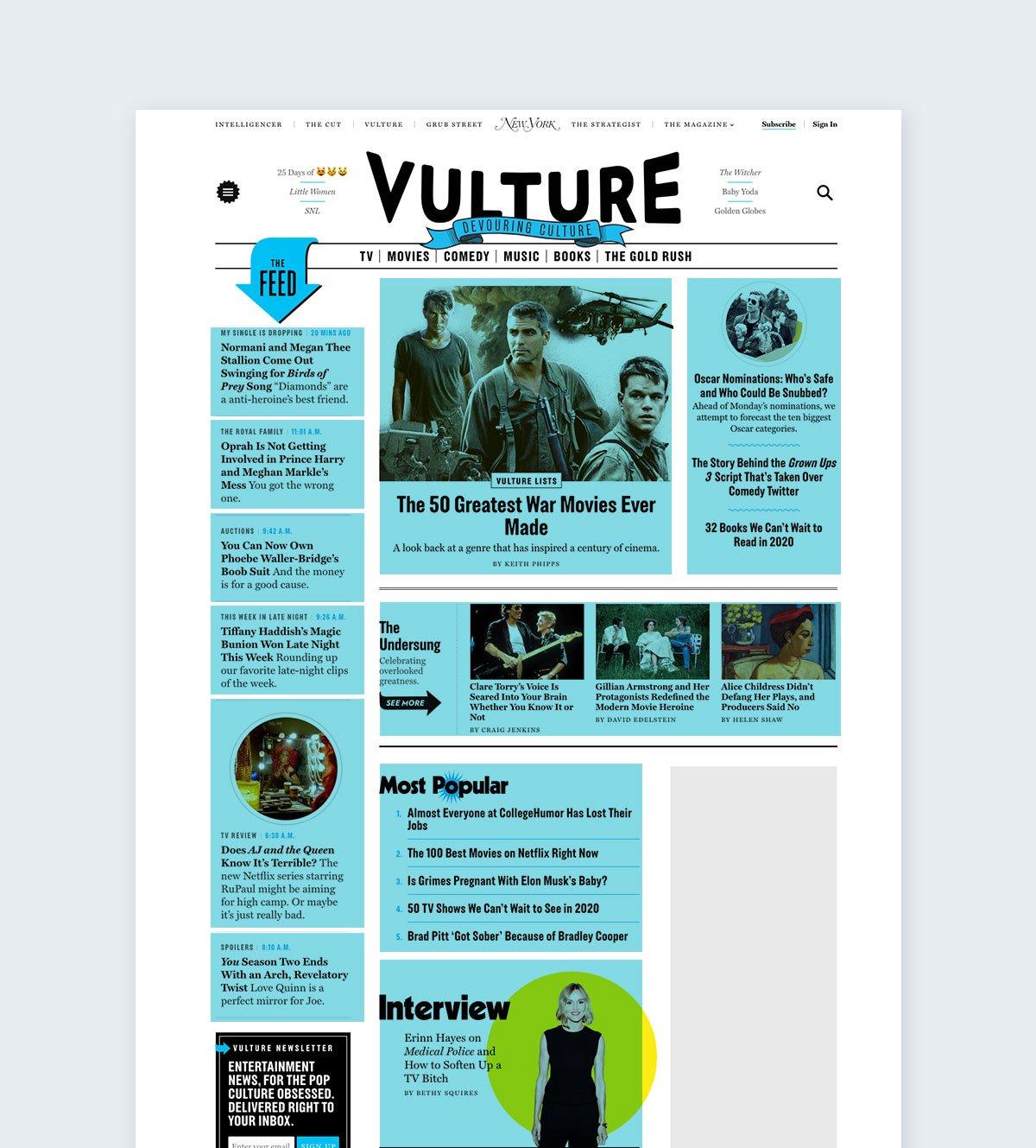
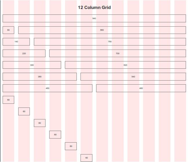
Grids didn’t start in UI.
They started in:
Why?
👉 To make content readable
👉 To align everything perfectly
👉 To remove guesswork
Then web design came.
Early websites?
👉 Tables. Chaos. No consistency.
Then came systems like:
And suddenly…
UI became structured.
───────────────────────────────────────────────────────────────────────────────
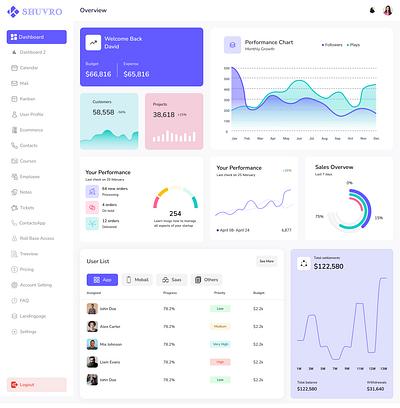
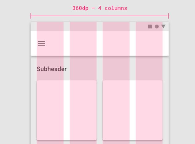
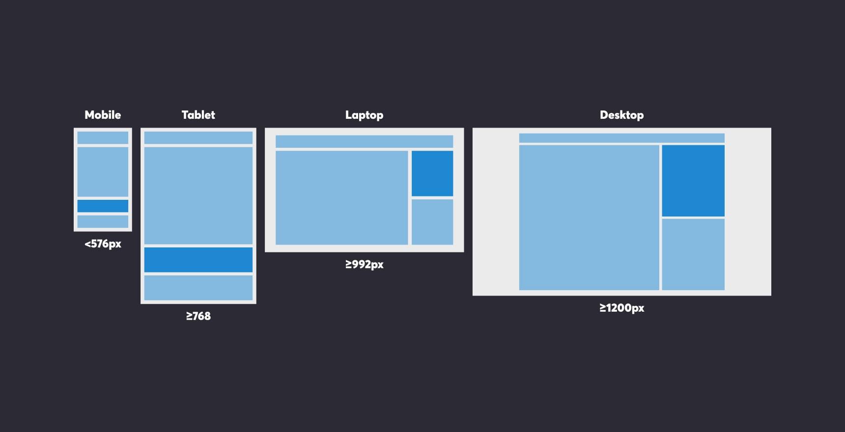
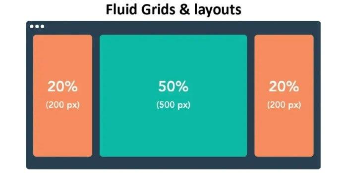
Old world:
Now:
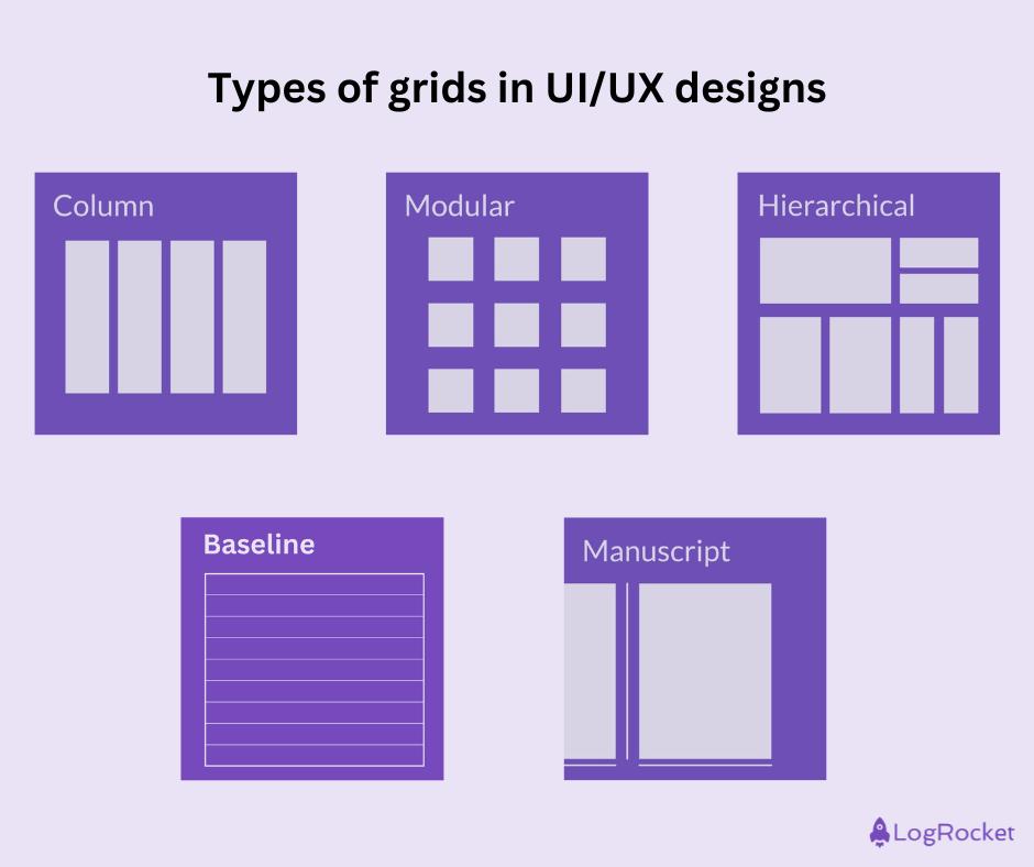
👉 One grid is not enough anymore.
Grids had to evolve into:
───────────────────────────────────────────────────────────────────────────────
A real grid system today must:
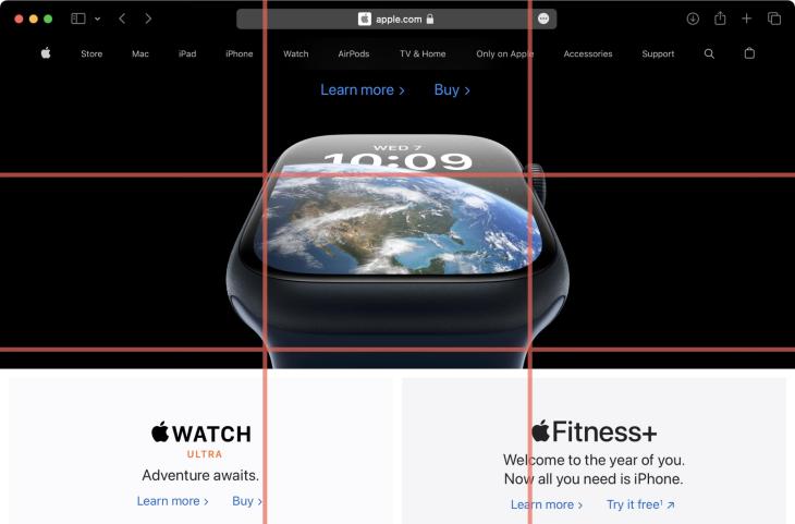
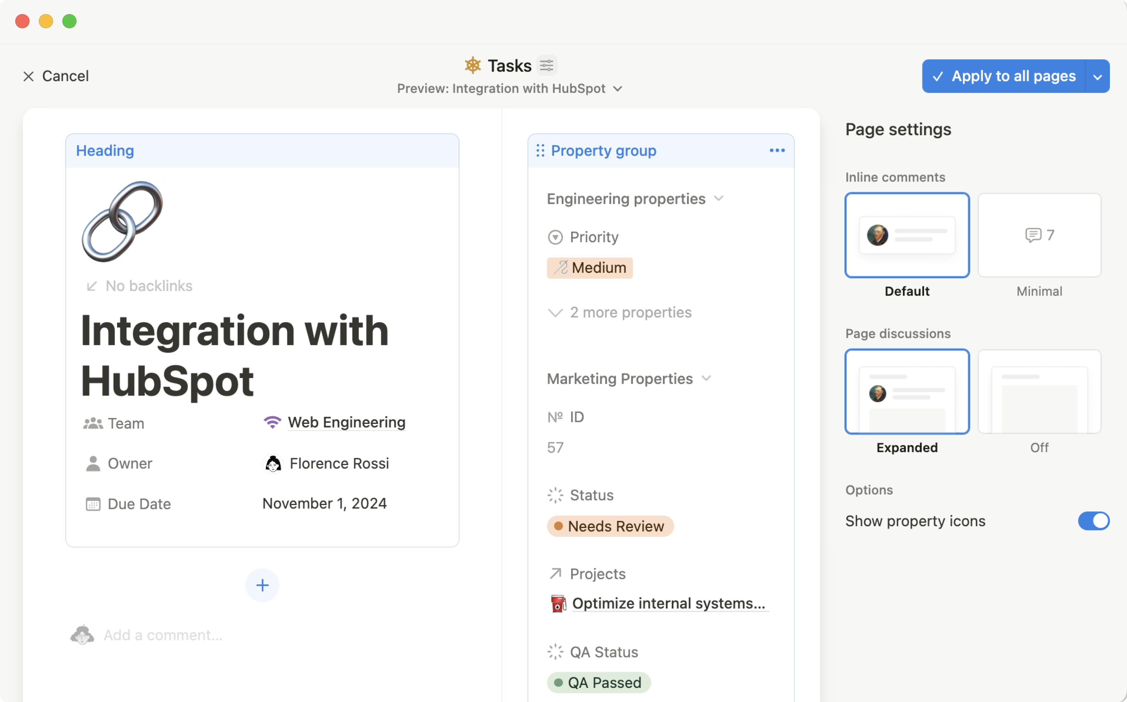
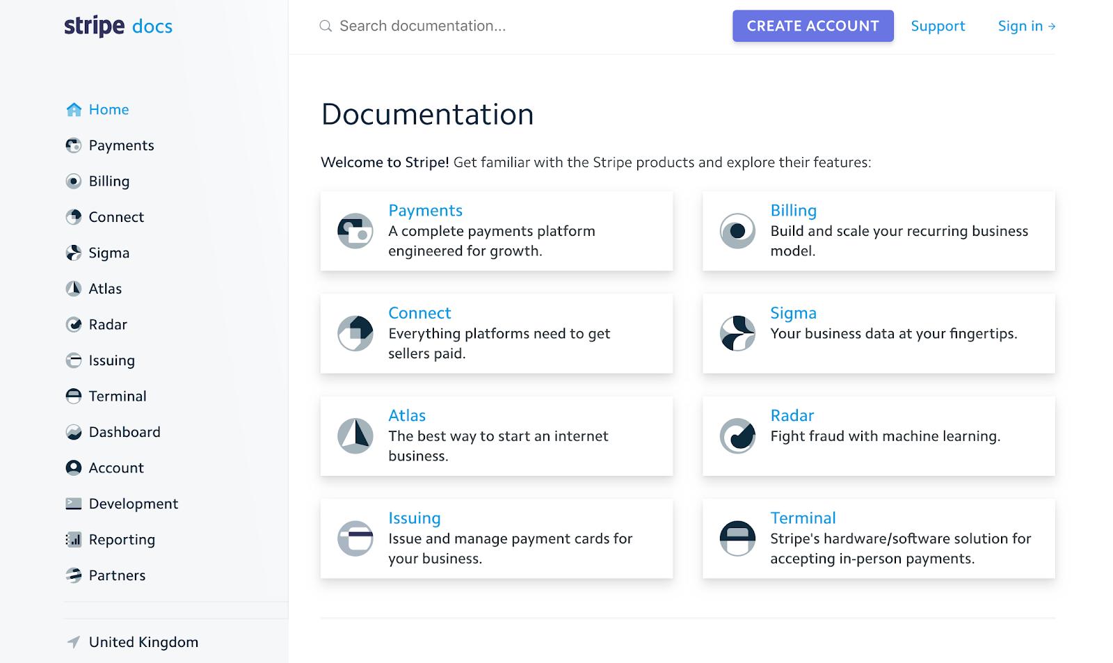
💡 Example:
They don’t “use grids.”
They live inside grids.
───────────────────────────────────────────────────────────────────────────────

───────────────────────────────────────────────────────────────────────────────
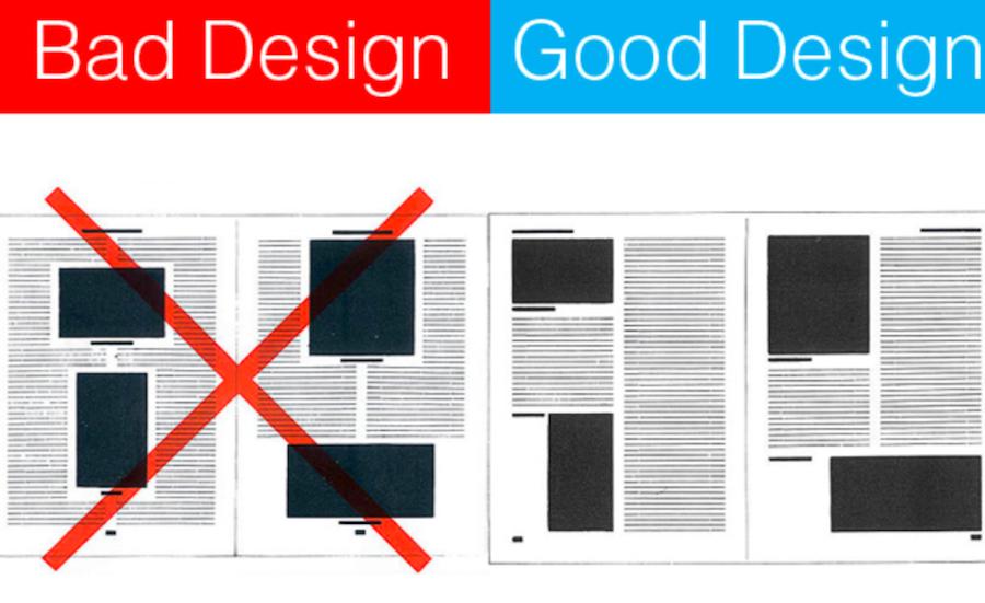
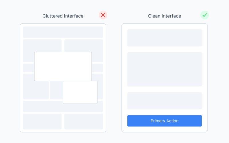

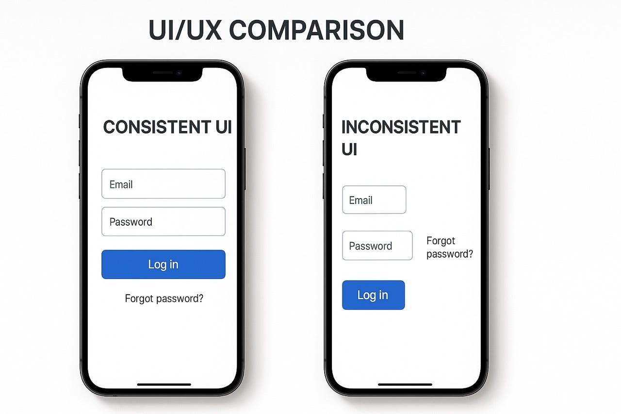
You’ve seen these:
Nothing is “broken.”
But everything feels:
👉 cheap
👉 rushed
👉 confusing
That’s not a color problem.
That’s a grid problem.
───────────────────────────────────────────────────────────────────────────────
😄 Let’s be honest:
And the classic:
👉 “Let me just center this…”
😄
Grids exist so you never do this again.
───────────────────────────────────────────────────────────────────────────────
Most design systems say:
👉 “Here is a 12-column grid”
That’s it.
But reality:
One grid ≠ real system
───────────────────────────────────────────────────────────────────────────────
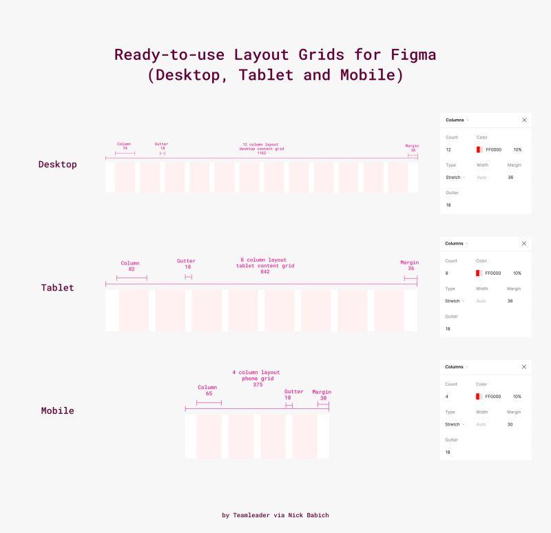
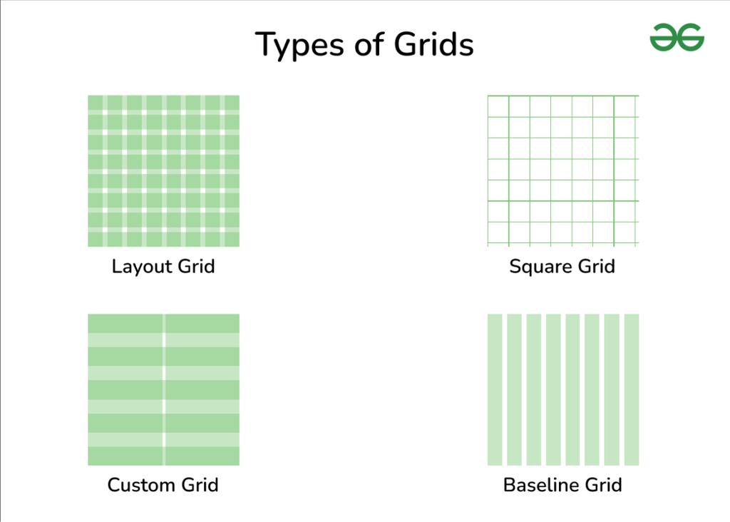
ZemryX doesn’t give you:
👉 “a grid”
It gives you:
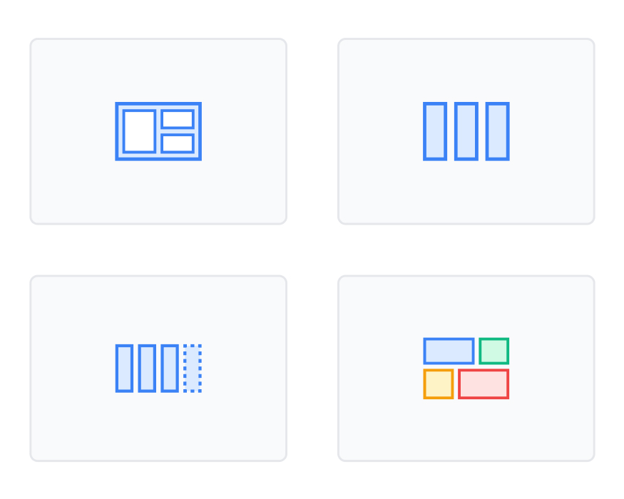
👉 all real-world grids you actually need
From your image system:
💡 This is the difference:
You don’t decide grids anymore.
You pick the right one instantly.
───────────────────────────────────────────────────────────────────────────────
Grid tokens define:
Example:
Grid/Desktop/Columns = 12
Grid/Desktop/Gutter = 24
Grid/Desktop/Margin = 80
👉 No guessing
👉 Fully consistent
───────────────────────────────────────────────────────────────────────────────
Instead of numbers:
layout-primarylayout-sidebarlayout-contentNow you design with:
👉 meaning
👉 intent
───────────────────────────────────────────────────────────────────────────────
Grids are not just pages.
They exist inside:
👉 Nested grids = clean components
───────────────────────────────────────────────────────────────────────────────
Your grid adapts to:
Not scaling.
👉 Transforming
───────────────────────────────────────────────────────────────────────────────
Most UI problems are not:
They are:
👉 grid problems
───────────────────────────────────────────────────────────────────────────────
ZemryX Grid System includes:
───────────────────────────────────────────────────────────────────────────────
Instead of:
👉 manually adjusting layouts
You get:
👉 predefined structure
👉 consistent behavior
👉 scalable UI
───────────────────────────────────────────────────────────────────────────────
Example:
Grid/Desktop/Main → Dashboard Layout
Grid/Mobile/Stack → Card Layout
👉 direct mapping
👉 zero confusion
───────────────────────────────────────────────────────────────────────────────
Good UI is not:
👉 creativity alone
It is:
👉 constraint + structure
Grids give that.
───────────────────────────────────────────────────────────────────────────────
Without ZemryX:
👉 Think → Try → Adjust → Fix
With ZemryX:
👉 Identify → Apply → Done
───────────────────────────────────────────────────────────────────────────────
Before:
👉 “Why is this misaligned?”
After:
👉 “This uses 6-column grid. Done.”
───────────────────────────────────────────────────────────────────────────────
Old thinking:
👉 Grids = layout tool
ZemryX thinking:
👉 Grids = design infrastructure
───────────────────────────────────────────────────────────────────────────────
Everything is:
So your UI:
👉 never breaks
👉 always aligns
───────────────────────────────────────────────────────────────────────────────
When grids are right:
👉 UI feels calm
👉 Design feels easy
👉 Decisions disappear
───────────────────────────────────────────────────────────────────────────────
Speed is a byproduct.
The real win is:
👉 confidence
───────────────────────────────────────────────────────────────────────────────
Because this is not:
👉 a file
It’s:
👉 a system
👉 continuously evolving
👉 covering every scenario
───────────────────────────────────────────────────────────────────────────────
Grids are invisible.
But they control everything.
Fix the grid…
And suddenly:
───────────────────────────────────────────────────────────────────────────────
👉 Great UI is not placed.
👉 It is structured.
───────────────────────────────────────────────────────────────────────────────
🚀 Build with structure, not struggle
Use ZemryX Grids
Design layouts that feel intentional, scalable, and production-ready —
without rethinking structure every single time.
If you want next:
👉 Landing page version
👉 Webflow interactive hero
👉 Figma marketing screens
👉 Grid playground demo
Just tell me 👍