Split Buttons

The One UI Pattern That Quietly Handles “What Happens Next”

Sandeep Akkipalli
May 1, 2026
In this articles
<a class="toc-link1" href="#intro">1. Intro</a> <a class="toc-link1" href="#a-small-story-every-designer-has-lived">2. A Small Story Every Designer Has Lived</a> <a class="toc-link1" href="#the-hidden-revenue-reality">3. The Hidden Revenue Reality</a> <a class="toc-link1" href="#the-real-problem-is-not-time">4. The Real Problem Is Not Time</a> <a class="toc-link1" href="#the-origin-of-interfaces">5. The Origin of Interfaces</a> <a class="toc-link1" href="#how-interfaces-evolved-and-why-interfaces-had-to-evolve-too">6. How Interfaces Evolved, And Why Interfaces Had to Evolve Too</a> <a class="toc-link1" href="#what-modern-systems-must-actually-do">7. What Modern Systems Must Actually Do</a> <a class="toc-link1" href="#success-stories-when-systems-quietly-improved-product-outcomes">8. Success Stories: When Systems Quietly Improved Product Outcomes</a> <a class="toc-link1" href="#failure-stories-when-systems-quietly-hurt-the-experience">9. Failure Stories: When Systems Quietly Hurt the Experience</a> <a class="toc-link1" href="#funny-lessons-because-systems-decisions-are-slightly-ridiculous">10. Funny Lessons Because Systems Decisions Are Slightly Ridiculous</a> <a class="toc-link1" href="#what-most-systems-still-get-wrong">11. What Most Systems Still Get Wrong</a> <a class="toc-link1" href="#the-zemryx-system">12. The ZemryX System</a> <a class="toc-link1" href="#theme-tokens-the-foundation-layer">13. Theme Tokens: The Foundation Layer</a> <a class="toc-link1" href="#core-typography-the-foundation-layer">14. Core Typography: The Foundation Layer</a> <a class="toc-link1" href="#component-tokens-real-ui-mapping">15. Component Tokens: Real UI Mapping</a> <a class="toc-link1" href="#all-states-all-surfaces-zero-guessing">16. All States. All Surfaces. Zero Guessing</a> <a class="toc-link1" href="#let-me-say-this-clearly">17. Let Me Say This Clearly</a> <a class="toc-link1" href="#what-the-system-actually-contains">18. What the System Actually Contains</a> <a class="toc-link1" href="#the-real-power-semantic-mapping-and-aliasing">19. The Real Power: Semantic Mapping and Aliasing</a> <a class="toc-link1" href="#alias-component-use-case">20. Alias → Component → Use Case</a> <a class="toc-link1" href="#what-most-people-do-not-realize">21. What Most People Do Not Realize</a> <a class="toc-link1" href="#the-5-second-workflow">22. The 5-Second Workflow</a> <a class="toc-link1" href="#same-scenario-new-reality">23. Same Scenario, New Reality</a> <a class="toc-link1" href="#systems-as-styling-vs-systems-as-infrastructure">24. Systems as Styling vs Systems as Infrastructure</a> <a class="toc-link1" href="#behind-the-scenes-the-zemryx-reality">25. Behind the Scenes: The ZemryX Reality</a> <a class="toc-link1" href="#the-emotional-truth-behind-the-system">26. The Emotional Truth Behind the System</a> <a class="toc-link1" href="#the-real-win-is-not-speed">27. The Real Win Is Not Speed</a> <a class="toc-link1" href="#why-subscription-matters">28. Why Subscription Matters</a> <a class="toc-link1" href="#final-takeaway">29. Final Takeaway</a> <a class="toc-link1" href="#closing-line">30. Closing Line</a> <a class="toc-link1" href="#cta-block">31. CTA Block</a>

Intro

Let’s talk about a button.

Not just any button.

A button that says:

👉 “Do this… or maybe do this instead.”

That’s a split button.

And it’s one of the most misunderstood patterns in UI.

───────────────────────────────────────────────────────────────────────────────

A Small Story Every Designer Has Lived

You design a button:

👉 “Save”

Then someone says:

“Can we also add Save as Draft?”

So you add another button.

Now UI feels cluttered.

So you try:

👉 Dropdown
👉 Secondary CTA
👉 Inline link

Nothing feels right.

Then someone says:

“Can we combine them?”

😄

And suddenly…

You discover split buttons.

───────────────────────────────────────────────────────────────────────────────

The Hidden Revenue Reality

Split buttons are not about UI.

They are about decision flexibility without friction.

Bad UI:

  • Forces user into one action
  • Or overwhelms with too many

Good UI:

  • Gives default action + alternatives

That’s where money is made.

───────────────────────────────────────────────────────────────────────────────

The Real Problem Is Not Time

Designers don’t struggle with creating split buttons.

They struggle with:

  • When to use them
  • What goes inside dropdown
  • Which action is primary
  • How it behaves in states

So they guess.

And guessing = inconsistency.

───────────────────────────────────────────────────────────────────────────────

The Origin of Interfaces

Split buttons didn’t start in modern SaaS.

They started in desktop software.

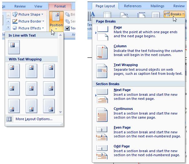
Microsoft Office (Classic Example)

  • Save” + dropdown
  • “Paste” + variations
  • “Insert” + options

👉 Default + extended action

This solved:

  • Speed + flexibility
  • Power user workflows

───────────────────────────────────────────────────────────────────────────────
How Interfaces Evolved, And Why Interfaces Had to Evolve Too

As we moved to web apps:

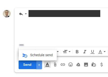
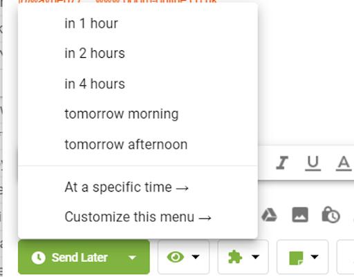
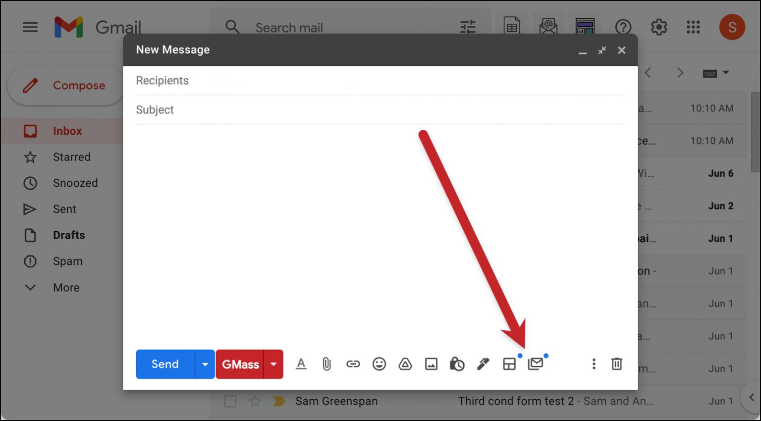
Gmail

  • Send
  • Send later
  • Schedule

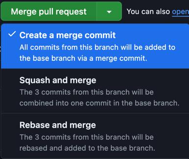
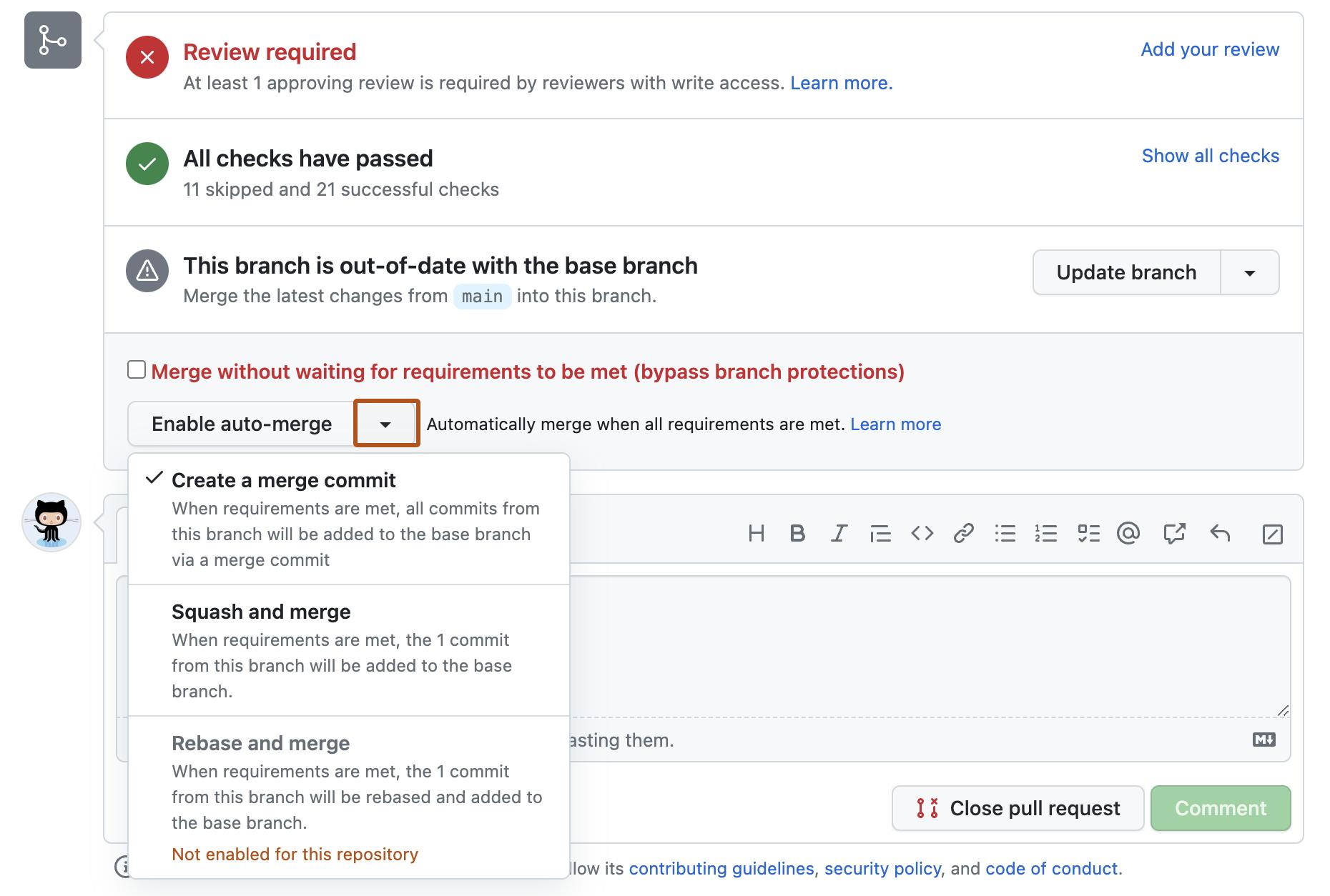
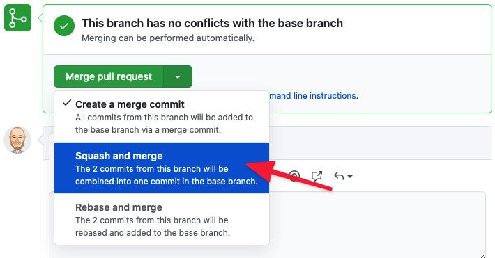
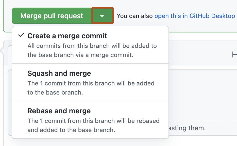
GitHub

  • Merge
  • Squash & merge
  • Rebase

💡 Evolution insight:

Split buttons became:

👉 Workflow tools
👉 Not just UI elements

───────────────────────────────────────────────────────────────────────────────
What Modern Systems Must Actually Do

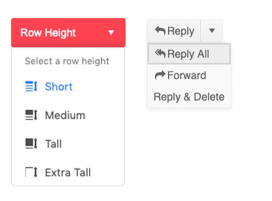
A real system must handle:

  • Default action clarity
  • Secondary actions hierarchy
  • State logic (hover, open, disabled)
  • Accessibility (keyboard + ARIA)
  • Context awareness

───────────────────────────────────────────────────────────────────────────────
Success Stories: When Systems Quietly Improved Product Outcomes

🟢 GitHub

Impact:

  • Cleaner workflows
  • Faster merges
  • Fewer mistakes

🟢 Figma

Impact:

  • Export flexibility
  • Multi-format workflows
  • Cleaner UI

───────────────────────────────────────────────────────────────────────────────

Failure Stories: When Systems Quietly Hurt the Experience

🔴 Overloaded Split Buttons

Problem:

  • Too many options
  • No clear default
  • Cognitive overload

🔴 Hidden Actions

  • Users don’t click dropdown
  • Important actions stay hidden

👉 Feature exists
👉 But never used

───────────────────────────────────────────────────────────────────────────────

Funny Lessons Because Systems Decisions Are Slightly Ridiculous

  • “Let’s add one more option” → becomes 12 options
  • “User will explore dropdown” → they never do
  • “Default doesn’t matter” → it matters the most

───────────────────────────────────────────────────────────────────────────────

What Most Systems Still Get Wrong

  • Treat split button as just UI
  • Ignore behavior logic
  • No state consistency
  • No semantic meaning

───────────────────────────────────────────────────────────────────────────────

The ZemryX System

ZemryX doesn’t treat split buttons as components.

It treats them as:

👉 Decision systems

───────────────────────────────────────────────────────────────────────────────

Theme Tokens: The Foundation Layer

Foundation layer:

  • Indigo:500 (Primary)
  • Neutral scales
  • Border tokens
  • Surface tokens

───────────────────────────────────────────────────────────────────────────────

Semantic Tokens: Meaning Without Guesswork

Instead of colors:

  • Primary Action
  • Secondary Action
  • Destructive Action
  • Disabled State

───────────────────────────────────────────────────────────────────────────────

Component Tokens: Real UI Mapping

Mapping:

  • Button base
  • Divider
  • Chevron
  • Dropdown

───────────────────────────────────────────────────────────────────────────────

All States. All Surfaces. Zero Guessing

Handled:

  • Default
  • Hover
  • Active
  • Focus
  • Disabled
  • Open

Across:

  • Filled
  • Outline
  • Tonal
  • Ghost

───────────────────────────────────────────────────────────────────────────────

Let Me Say This Clearly

Split buttons are not:

👉 “Button + dropdown”

They are:

👉 Primary decision + fallback paths

───────────────────────────────────────────────────────────────────────────────

What the System Actually Contains

From your system:

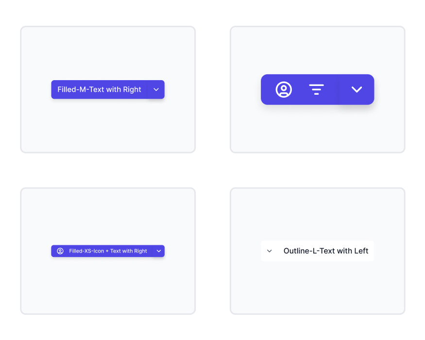
  • Text + Left Split
  • Text + Right Split
  • Icon + Text
  • Icon Only
  • Dual Icon
  • XS → L sizes
  • Filled / Outline / Tonal / Ghost

👉 Fully mapped.

───────────────────────────────────────────────────────────────────────────────

The Real Power: Semantic Mapping and Aliasing

Not visuals.

But:

  • State logic
  • Semantic mapping
  • Aliasing

───────────────────────────────────────────────────────────────────────────────

Alias → Component → State

Example:

Primary CTA → Split Button → Hover

Everything connected.

No guessing.

───────────────────────────────────────────────────────────────────────────────

What Most People Do Not Realize

Users:

👉 Click main action 90%
👉 Use dropdown only when needed

So:

👉 Default matters more than dropdown

───────────────────────────────────────────────────────────────────────────────

The 5-Second Workflow

Without system:

  • Think
  • Try
  • Adjust

With ZemryX:

  • Pick
  • Place
  • Done

───────────────────────────────────────────────────────────────────────────────

Same Scenario, New Reality

Before:
“Should this be dropdown?”

After:
👉 “This is a split action pattern.”

───────────────────────────────────────────────────────────────────────────────

Systems as Styling vs Systems as Infrastructure

Most systems:
👉 UI component

ZemryX:
👉 Decision infrastructure

───────────────────────────────────────────────────────────────────────────────

Behind the Scenes: The ZemryX Reality

  • Token-driven
  • Auto layout ready
  • WCAG compliant
  • Prototype-ready

───────────────────────────────────────────────────────────────────────────────

The Emotional Truth Behind the System

Good split button:

👉 Feels obvious

Bad one:

👉 Feels confusing

───────────────────────────────────────────────────────────────────────────────

The Real Win Is Not Speed

It’s:

👉 Confidence

───────────────────────────────────────────────────────────────────────────────

Why Subscription Matters

Because:

  • Thousands of combinations
  • Pre-built states
  • No manual setup

───────────────────────────────────────────────────────────────────────────────

Final Takeaway

Split buttons decide:

👉 What happens next

───────────────────────────────────────────────────────────────────────────────

Closing Line

A normal button asks:

👉 “Do you want to proceed?”

A split button asks:

👉 “How do you want to proceed?”

───────────────────────────────────────────────────────────────────────────────

CTA Block

Stop designing buttons.
Start designing decisions.

👉 With ZemryX
👉 Everything is already defined
👉 You just choose