Design Systems
Colour Select
Clarity. Accessibility. Confidence. Speed. And far fewer “which shade is right?” moments.

Mohan vanjarapu
April 30, 2026
The One UI Pattern That Quietly Handles “What Happens Next”

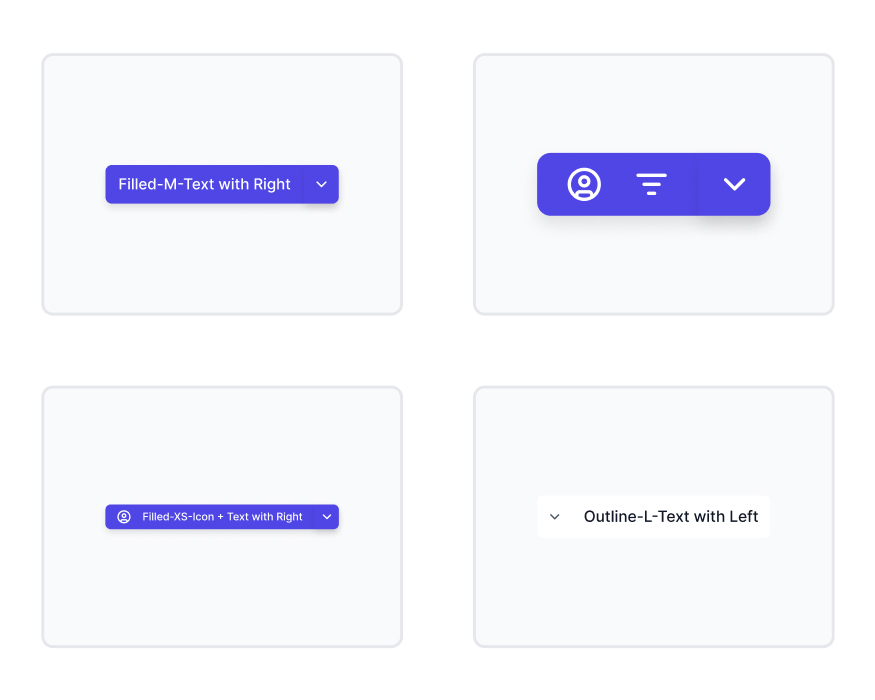
Let’s talk about a button.
Not just any button.
A button that says:
👉 “Do this… or maybe do this instead.”
That’s a split button.
And it’s one of the most misunderstood patterns in UI.
───────────────────────────────────────────────────────────────────────────────
You design a button:
👉 “Save”
Then someone says:
“Can we also add Save as Draft?”
So you add another button.
Now UI feels cluttered.
So you try:
👉 Dropdown
👉 Secondary CTA
👉 Inline link
Nothing feels right.
Then someone says:
“Can we combine them?”
😄
And suddenly…
You discover split buttons.
───────────────────────────────────────────────────────────────────────────────
Split buttons are not about UI.
They are about decision flexibility without friction.
Bad UI:
Good UI:
That’s where money is made.
───────────────────────────────────────────────────────────────────────────────
Designers don’t struggle with creating split buttons.
They struggle with:
So they guess.
And guessing = inconsistency.
───────────────────────────────────────────────────────────────────────────────
Split buttons didn’t start in modern SaaS.
They started in desktop software.

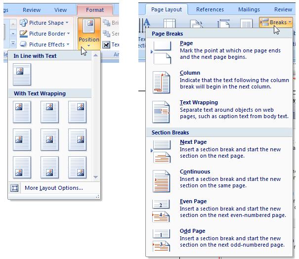
👉 Default + extended action
This solved:
───────────────────────────────────────────────────────────────────────────────
As we moved to web apps:
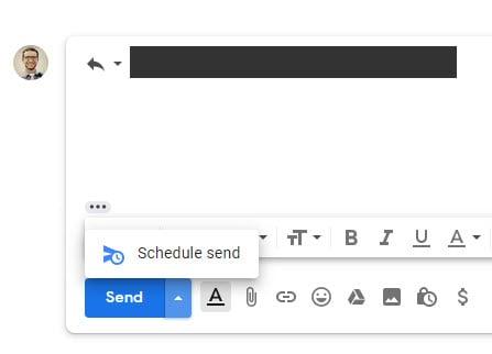
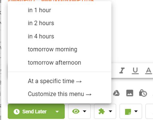
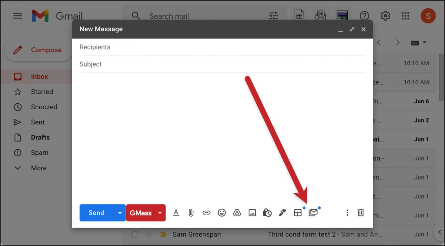
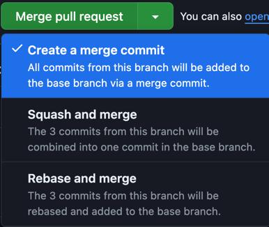
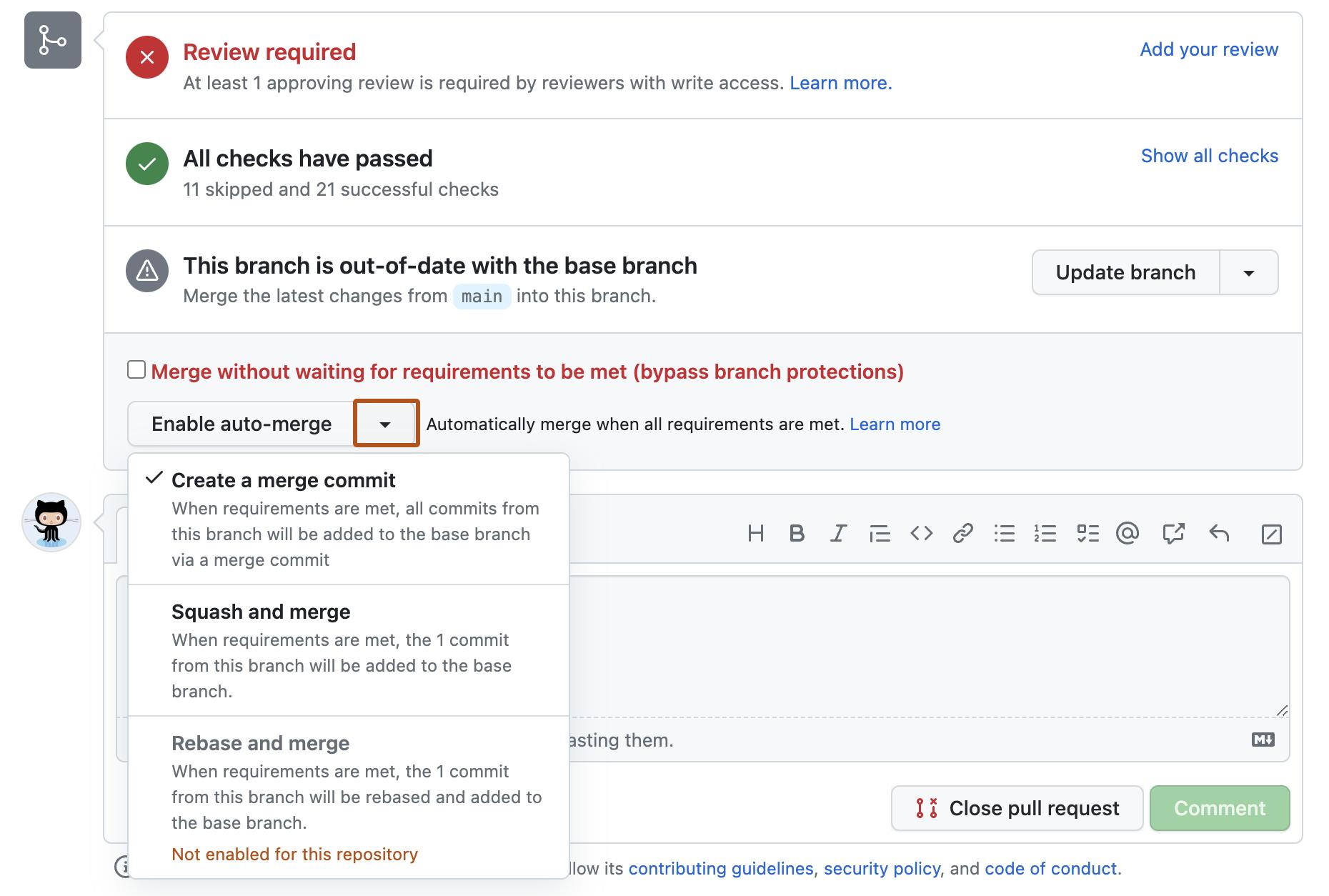
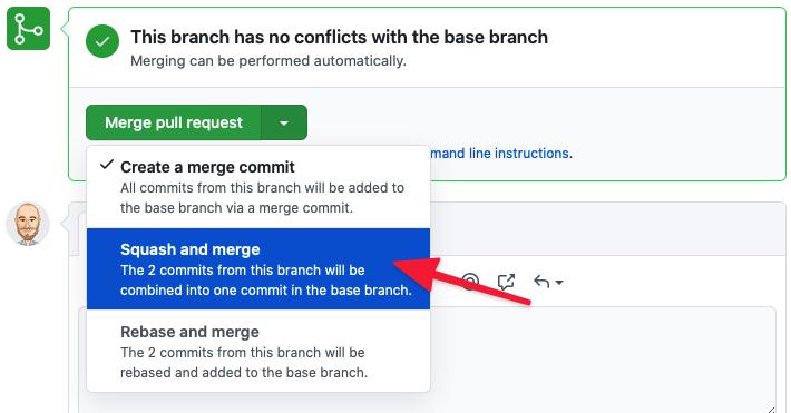
💡 Evolution insight:
Split buttons became:
👉 Workflow tools
👉 Not just UI elements
───────────────────────────────────────────────────────────────────────────────
A real system must handle:
───────────────────────────────────────────────────────────────────────────────
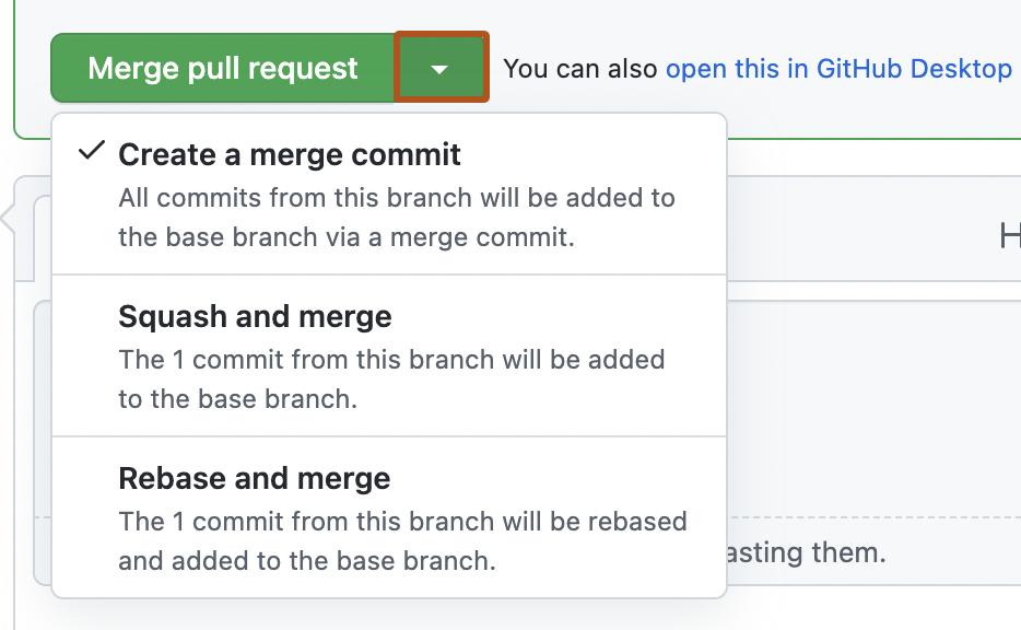
Impact:
Impact:
───────────────────────────────────────────────────────────────────────────────
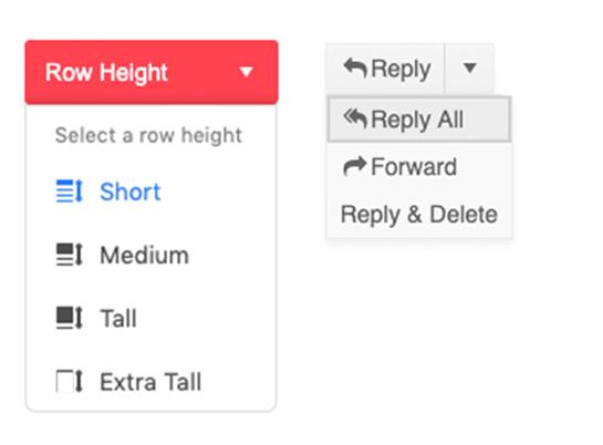
Problem:
👉 Feature exists
👉 But never used
───────────────────────────────────────────────────────────────────────────────
───────────────────────────────────────────────────────────────────────────────
───────────────────────────────────────────────────────────────────────────────
ZemryX doesn’t treat split buttons as components.
It treats them as:
👉 Decision systems
───────────────────────────────────────────────────────────────────────────────
Foundation layer:
───────────────────────────────────────────────────────────────────────────────
Instead of colors:
───────────────────────────────────────────────────────────────────────────────
Mapping:
───────────────────────────────────────────────────────────────────────────────
Handled:
Across:
───────────────────────────────────────────────────────────────────────────────
Split buttons are not:
👉 “Button + dropdown”
They are:
👉 Primary decision + fallback paths
───────────────────────────────────────────────────────────────────────────────
From your system:
👉 Fully mapped.
───────────────────────────────────────────────────────────────────────────────
Not visuals.
But:
───────────────────────────────────────────────────────────────────────────────
Example:
Primary CTA → Split Button → Hover
Everything connected.
No guessing.
───────────────────────────────────────────────────────────────────────────────
Users:
👉 Click main action 90%
👉 Use dropdown only when needed
So:
👉 Default matters more than dropdown
───────────────────────────────────────────────────────────────────────────────
Without system:
With ZemryX:
───────────────────────────────────────────────────────────────────────────────
Before:
“Should this be dropdown?”
After:
👉 “This is a split action pattern.”
───────────────────────────────────────────────────────────────────────────────
Most systems:
👉 UI component
ZemryX:
👉 Decision infrastructure
───────────────────────────────────────────────────────────────────────────────
───────────────────────────────────────────────────────────────────────────────
Good split button:
👉 Feels obvious
Bad one:
👉 Feels confusing
───────────────────────────────────────────────────────────────────────────────
It’s:
👉 Confidence
───────────────────────────────────────────────────────────────────────────────
Because:
───────────────────────────────────────────────────────────────────────────────
Split buttons decide:
👉 What happens next
───────────────────────────────────────────────────────────────────────────────
A normal button asks:
👉 “Do you want to proceed?”
A split button asks:
👉 “How do you want to proceed?”
───────────────────────────────────────────────────────────────────────────────
Stop designing buttons.
Start designing decisions.
👉 With ZemryX
👉 Everything is already defined
👉 You just choose