UI
Blurs
The Effect Designers Use When They Want UI to Feel Premium… And the One They Most Often Overdo

Mohan vanjarapu
May 15, 2026
It’s the Shape of Your Product’s Personality

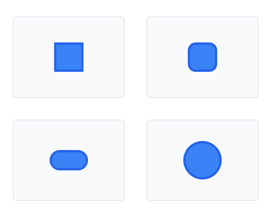
There’s a detail in your UI that almost nobody talks about.
It doesn’t animate.
It doesn’t load data.
It doesn’t even look “important.”
And yet
👉 it quietly defines how your entire product feels.
That detail is radius.
───────────────────────────────────────────────────────────────────────────────
Open your design file.
Pick any screen.
Now zoom into:
And ask yourself:
Did I consciously choose every radius value here?
Or did I just:
👉 Try 4px
👉 Try 6px
👉 Try 8px
👉 “Yeah… this looks fine”
───────────────────────────────────────────────────────────────────────────────
Users don’t say:
“This product has inconsistent border radius.”
But they feel it.
And that feeling becomes:
Because UI polish is not decoration.
👉 It’s decision clarity at scale
───────────────────────────────────────────────────────────────────────────────
Radius is simple.
It’s just a number.
0, 2, 4, 8, 12…
But the real problem is:
👉 You decide it every single time
Across:
───────────────────────────────────────────────────────────────────────────────
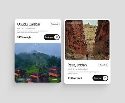
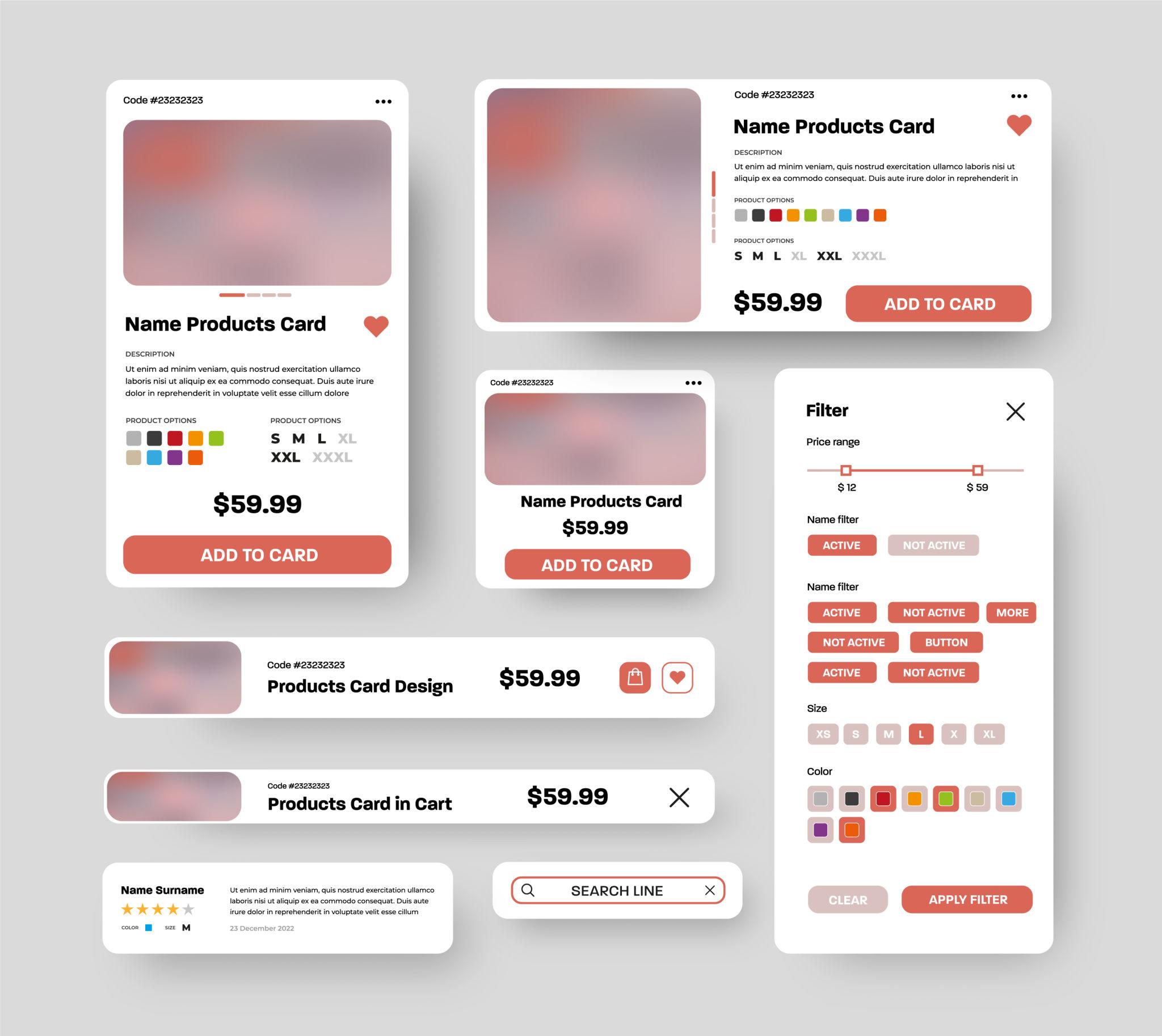
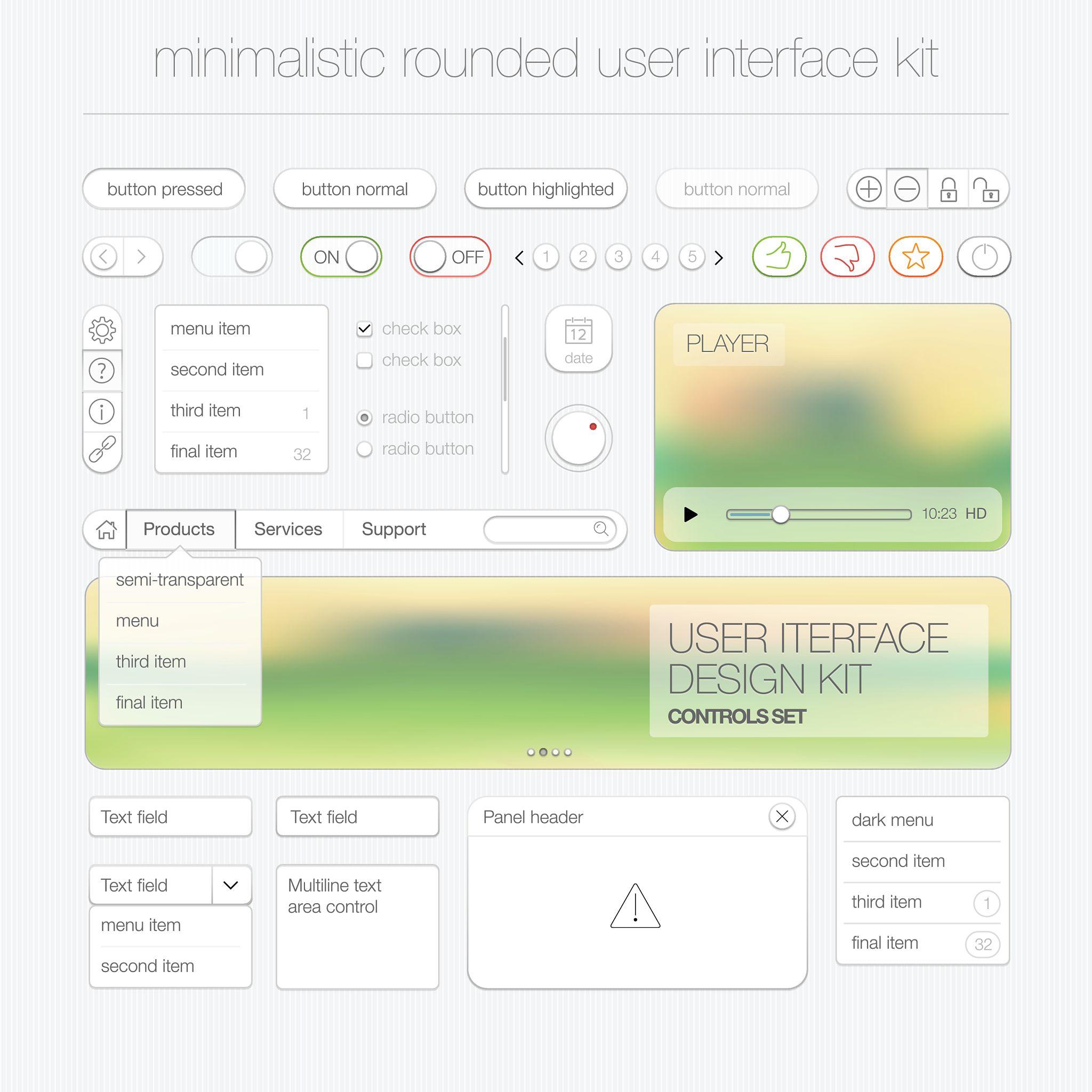
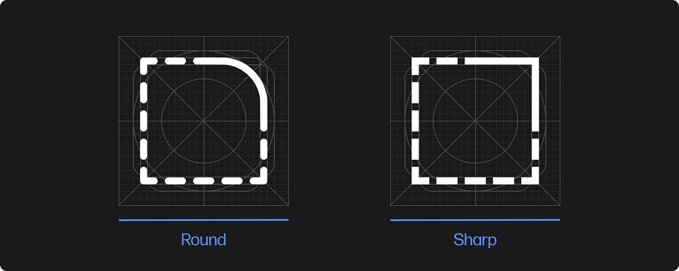
There was a time when interfaces had no softness.
Everything was sharp.
Early systems like classic Windows UI and early web interfaces were built for function, not feeling.
So radius didn’t matter.
0px
Then interfaces evolved.
👉 They became experiences.
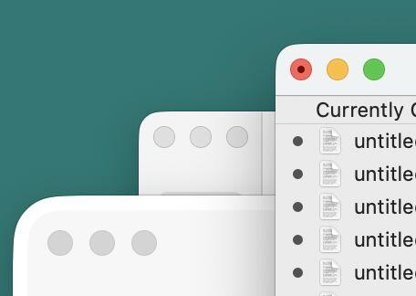
Mobile platforms like iOS introduced:
Products like Apple and Airbnb didn’t just add radius.
👉 They used it to make interfaces feel human.
Because:
👉 Radius became product psychology
───────────────────────────────────────────────────────────────────────────────
As interfaces became:
Radius stopped being styling.
👉 It became structure
It now controls:
───────────────────────────────────────────────────────────────────────────────
A real system should:
✔ Remove decision fatigue
✔ Ensure consistency
✔ Scale across products
✔ Map to real UI
Not:
❌ “Here are values — figure it out”
───────────────────────────────────────────────────────────────────────────────

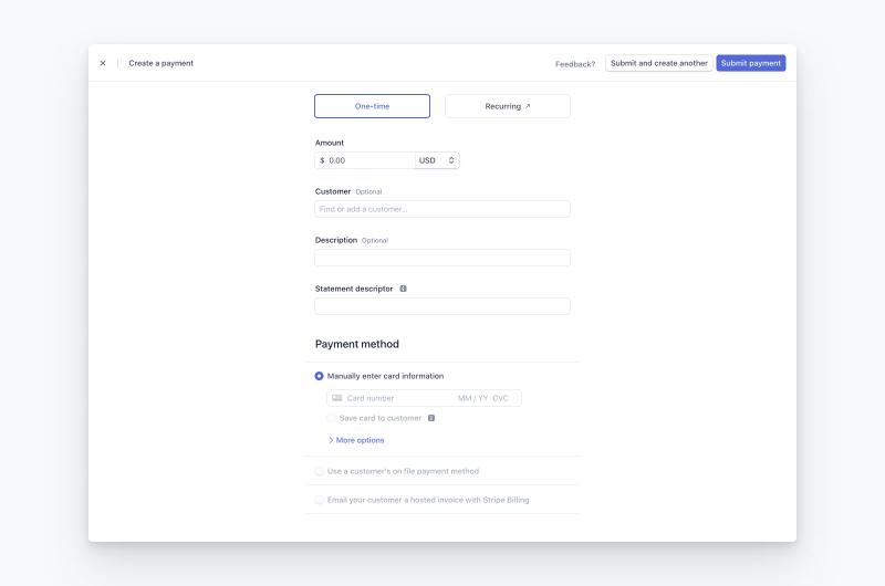
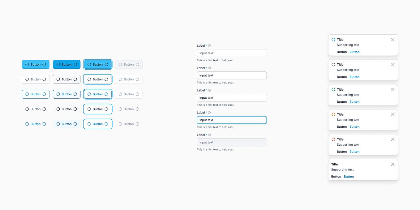
Look at products like:
Nothing stands out.
And that’s the point.
They feel:
Because:
👉 Radius is consistent everywhere
👉 You never notice radius
👉 Because it never breaks
And that creates:
───────────────────────────────────────────────────────────────────────────────
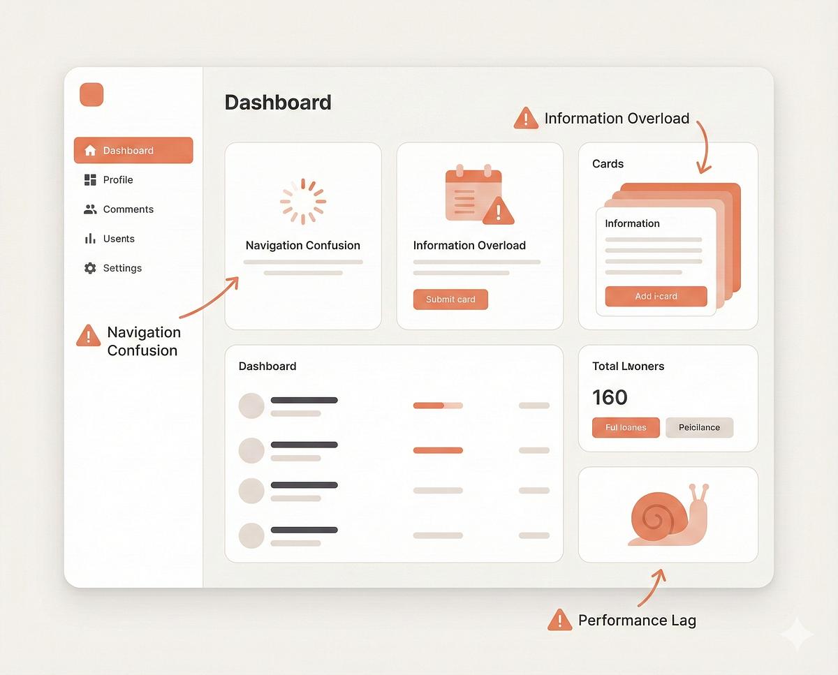
Now think about products that feel…
“slightly off”
Look closer:
All valid values.
But no system.
Common in:
Result:
👉 Nothing breaks
👉 But nothing feels tight
───────────────────────────────────────────────────────────────────────────────
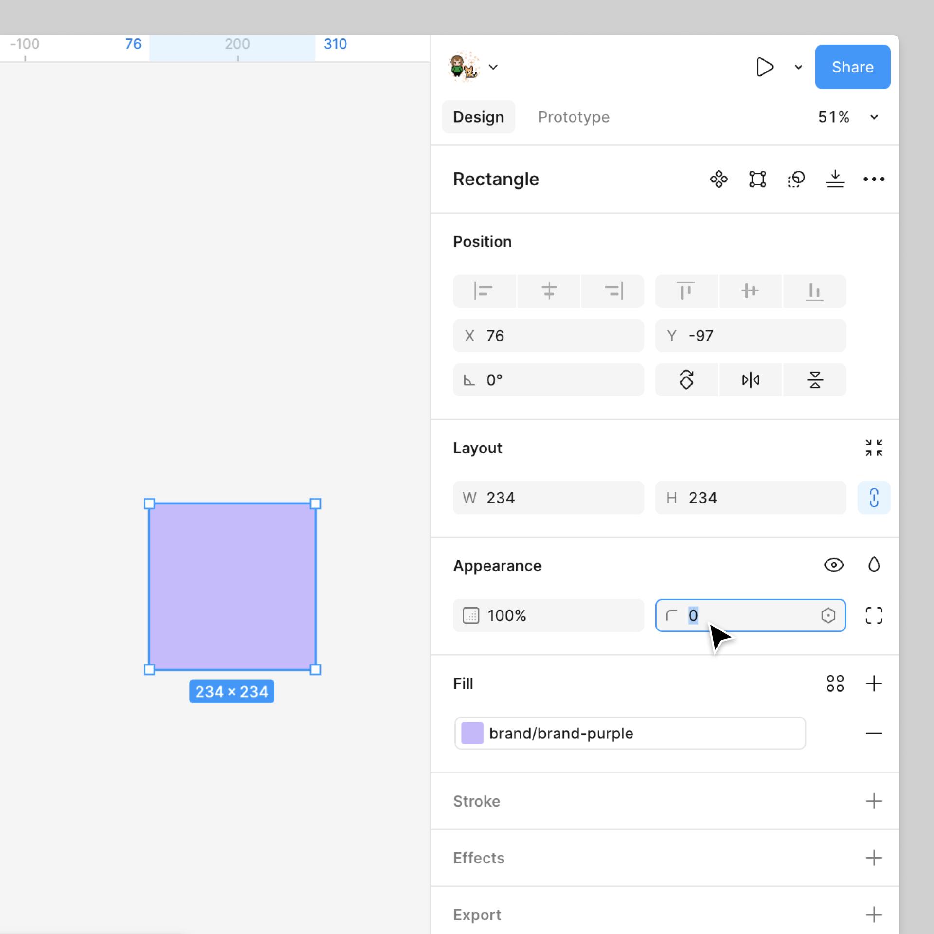
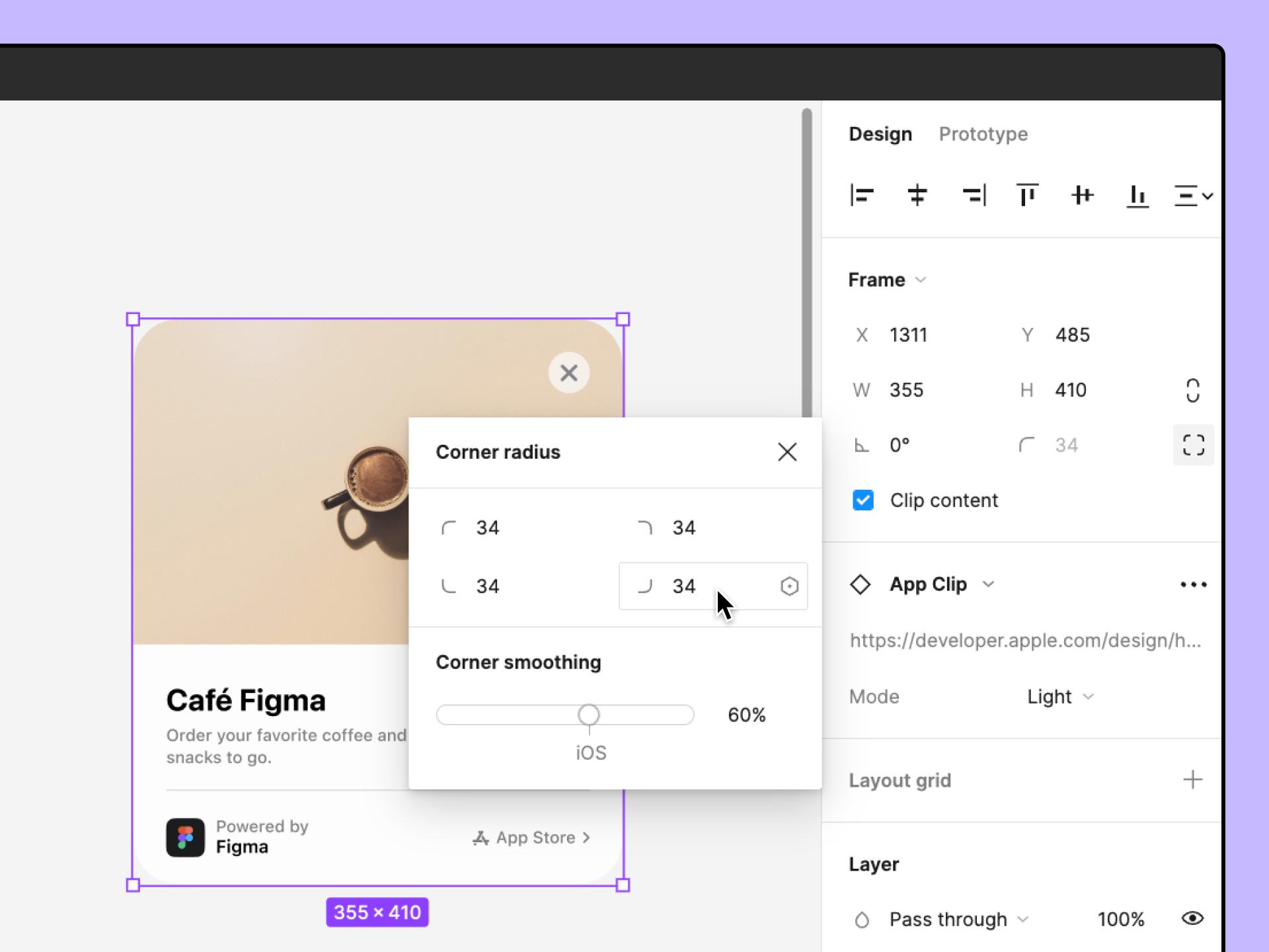
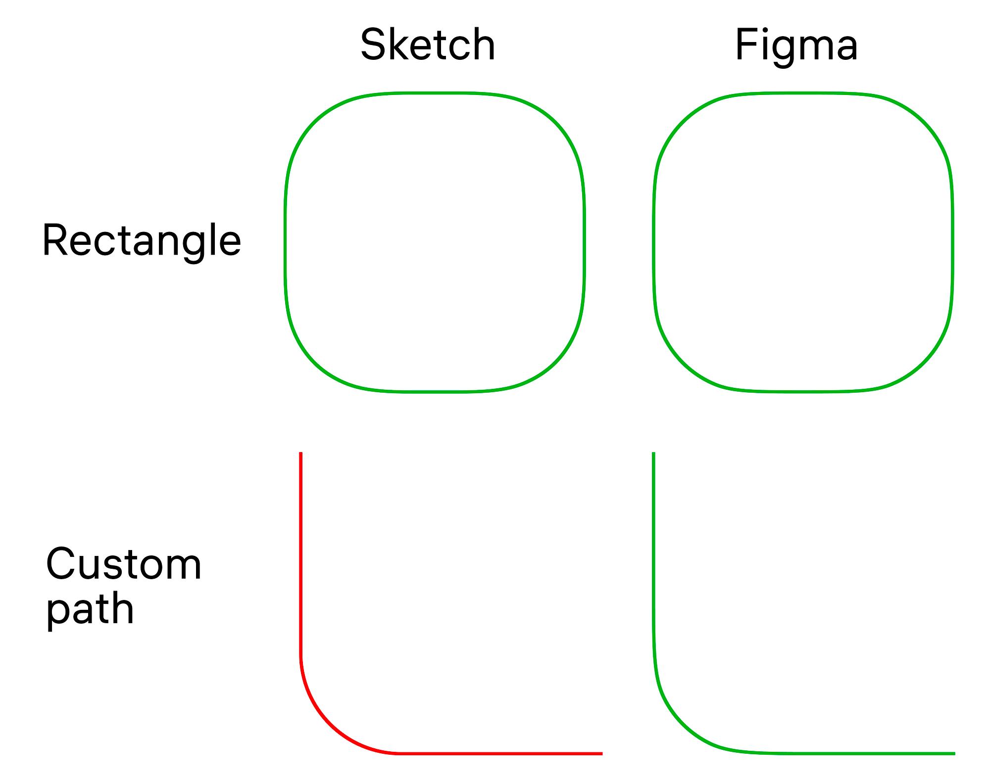
You’ve done this:
😄
Two days later?
👉 You change it again
You didn’t solve it.
👉 You postponed it
Multiply that across your product:
👉 Design debt
───────────────────────────────────────────────────────────────────────────────
Most systems give you:
0 / 2 / 4 / 8 / 12 / 16
But not:
👉 When to use what
───────────────────────────────────────────────────────────────────────────────
ZemryX doesn’t give values.
👉 It gives decisions
───────────────────────────────────────────────────────────────────────────────
TokenValueradius-00radius-11radius-22radius-44radius-66radius-88radius-1010radius-1212radius-1414radius-1616radius-2020radius-2424radius-3232radius-124124radius-pill9999
───────────────────────────────────────────────────────────────────────────────
TokenMeaningradius-xxsSharpradius-xsSubtleradius-smButtons / Inputsradius-mdCardsradius-lgModalsradius-xlLayoutradius-2xlContainersradius-pillPillsradius-circleCircles
───────────────────────────────────────────────────────────────────────────────
ComponentTokenButtonradius-smInputradius-smCardradius-mdModalradius-lgBadgeradius-pillAvatarradius-circle
───────────────────────────────────────────────────────────────────────────────
Hover. Active. Disabled.
👉 Radius stays consistent
───────────────────────────────────────────────────────────────────────────────
You don’t need more options.
👉 You need fewer decisions
───────────────────────────────────────────────────────────────────────────────
ZemryX gives:
✔ Full scale
✔ Semantic mapping
✔ Component usage
✔ Ready UI
───────────────────────────────────────────────────────────────────────────────
radius-md → radius-8
Change once → updates everywhere
───────────────────────────────────────────────────────────────────────────────
radius-8 → radius-md → Card
───────────────────────────────────────────────────────────────────────────────
Tiny tweaks:
👉 Become system-wide inconsistency
───────────────────────────────────────────────────────────────────────────────
Before:
❌ Try → Adjust → Compare
After:
✅ “Card → radius-md”
Done.
───────────────────────────────────────────────────────────────────────────────
Same designer. Same UI.
👉 Zero guesswork
👉 Full consistency
───────────────────────────────────────────────────────────────────────────────
Old:
👉 Decoration
ZemryX:
👉 Infrastructure
───────────────────────────────────────────────────────────────────────────────
Everything:
───────────────────────────────────────────────────────────────────────────────
You were never bad at design.
👉 You just lacked a system
───────────────────────────────────────────────────────────────────────────────
The real win:
👉 Confidence
👉 Consistency
👉 Clarity
───────────────────────────────────────────────────────────────────────────────
Because:
This is not a UI kit.
This is:
👉 A decision system
👉 A scalable foundation
👉 A production workflow
───────────────────────────────────────────────────────────────────────────────
Radius is not:
❌ Just a number
It is:
✅ A system
✅ A language
✅ A product decision
───────────────────────────────────────────────────────────────────────────────
Great design is not about choosing better values.
It’s about:
👉 Not needing to choose at all.
───────────────────────────────────────────────────────────────────────────────
🚀 Start Designing Without Guesswork
Use ZemryX.
Use the Radius System.
Build like a real product team.
Copy → Paste → Done.