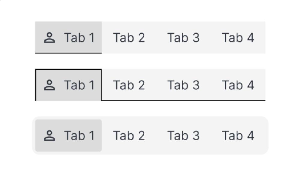
Segmented Buttons

The Small Control That Quietly Decides How Fast Your Product Feels
Mohan vanjarapu
May 21, 2026
In this articles
<a class="toc-link1" href="#intro">1. Intro</a> <a class="toc-link1" href="#a-small-story-every-designer-has-lived">2. A Small Story Every Designer Has Lived</a> <a class="toc-link1" href="#the-hidden-revenue-reality">3. The Hidden Revenue Reality</a> <a class="toc-link1" href="#the-real-problem-is-not-time">4. The Real Problem Is Not Time</a> <a class="toc-link1" href="#the-origin-of-interfaces">5. The Origin of Interfaces</a> <a class="toc-link1" href="#how-interfaces-evolved-and-why-interfaces-had-to-evolve-too">6. How Interfaces Evolved, And Why Interfaces Had to Evolve Too</a> <a class="toc-link1" href="#what-modern-systems-must-actually-do">7. What Modern Systems Must Actually Do</a> <a class="toc-link1" href="#success-stories-when-systems-quietly-improved-product-outcomes">8. Success Stories: When Systems Quietly Improved Product Outcomes</a> <a class="toc-link1" href="#failure-stories-when-systems-quietly-hurt-the-experience">9. Failure Stories: When Systems Quietly Hurt the Experience</a> <a class="toc-link1" href="#funny-lessons-because-systems-decisions-are-slightly-ridiculous">10. Funny Lessons Because Systems Decisions Are Slightly Ridiculous</a> <a class="toc-link1" href="#what-most-systems-still-get-wrong">11. What Most Systems Still Get Wrong</a> <a class="toc-link1" href="#the-zemryx-system">12. The ZemryX System</a> <a class="toc-link1" href="#theme-tokens-the-foundation-layer">13. Theme Tokens: The Foundation Layer</a> <a class="toc-link1" href="#core-typography-the-foundation-layer">14. Core Typography: The Foundation Layer</a> <a class="toc-link1" href="#component-tokens-real-ui-mapping">15. Component Tokens: Real UI Mapping</a> <a class="toc-link1" href="#all-states-all-surfaces-zero-guessing">16. All States. All Surfaces. Zero Guessing</a> <a class="toc-link1" href="#let-me-say-this-clearly">17. Let Me Say This Clearly</a> <a class="toc-link1" href="#what-the-system-actually-contains">18. What the System Actually Contains</a> <a class="toc-link1" href="#the-real-power-semantic-mapping-and-aliasing">19. The Real Power: Semantic Mapping and Aliasing</a> <a class="toc-link1" href="#alias-component-use-case">20. Alias β†’ Component β†’ Use Case</a> <a class="toc-link1" href="#what-most-people-do-not-realize">21. What Most People Do Not Realize</a> <a class="toc-link1" href="#the-5-second-workflow">22. The 5-Second Workflow</a> <a class="toc-link1" href="#same-scenario-new-reality">23. Same Scenario, New Reality</a> <a class="toc-link1" href="#systems-as-styling-vs-systems-as-infrastructure">24. Systems as Styling vs Systems as Infrastructure</a> <a class="toc-link1" href="#behind-the-scenes-the-zemryx-reality">25. Behind the Scenes: The ZemryX Reality</a> <a class="toc-link1" href="#the-emotional-truth-behind-the-system">26. The Emotional Truth Behind the System</a> <a class="toc-link1" href="#the-real-win-is-not-speed">27. The Real Win Is Not Speed</a> <a class="toc-link1" href="#why-subscription-matters">28. Why Subscription Matters</a> <a class="toc-link1" href="#final-takeaway">29. Final Takeaway</a> <a class="toc-link1" href="#closing-line">30. Closing Line</a> <a class="toc-link1" href="#cta-block">31. CTA Block</a>

Intro

There’s a moment in every product…

Where the user is not exploring anymore.
Not learning anymore.

They are choosing.

πŸ‘‰ View
πŸ‘‰ Filter
πŸ‘‰ Mode
πŸ‘‰ State

And in that moment…

A tiny UI element decides everything:

The segmented button.

‍

───────────────────────────────────────────────────────────────────────────────

‍

A Small Story Every Designer Has Lived

You design a dashboard.

You add:

  • Tabs
  • Filters
  • Toggles

And then you pause…

β€œShould this be tabs?”
β€œOr buttons?”
β€œOr chips?”
β€œOr dropdown?”

You try one.

Then another.

Then:
πŸ˜„ β€œOkay… this looks fine.”

That β€œfine” is the problem.

Because segmented controls are not about how they look.

They are about:

πŸ‘‰ How quickly users decide

‍

───────────────────────────────────────────────────────────────────────────────
‍

The Hidden Revenue Reality

Segmented buttons directly impact:

  • Conversion speed
  • Task completion time
  • User confidence

A bad segmented control causes:

❌ Hesitation
❌ Wrong selections
❌ Slower workflows

A good one:

βœ… Feels instant
βœ… Feels obvious
βœ… Feels effortless

‍

───────────────────────────────────────────────────────────────────────────────
‍

The Real Problem Is Not Time

Designers don’t struggle because they lack time.

They struggle because:

πŸ‘‰ There is no system

Every time:

  • You decide layout again
  • You decide spacing again
  • You decide states again

‍

───────────────────────────────────────────────────────────────────────────────
‍

The Origin of Interfaces

‍

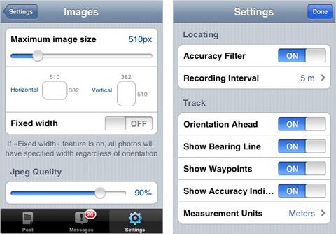
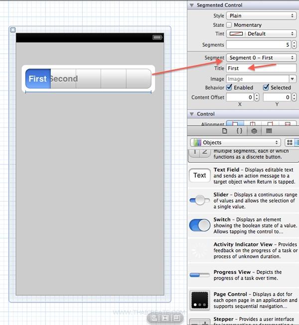
πŸ“± Early iOS Segmented Control (Apple)

Apple introduced segmented controls for:

  • Mode switching
  • Quick selection
  • Binary decisions

πŸ‘‰ Example:

  • List vs Grid
  • Day vs Week vs Month

🧠 Why It Worked

Because it solved one thing:

πŸ‘‰ Reduce decision friction

‍

───────────────────────────────────────────────────────────────────────────────
‍

How Interfaces Evolved, And Why Interfaces Had to Evolve Too

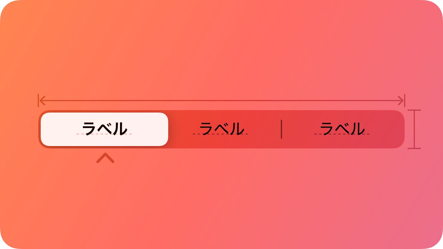
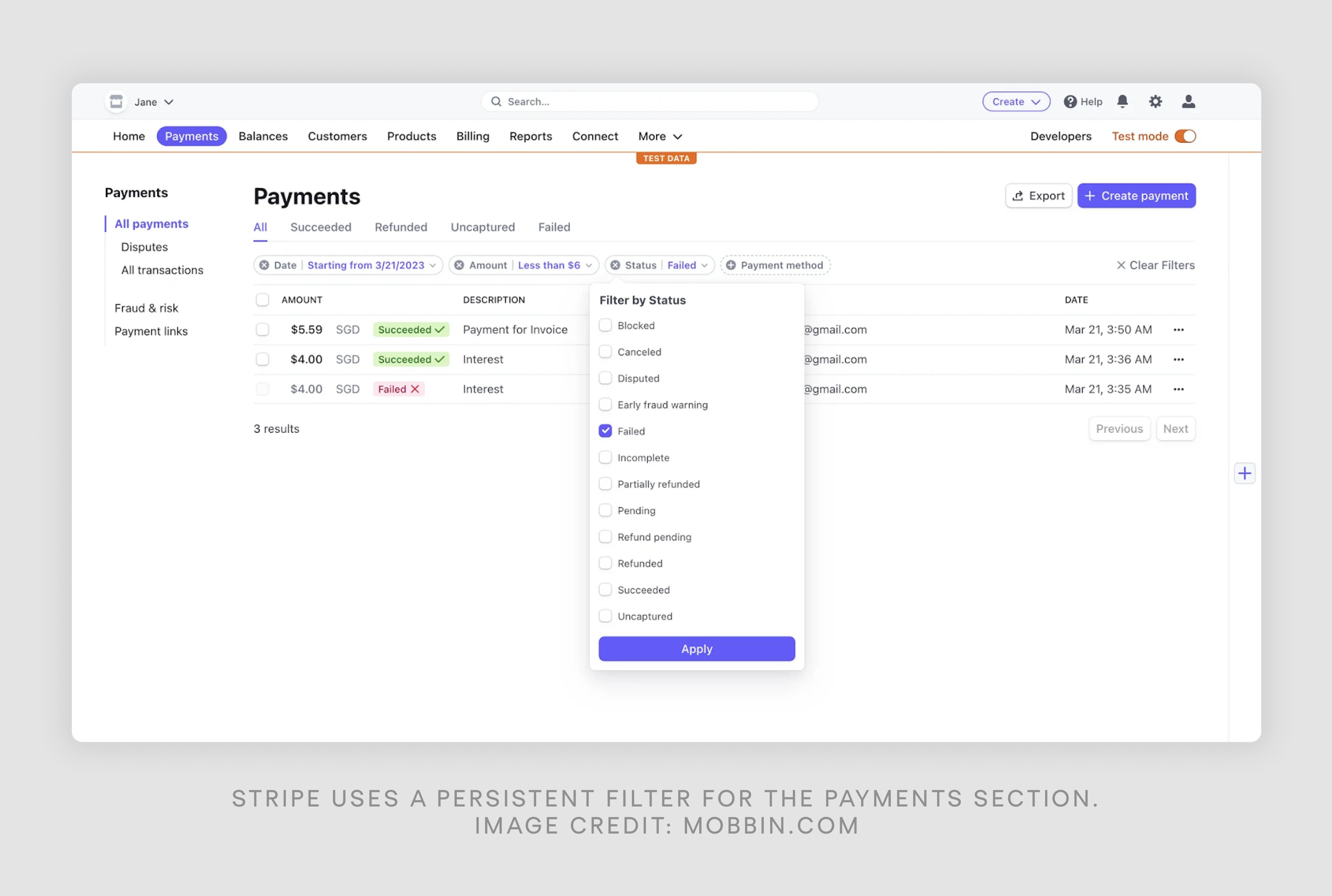
πŸ“Š Modern SaaS (Notion, Figma, Stripe)

Segmented buttons evolved into:

  • Filter bars
  • Toolbars
  • Toggle groups
  • Mode switchers

πŸ‘‰ From simple tabs β†’ to multi-functional decision systems

‍

───────────────────────────────────────────────────────────────────────────────
‍

What Modern Systems Must Actually Do

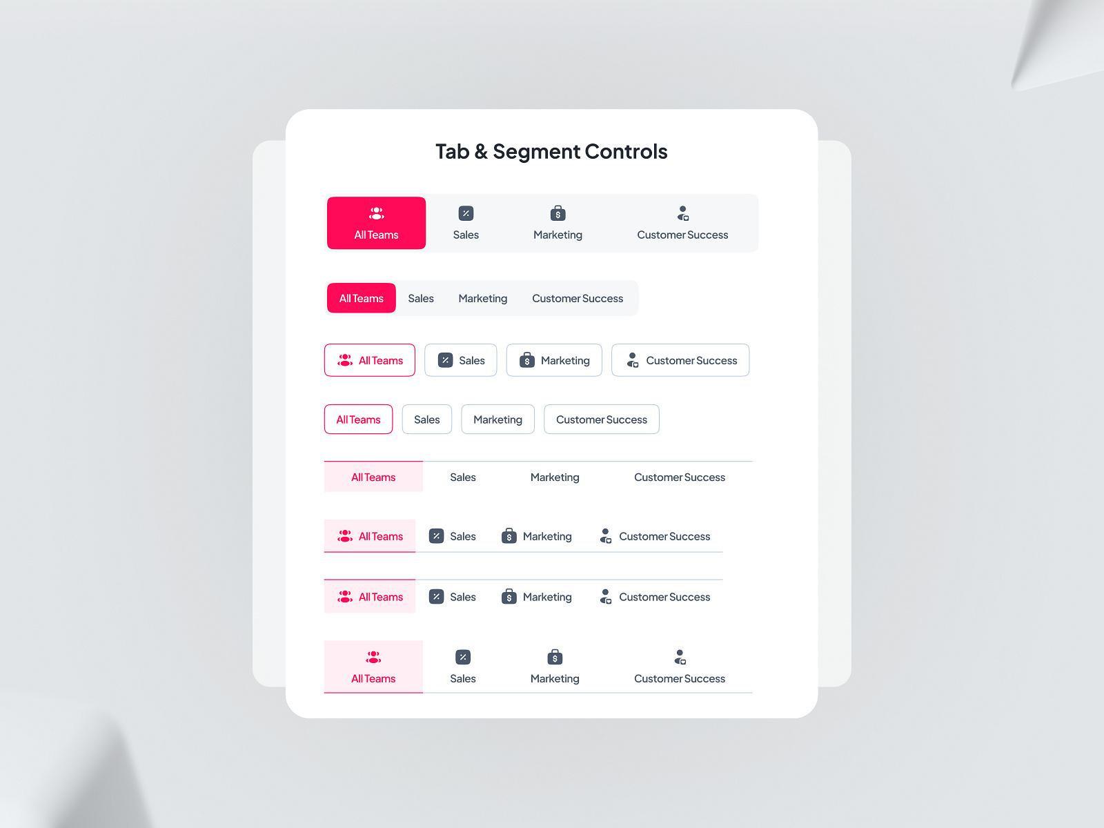
Today, a segmented system must support:

1. Selection Types

  • Single select
  • Multi select

2. Layout Types

  • Horizontal
  • Vertical

3. Content Types

  • Text only
  • Icon only
  • Icon + text

4. Behavior Types

  • Toggle group
  • Dropdown hybrid
  • Persistent state

‍

───────────────────────────────────────────────────────────────────────────────
‍

Success Stories: When Systems Quietly Improved Product Outcomes

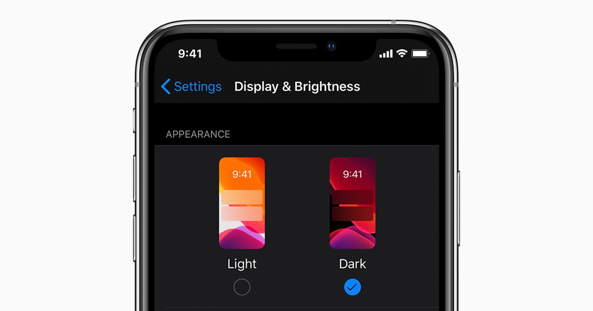
🟒 Apple β€” iOS Settings

  • Light / Dark mode toggle
  • Clean, obvious
  • Zero confusion

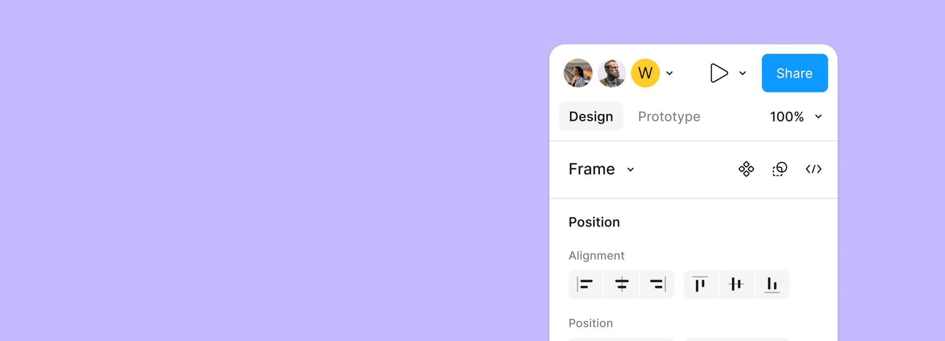
🟒 Figma β€” Toolbar Controls

  • Alignment
  • Layout
  • Formatting

πŸ‘‰ Instant actions
πŸ‘‰ No labels needed

‍

───────────────────────────────────────────────────────────────────────────────
‍

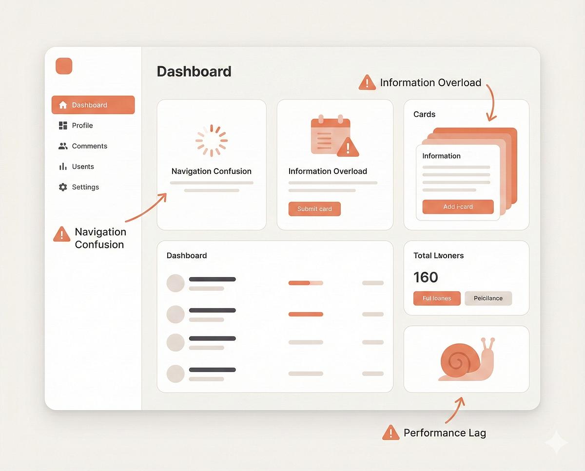
Failure Stories: When Systems Quietly Hurt the Experience

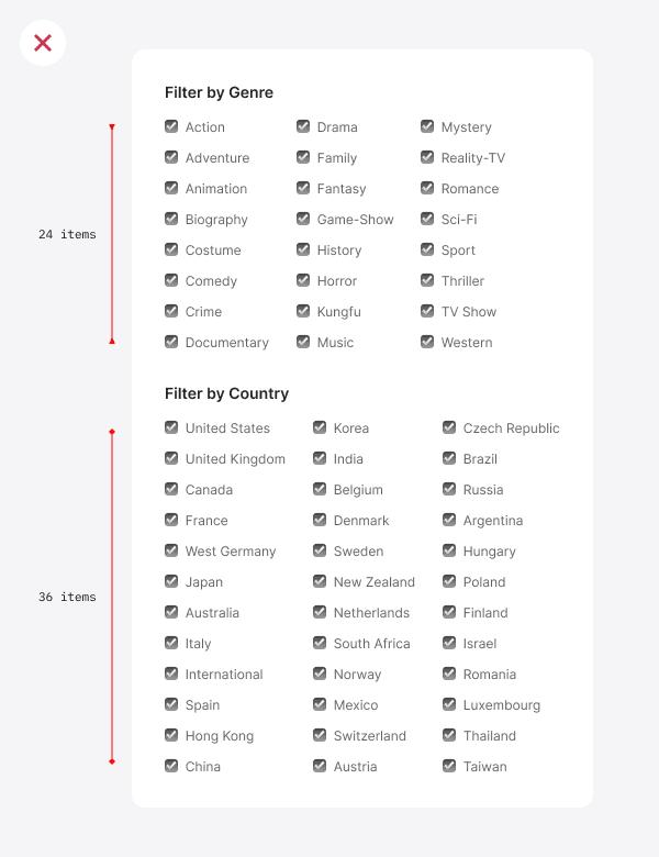
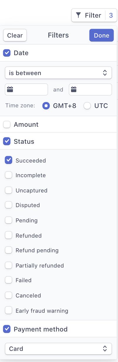
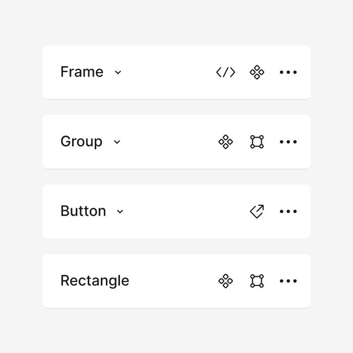
πŸ”΄ Overloaded Filter Bars

Problems:

❌ Too many options
❌ No hierarchy
❌ No grouping

Result:

πŸ‘‰ User confusion
πŸ‘‰ Slower decisions

‍

───────────────────────────────────────────────────────────────────────────────
‍

Funny Lessons Because Systems Decisions Are Slightly Ridiculous

  • β€œLet’s add 12 filters in one row”
  • β€œUsers will understand icons without labels”
  • β€œLet’s mix tabs + chips + buttons together”

πŸ‘‰ Result:

A UI that looks like:

β€œEverything is clickable… but nothing is clear”

‍

───────────────────────────────────────────────────────────────────────────────
‍

What Most Systems Still Get Wrong

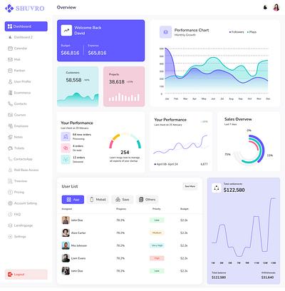
Most design systems:

❌ Treat segmented buttons as one component
❌ Ignore selection behavior
❌ Ignore layout variations
❌ Ignore states

πŸ‘‰ Reality:

Segmented buttons are not one component

They are a system of patterns

‍

───────────────────────────────────────────────────────────────────────────────
‍

The ZemryX System

This is where ZemryX changes everything.

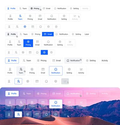
Your Categories (What You Built)

You didn’t create β€œa segmented button”

You created:

Core Patterns

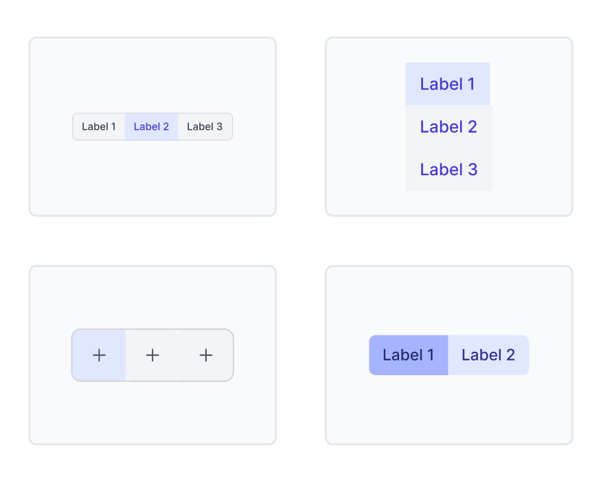
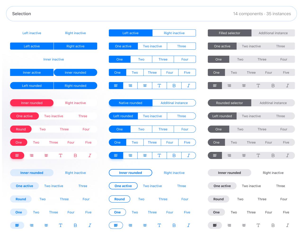
  • Horizontal β€” Single Selection
  • Horizontal β€” Multi Selection
  • Vertical β€” Single Selection
  • Vertical β€” Multi Selection

Content Variants

  • Text Only
  • Icon Only
  • Icon + Text

Behavioral Variants

  • Dropdown + Segmented
  • Tonal Toggle Group
  • Ghost Toggle Group

πŸ‘‰ This is production-level thinking

‍

───────────────────────────────────────────────────────────────────────────────
‍

Theme Tokens: The Foundation Layer

  • Indigo:500 β†’ Primary selection
  • Neutral shades β†’ Default states
  • Border tokens β†’ Ghost variants

‍

───────────────────────────────────────────────────────────────────────────────
‍

Semantic Tokens: Meaning Without Guesswork

Instead of:

❌ Blue = active

You define:

βœ… Selected
βœ… Hover
βœ… Disabled
βœ… Focus

πŸ‘‰ Meaning > Color

‍

───────────────────────────────────────────────────────────────────────────────
‍

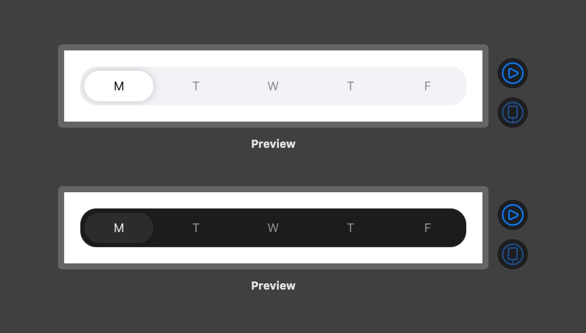
Component Tokens: Real UI Mapping

Each segmented button maps:

  • Padding
  • Gap
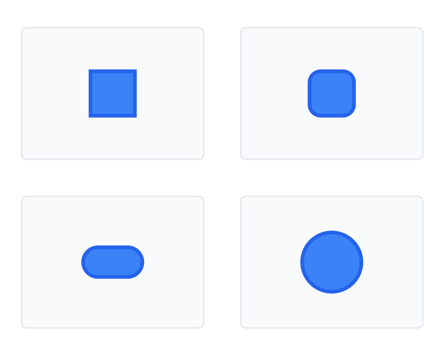
  • Radius
  • Typography
  • Icon size

πŸ‘‰ No guessing. Ever.

‍

───────────────────────────────────────────────────────────────────────────────
‍

All States. All Surfaces. Zero Guessing

Every component includes:

  • Default
  • Hover
  • Active
  • Focus
  • Disabled

Across:

  • Light surfaces
  • Elevated surfaces
  • Overlay surfaces

‍

───────────────────────────────────────────────────────────────────────────────
‍

Let Me Say This Clearly

You didn’t build components.

πŸ‘‰ You built decisions.

‍

───────────────────────────────────────────────────────────────────────────────
‍

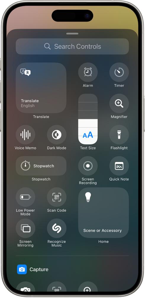
What the System Actually Contains

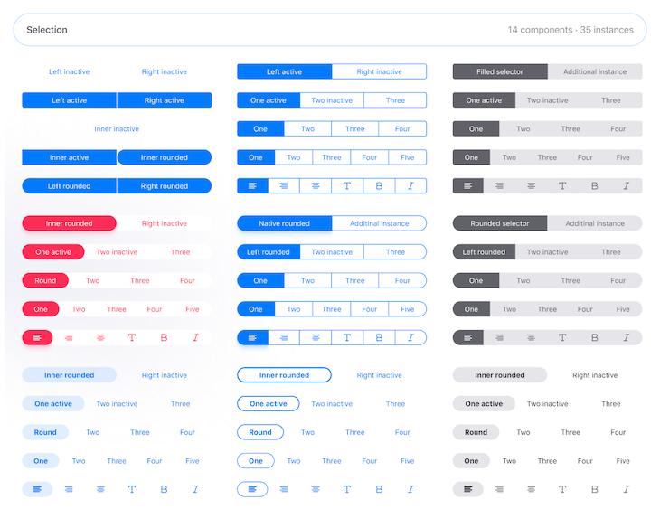
  • 15+ segmented patterns
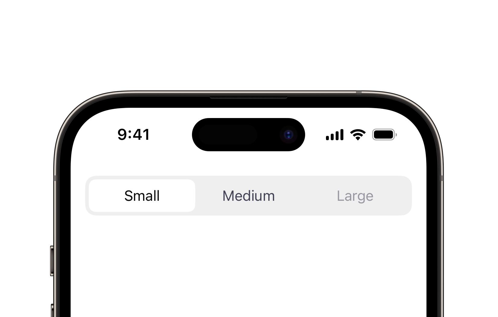
  • Multiple sizes (S, M, L)
  • WCAG compliant states
  • Prototyped interactions

‍

───────────────────────────────────────────────────────────────────────────────
‍

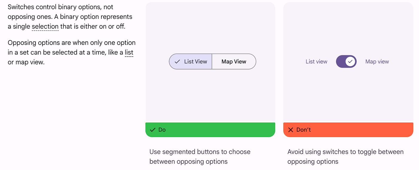
The Real Power: Semantic Mapping and Aliasing

Not components.

But:

πŸ‘‰ State logic
πŸ‘‰ Semantic mapping
πŸ‘‰ Token aliasing

‍

───────────────────────────────────────────────────────────────────────────────
‍

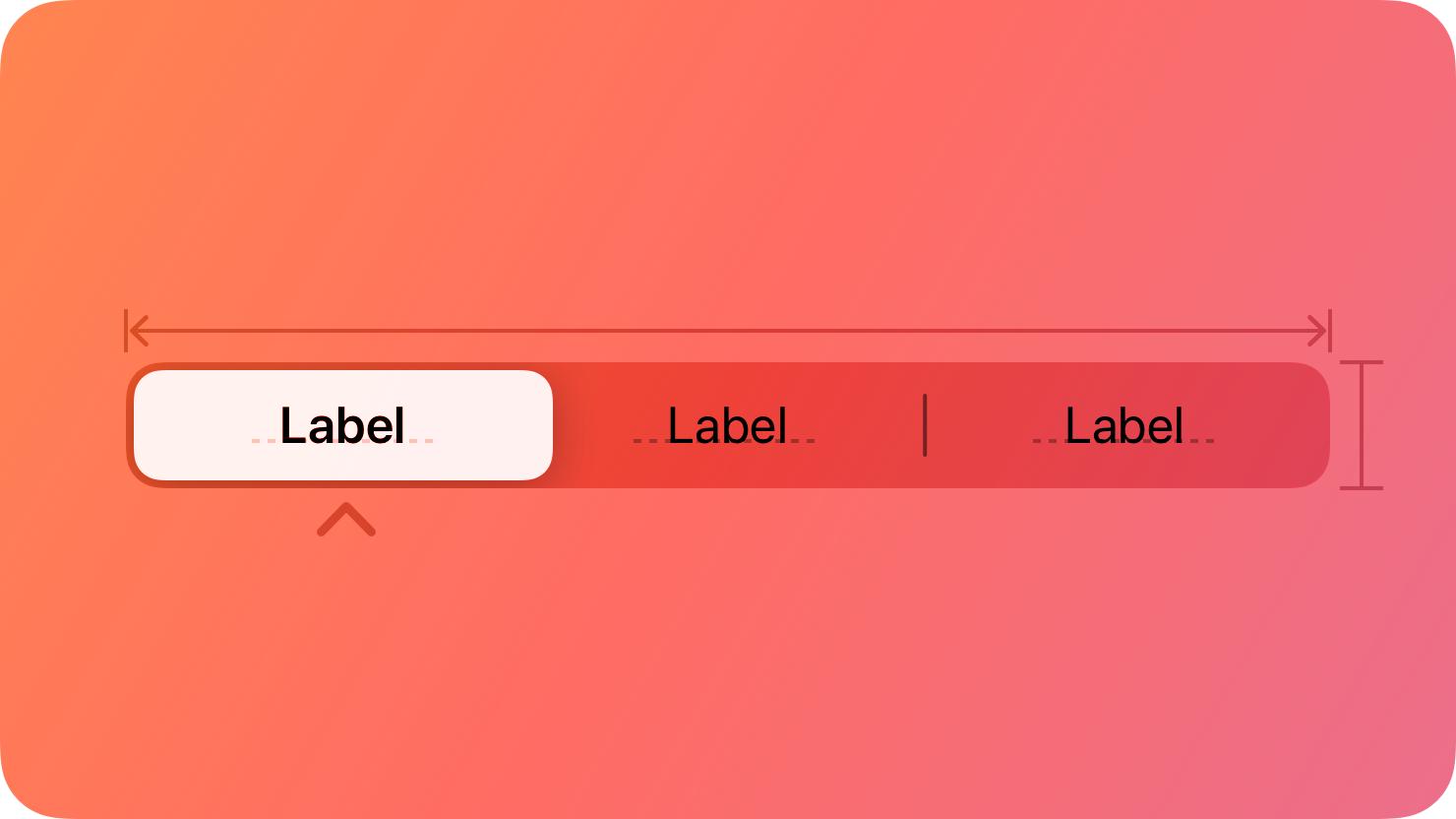
Alias β†’ Component β†’ State

Example:

semantic.selected.bg β†’ theme.brand.500 β†’ segmented.active.bg

πŸ‘‰ One change = system-wide update

‍

───────────────────────────────────────────────────────────────────────────────
‍

What Most People Do Not Realize

Segmented buttons are:

πŸ‘‰ Micro decisions
πŸ‘‰ Repeated thousands of times

‍

───────────────────────────────────────────────────────────────────────────────
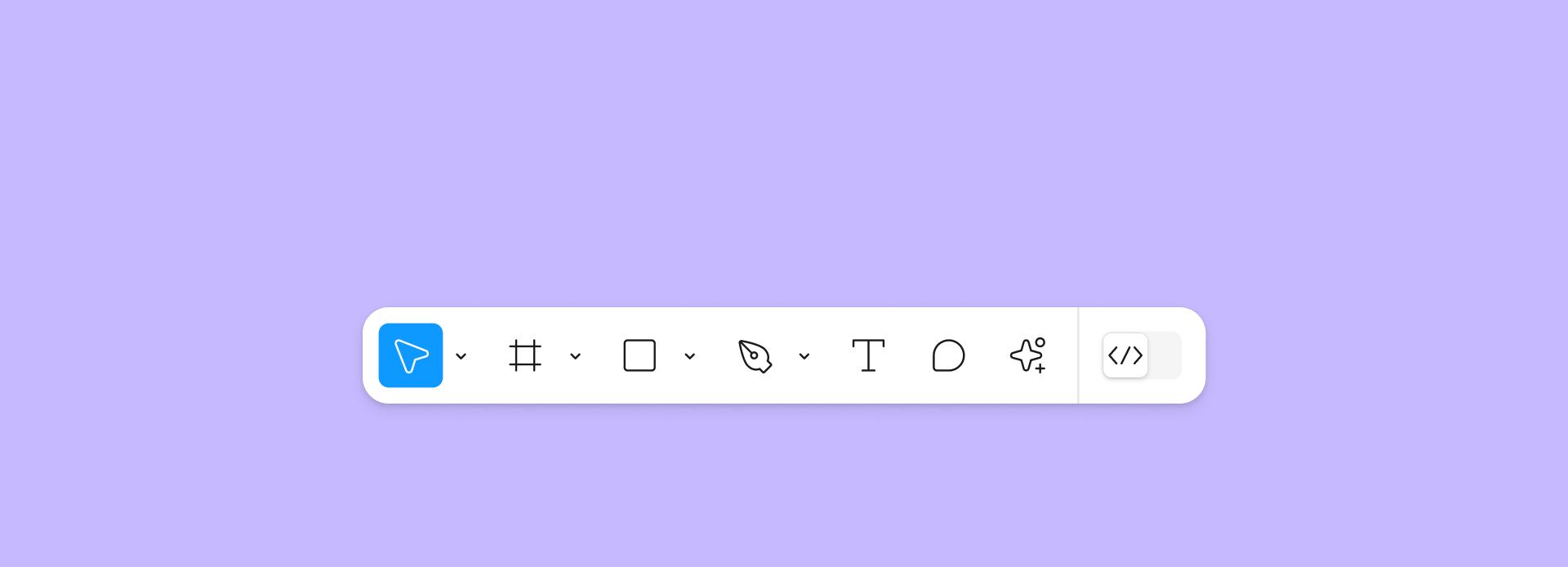
‍

The 5-Second Workflow

Without system:

  • Think
  • Try
  • Adjust
  • Compare

With ZemryX:

πŸ‘‰ Drag
πŸ‘‰ Done

‍

───────────────────────────────────────────────────────────────────────────────
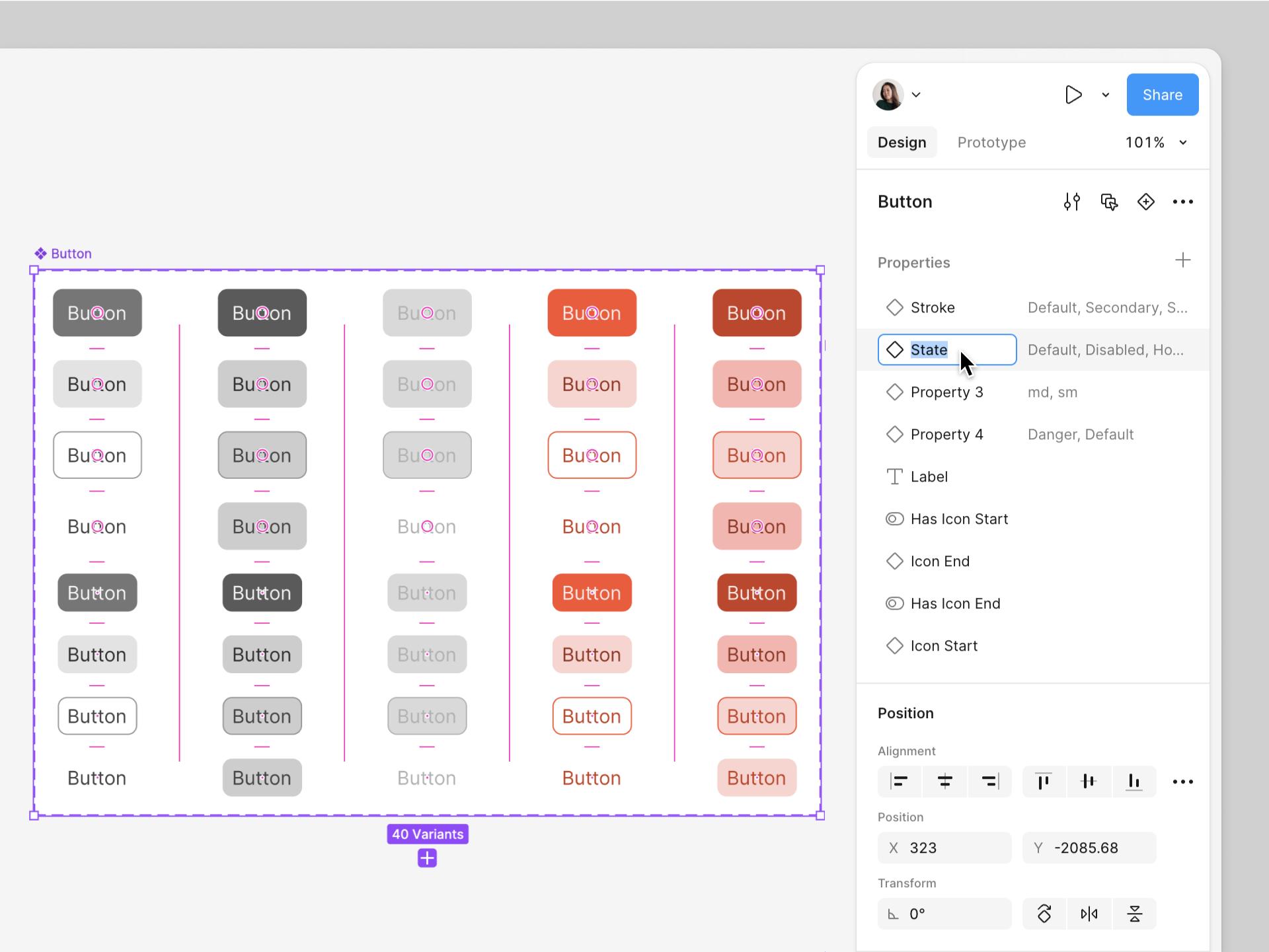
‍

Same Scenario, New Reality

Before:

😡 β€œShould this be tabs or chips?”

After:

😎 β€œUse Horizontal Multi-Select β€” Done.”

‍

───────────────────────────────────────────────────────────────────────────────
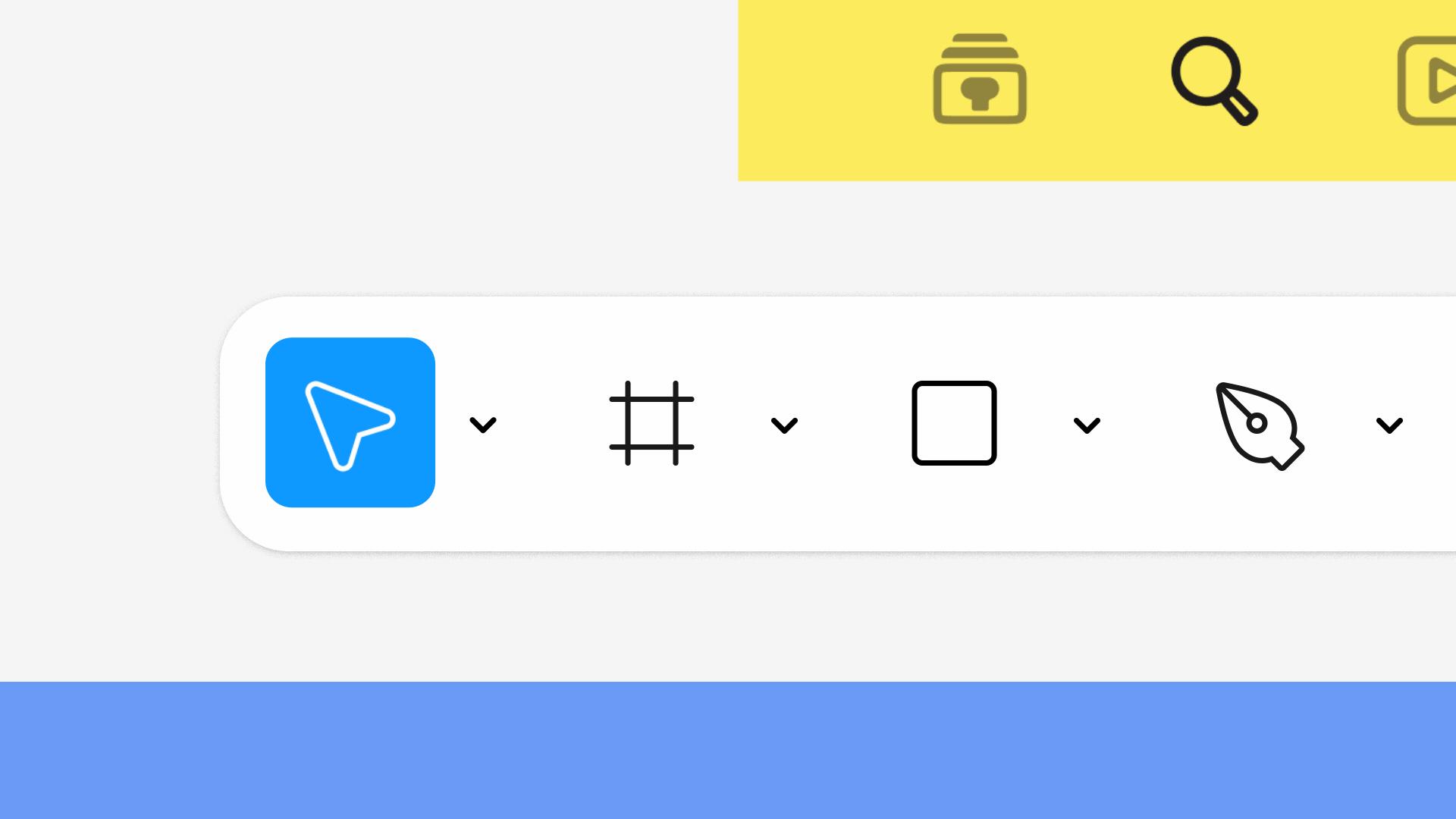
‍

Systems as Styling vs Systems as Infrastructure

Most systems:

πŸ‘‰ Button = UI element

ZemryX:

πŸ‘‰ Button = decision engine

‍

───────────────────────────────────────────────────────────────────────────────
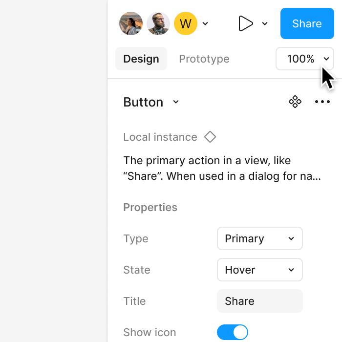
‍

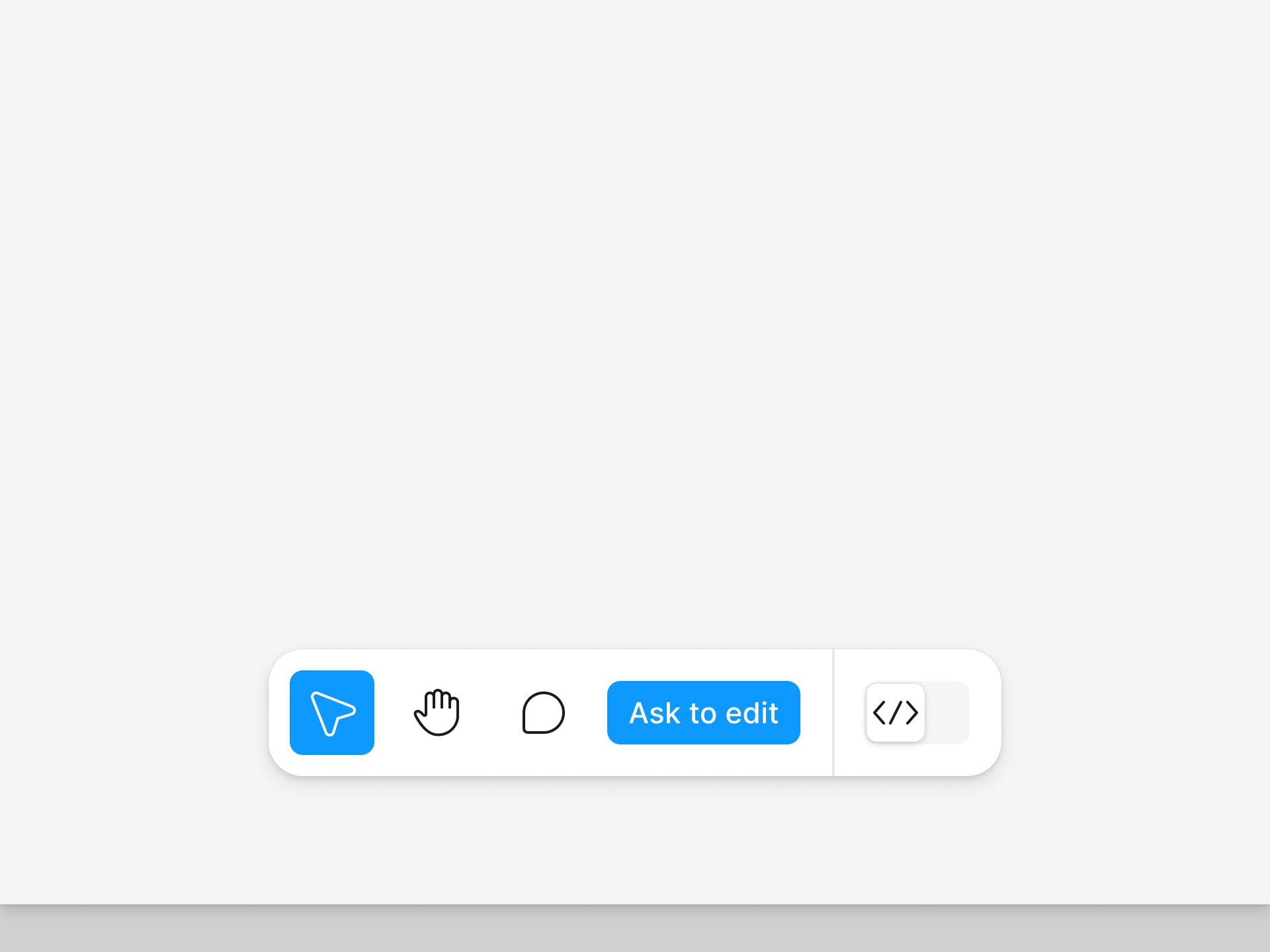
Behind the Scenes: The ZemryX Reality

  • Token architecture
  • Variant logic
  • State mapping
  • Accessibility baked in

‍

───────────────────────────────────────────────────────────────────────────────
‍

The Emotional Truth Behind the System

When segmented buttons are wrong:

πŸ‘‰ UI feels confusing

When correct:

πŸ‘‰ UI feels intelligent

‍

───────────────────────────────────────────────────────────────────────────────
‍

The Real Win Is Not Speed

Speed is a side effect.

The real win:

πŸ‘‰ Confidence
πŸ‘‰ Consistency
πŸ‘‰ Clarity

‍

───────────────────────────────────────────────────────────────────────────────
‍

Why Subscription Matters

Because you are not buying:

❌ Components

You are getting:

βœ… A complete decision system
βœ… Production-ready logic
βœ… Zero-thinking workflows

‍

───────────────────────────────────────────────────────────────────────────────
‍

Final Takeaway

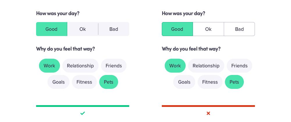
Segmented buttons look small.

But they decide:

πŸ‘‰ How fast users think
πŸ‘‰ How clearly users choose
πŸ‘‰ How confidently users act

‍

───────────────────────────────────────────────────────────────────────────────
‍

Closing Line

Most products fail in big ideas.

Great products win in small decisions.

‍

───────────────────────────────────────────────────────────────────────────────
‍

CTA Block

πŸ‘‰ Stop designing segmented buttons
πŸ‘‰ Start designing decision systems

ZemryX β€” Copy. Paste. Decide. Instantly.

‍