Spaces

The Design Decision You Repeat Hundreds of Times… Without Realizing It

Sandeep Akkipalli
May 2, 2026
In this articles
<a class="toc-link1" href="#intro">1. Intro</a> <a class="toc-link1" href="#a-small-story-every-designer-has-lived">2. A Small Story Every Designer Has Lived</a> <a class="toc-link1" href="#the-hidden-revenue-reality">3. The Hidden Revenue Reality</a> <a class="toc-link1" href="#the-real-problem-is-not-time">4. The Real Problem Is Not Time</a> <a class="toc-link1" href="#the-origin-of-interfaces">5. The Origin of Interfaces</a> <a class="toc-link1" href="#how-interfaces-evolved-and-why-interfaces-had-to-evolve-too">6. How Interfaces Evolved, And Why Interfaces Had to Evolve Too</a> <a class="toc-link1" href="#what-modern-systems-must-actually-do">7. What Modern Systems Must Actually Do</a> <a class="toc-link1" href="#success-stories-when-systems-quietly-improved-product-outcomes">8. Success Stories: When Systems Quietly Improved Product Outcomes</a> <a class="toc-link1" href="#failure-stories-when-systems-quietly-hurt-the-experience">9. Failure Stories: When Systems Quietly Hurt the Experience</a> <a class="toc-link1" href="#funny-lessons-because-systems-decisions-are-slightly-ridiculous">10. Funny Lessons Because Systems Decisions Are Slightly Ridiculous</a> <a class="toc-link1" href="#what-most-systems-still-get-wrong">11. What Most Systems Still Get Wrong</a> <a class="toc-link1" href="#the-zemryx-system">12. The ZemryX System</a> <a class="toc-link1" href="#theme-tokens-the-foundation-layer">13. Theme Tokens: The Foundation Layer</a> <a class="toc-link1" href="#core-typography-the-foundation-layer">14. Core Typography: The Foundation Layer</a> <a class="toc-link1" href="#component-tokens-real-ui-mapping">15. Component Tokens: Real UI Mapping</a> <a class="toc-link1" href="#all-states-all-surfaces-zero-guessing">16. All States. All Surfaces. Zero Guessing</a> <a class="toc-link1" href="#let-me-say-this-clearly">17. Let Me Say This Clearly</a> <a class="toc-link1" href="#what-the-system-actually-contains">18. What the System Actually Contains</a> <a class="toc-link1" href="#the-real-power-semantic-mapping-and-aliasing">19. The Real Power: Semantic Mapping and Aliasing</a> <a class="toc-link1" href="#alias-component-use-case">20. Alias → Component → Use Case</a> <a class="toc-link1" href="#what-most-people-do-not-realize">21. What Most People Do Not Realize</a> <a class="toc-link1" href="#the-5-second-workflow">22. The 5-Second Workflow</a> <a class="toc-link1" href="#same-scenario-new-reality">23. Same Scenario, New Reality</a> <a class="toc-link1" href="#systems-as-styling-vs-systems-as-infrastructure">24. Systems as Styling vs Systems as Infrastructure</a> <a class="toc-link1" href="#behind-the-scenes-the-zemryx-reality">25. Behind the Scenes: The ZemryX Reality</a> <a class="toc-link1" href="#the-emotional-truth-behind-the-system">26. The Emotional Truth Behind the System</a> <a class="toc-link1" href="#the-real-win-is-not-speed">27. The Real Win Is Not Speed</a> <a class="toc-link1" href="#why-subscription-matters">28. Why Subscription Matters</a> <a class="toc-link1" href="#final-takeaway">29. Final Takeaway</a> <a class="toc-link1" href="#closing-line">30. Closing Line</a> <a class="toc-link1" href="#cta-block">31. CTA Block</a>

Intro

Let’s talk honestly.

Not like a spacing scale document.
Not like a token sheet.
Not like someone saying:

“8, 12, 16, 24… done.”

Just you and me.

───────────────────────────────────────────────────────────────────────────────

A Small Story Every Designer Has Lived

You’re designing a section.

You add:

  • a heading
  • some body text
  • a button

Then you pause.

And think:

  • “Should this gap be 16?”
  • “Or 20?”
  • “Maybe 24 feels cleaner…”
  • “Why does this card feel cramped?”
  • “Why does this section feel too loose?”

So you adjust.
Then adjust again.
Then compare with another screen.

And finally:

“Okay… this looks fine.”

😄

That’s the problem.

Not because the spacing is wrong.

But because you had to guess it in the first place.

───────────────────────────────────────────────────────────────────────────────

The Hidden Revenue Reality

Users don’t say:

  • “Spacing is inconsistent.”

They say:

  • “This looks messy.”
  • “This feels crowded.”
  • “Why is this so empty?”
  • “Something feels off.”

That “something”?

👉 Spacing.

Spacing directly impacts:

  • conversion
  • readability
  • trust
  • perceived quality

Bad spacing doesn’t break UI.

It slowly reduces confidence.

───────────────────────────────────────────────────────────────────────────────

The Real Problem Is Not Time

Most teams think:

“We just need more time to polish spacing.”

No.

Even with time, you still guess.

Because the real problem is:

👉 No system to decide spacing.

───────────────────────────────────────────────────────────────────────────────

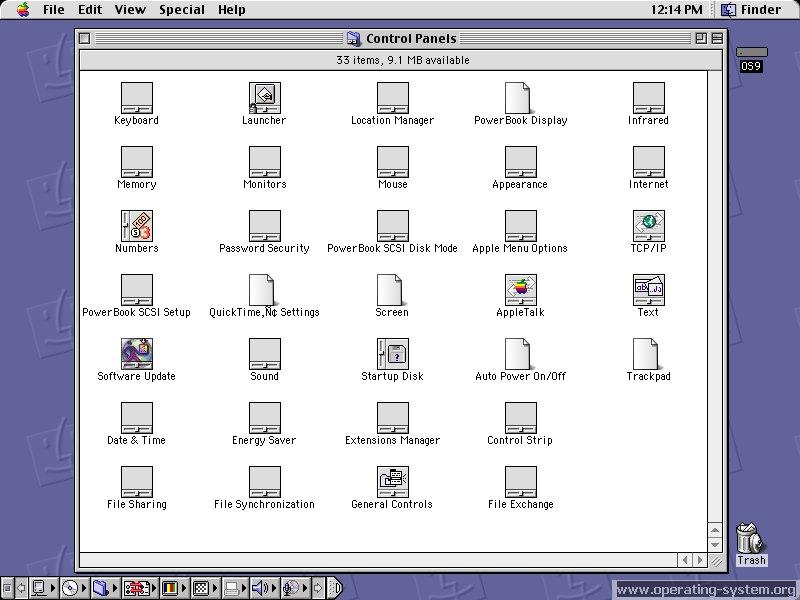
The Origin of Interfaces

Before design systems…

Interfaces were handcrafted.
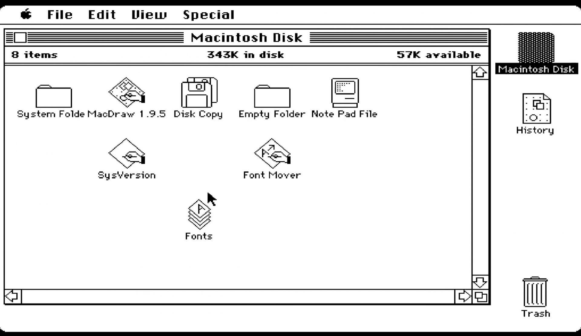
Example: Early Apple Interfaces

  • Fixed layouts
  • Minimal spacing logic
  • Pixel-based decisions

Designers didn’t have:

  • responsive layouts
  • scalable systems
  • reusable components

Spacing was:

👉 manual
👉 rigid
👉 inconsistent

───────────────────────────────────────────────────────────────────────────────

How Interfaces Evolved, And Why Interfaces Had to Evolve Too

As products scaled…

So did complexity.
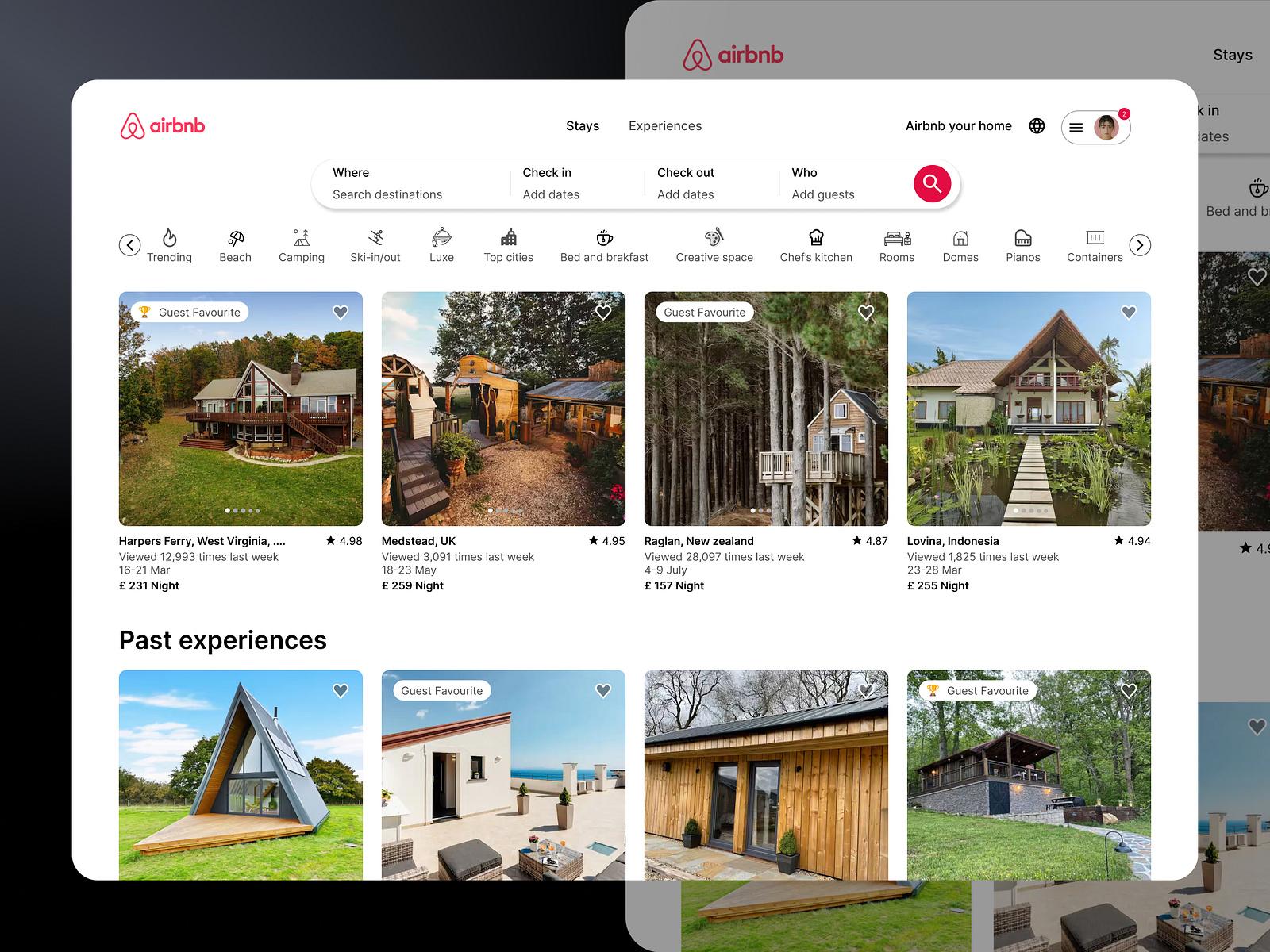
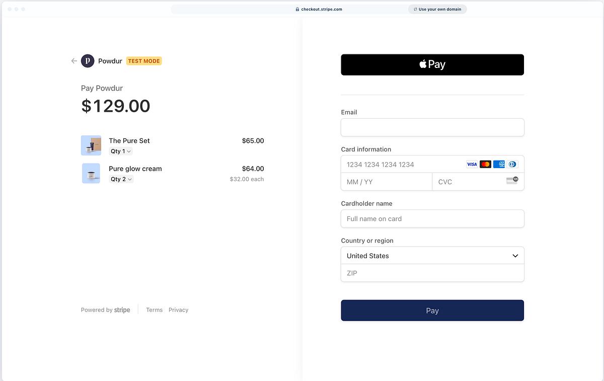
Example: Modern Product Interfaces

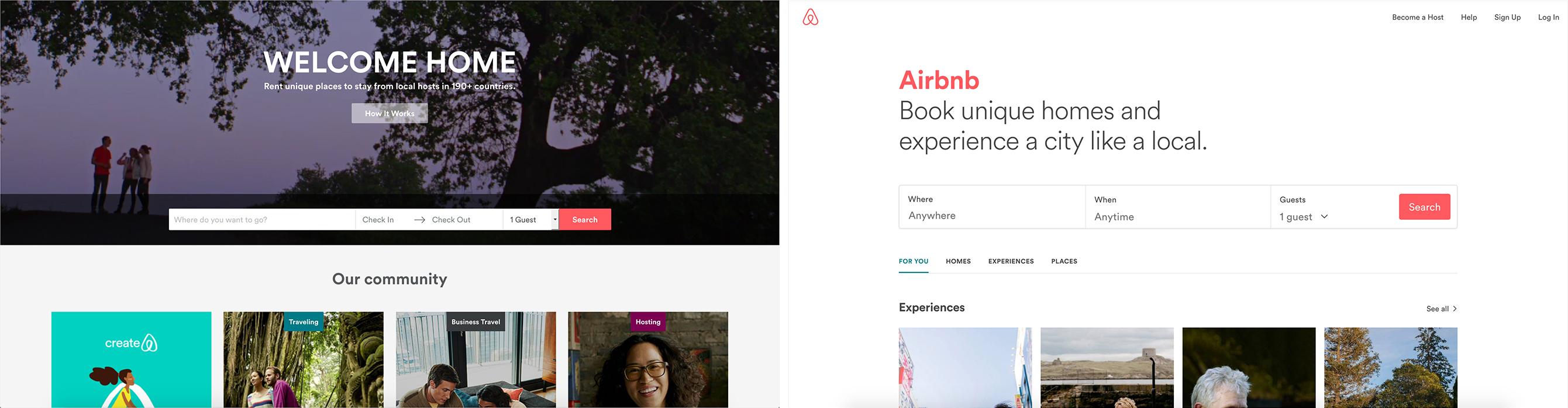
Platforms like:

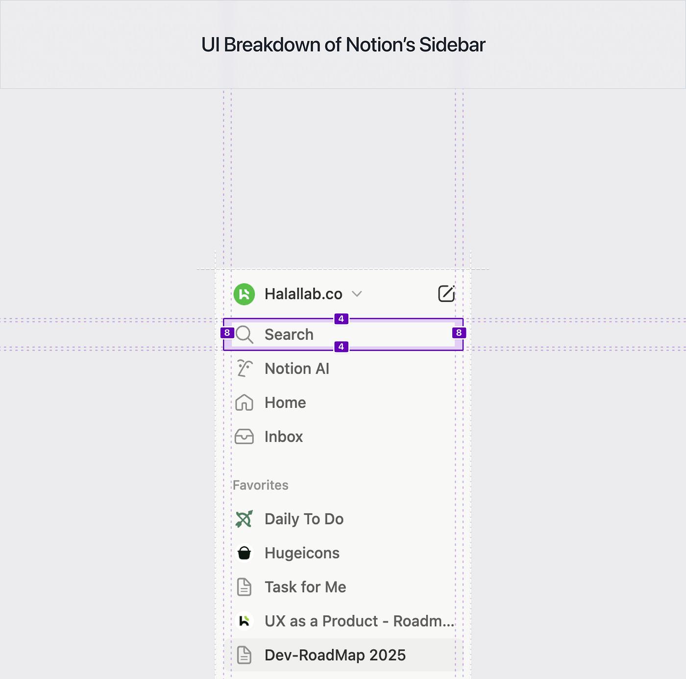
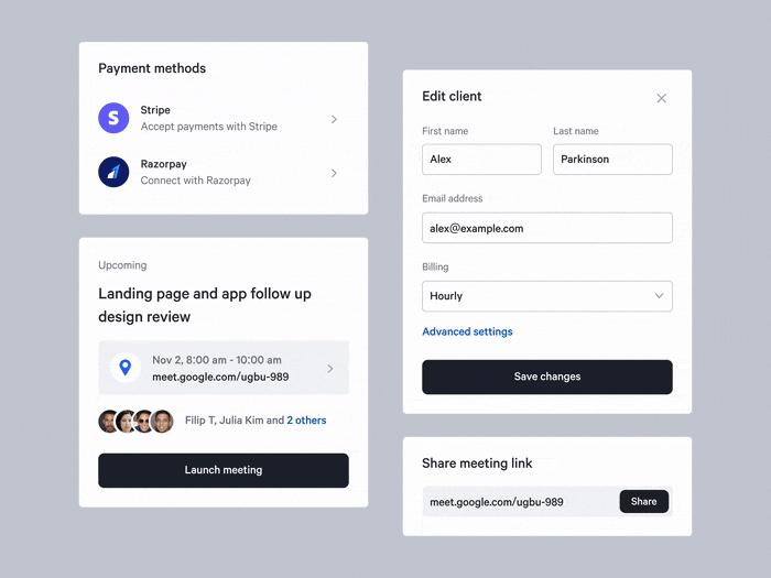
  • Airbnb
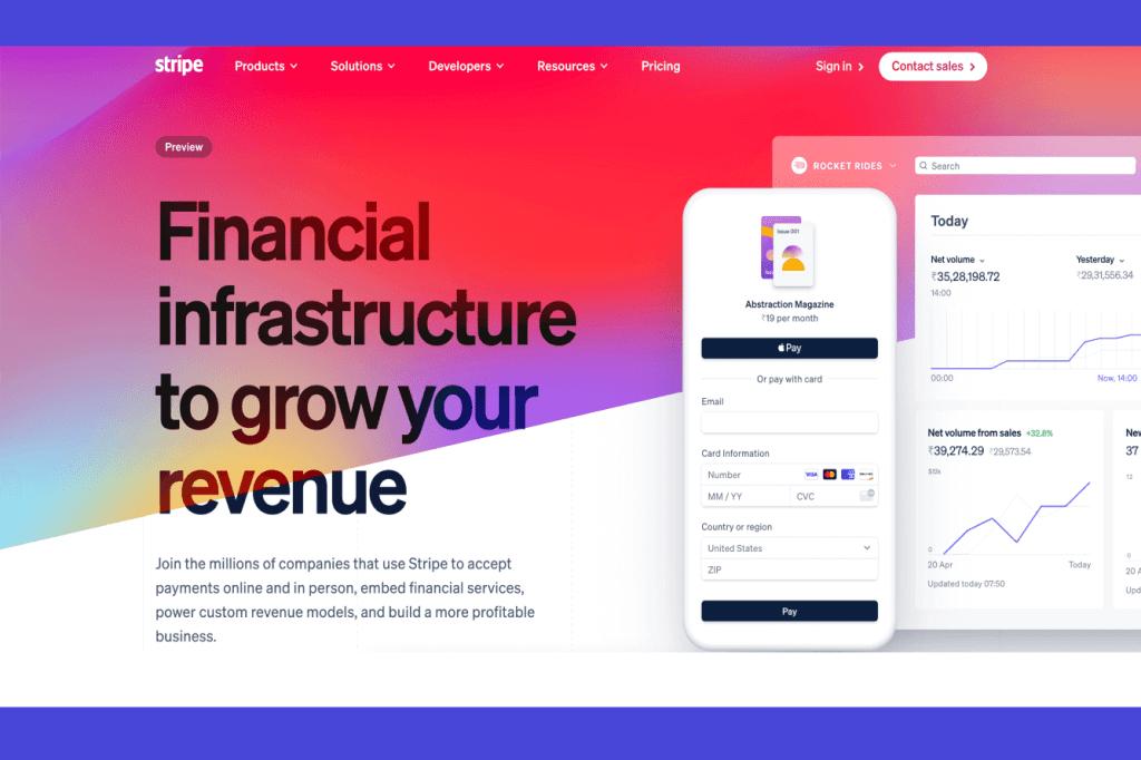
  • Stripe
  • Notion

Require:

  • scalable layouts
  • consistent rhythm
  • predictable spacing

Because:

👉 spacing now defines usability at scale

───────────────────────────────────────────────────────────────────────────────

What Modern Systems Must Actually Do

A modern spacing system must:

  • adapt across screen sizes
  • define rhythm across layouts
  • map spacing to context
  • eliminate guesswork

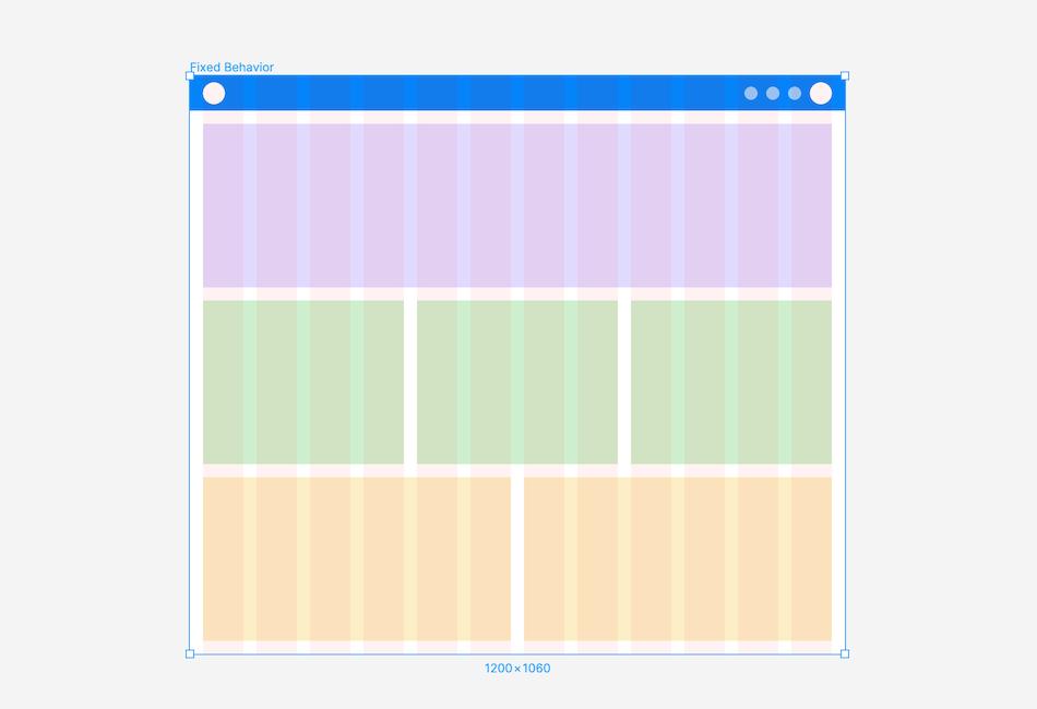
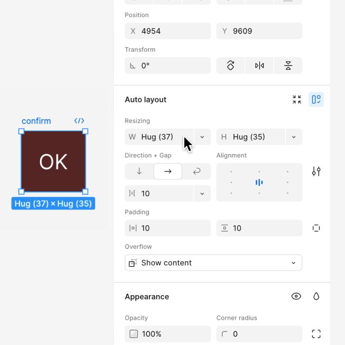
Example: Figma Auto Layout

Tools like Figma introduced:

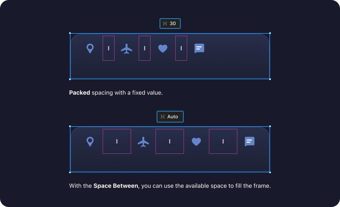
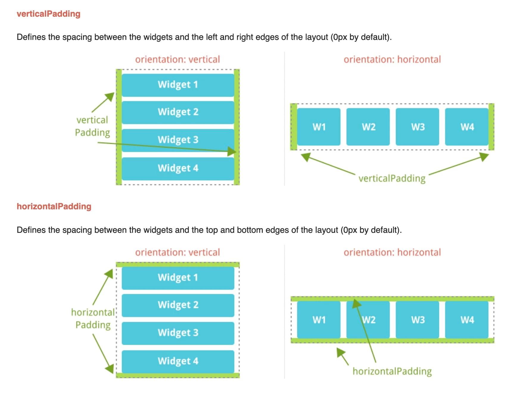
  • gap
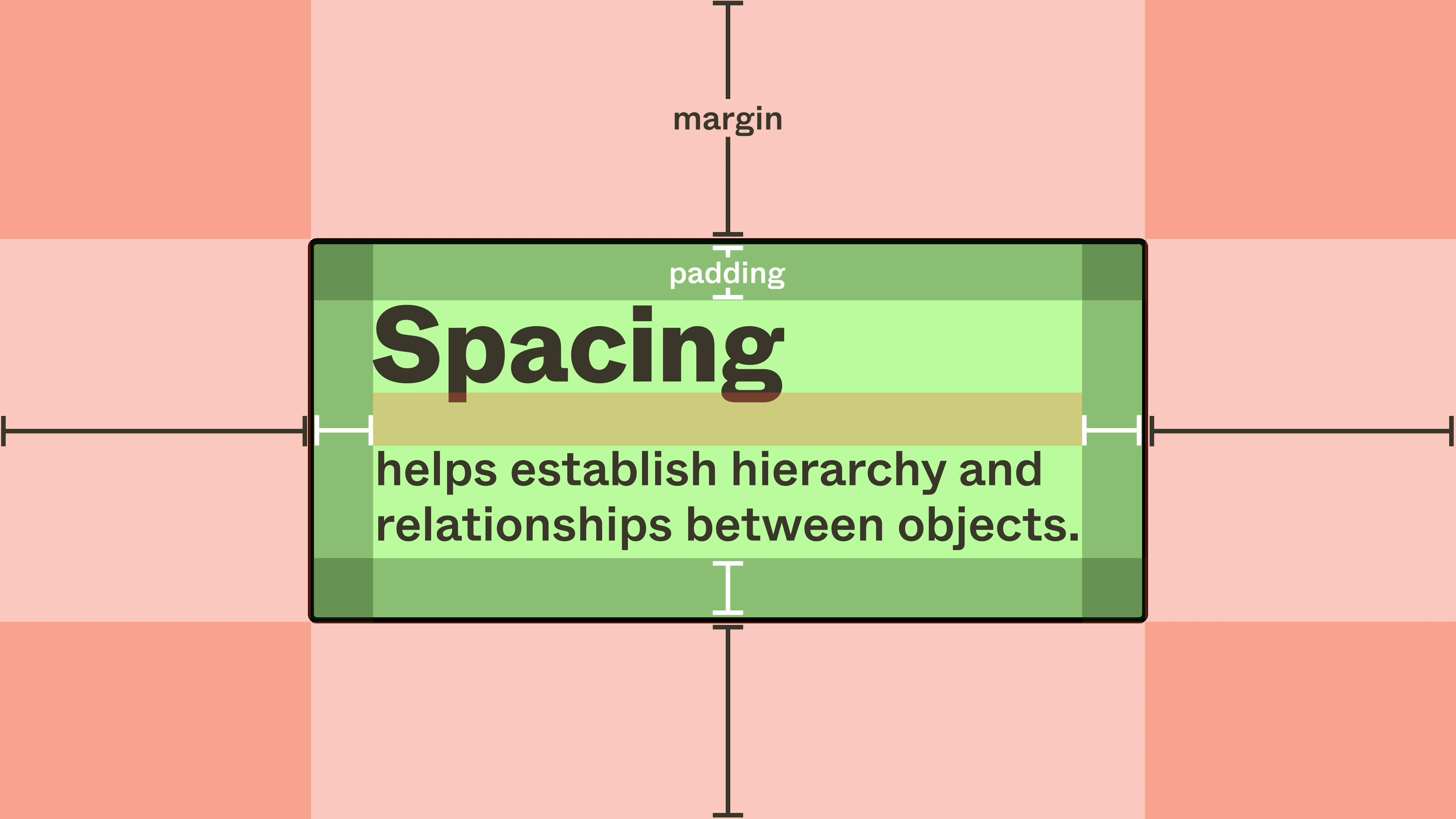
  • padding
  • constraints

But still:

👉 designers must decide values

That’s where systems like ZemryX step in.

───────────────────────────────────────────────────────────────────────────────
Success Stories: When Systems Quietly Improved Product Outcomes

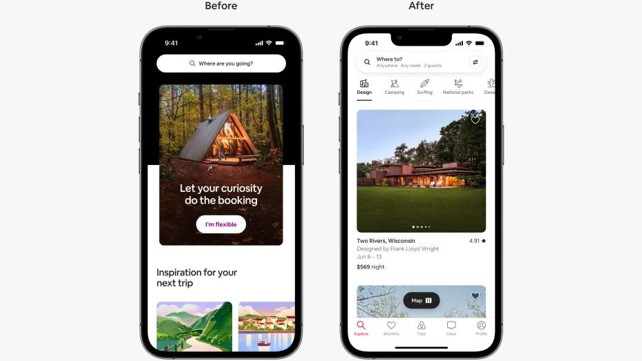
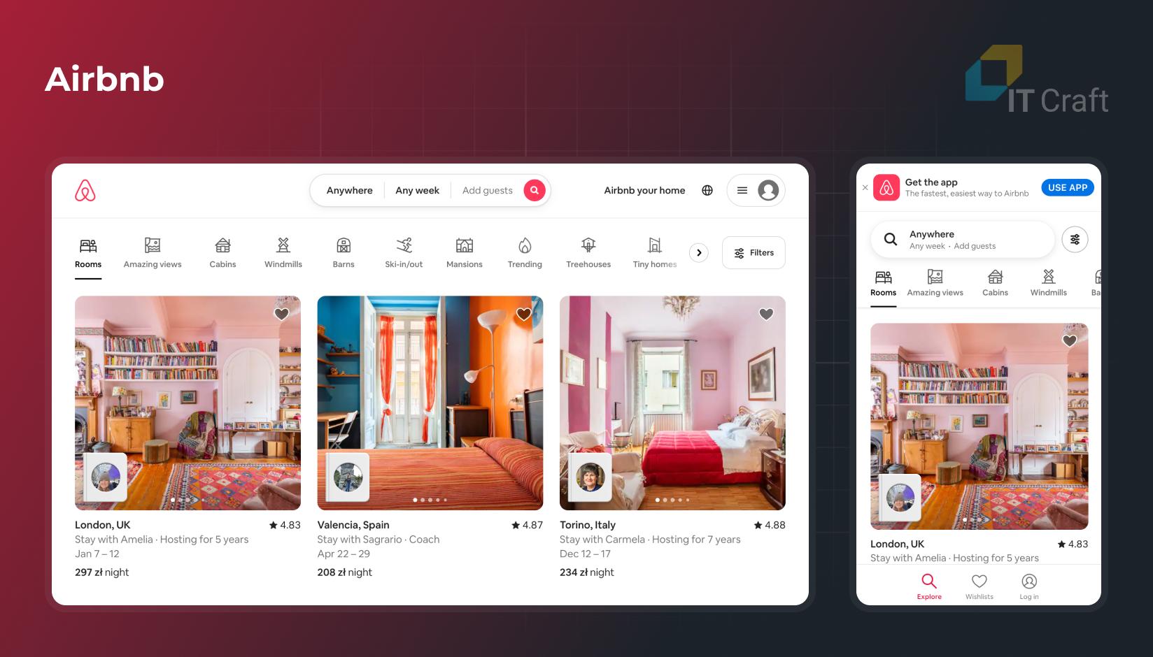
Example: Airbnb

Airbnb improved:

  • readability
  • booking clarity
  • visual hierarchy

By:

👉 increasing spacing consistency

Result:

✔ better scanning
✔ better conversion

Example: Stripe

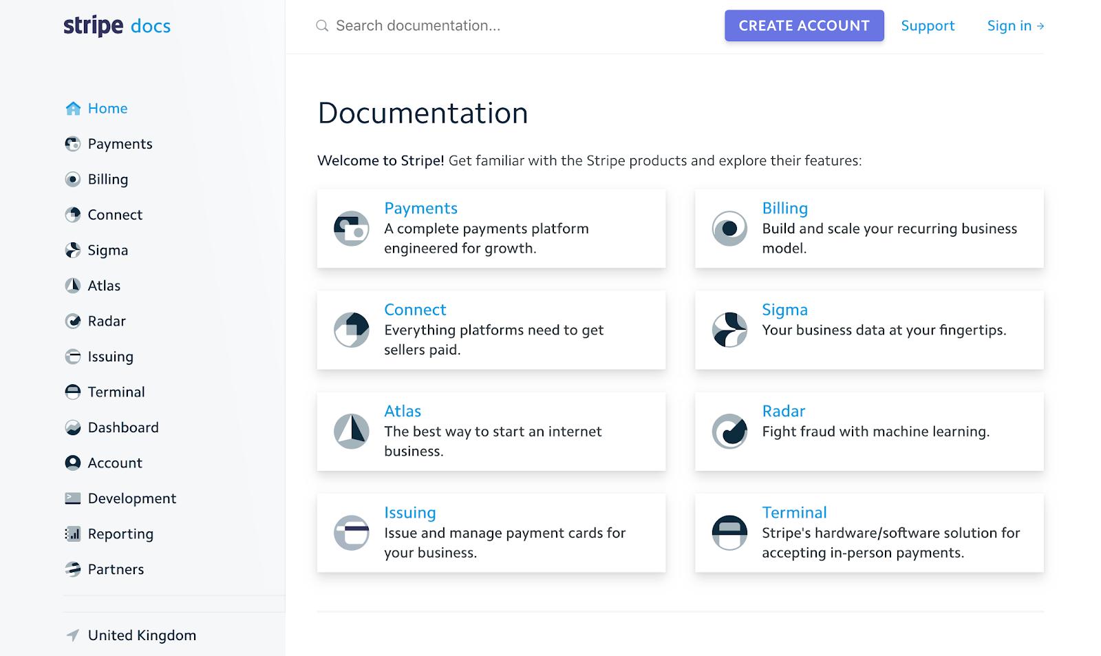
Stripe uses:

  • consistent stack spacing
  • predictable card padding

Result:

✔ developer trust
✔ clarity in complex data

───────────────────────────────────────────────────────────────────────────────
Failure Stories: When Systems Quietly Hurt the Experience

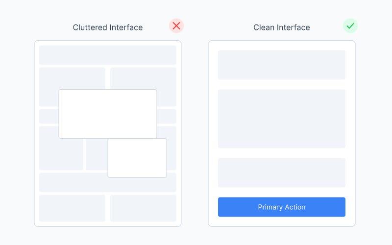
Example: Early cluttered dashboards

Problems:

  • inconsistent gaps
  • tight components
  • no hierarchy

Result:

❌ cognitive overload
❌ low usability

───────────────────────────────────────────────────────────────────────────────
Funny Lessons Because Systems Decisions Are Slightly Ridiculous

Let’s be honest 😄

You’ve done this:

  • copied spacing from another screen
  • nudged it by 2px
  • didn’t know why
  • called it “optical adjustment”

Sometimes it’s real.

Sometimes it’s:

👉 spacing panic wearing a design hat

───────────────────────────────────────────────────────────────────────────────
What Most Systems Still Get Wrong

Most systems give:

❌ spacing values
❌ spacing scales

They don’t give:

👉 context
👉 meaning
👉 usage clarity

So designers still guess.

───────────────────────────────────────────────────────────────────────────────
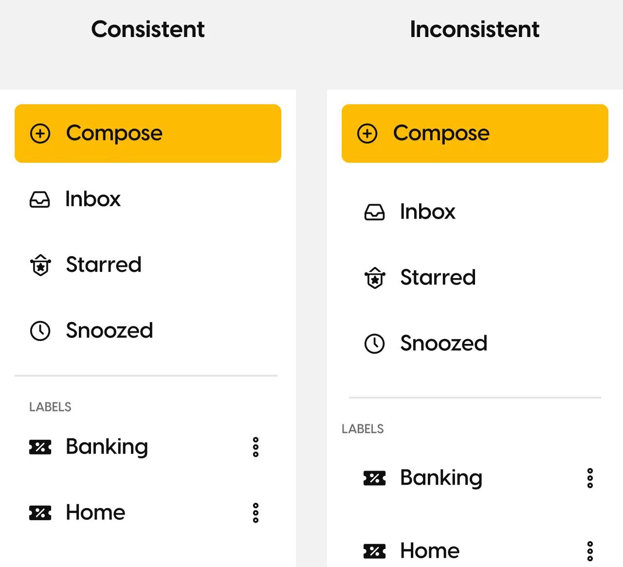
The ZemryX System

ZemryX changes the approach.

Not:

❌ “Here’s 8, 16, 24… good luck.”

But:

✅ “Here’s the right spacing for the right situation.”

───────────────────────────────────────────────────────────────────────────────
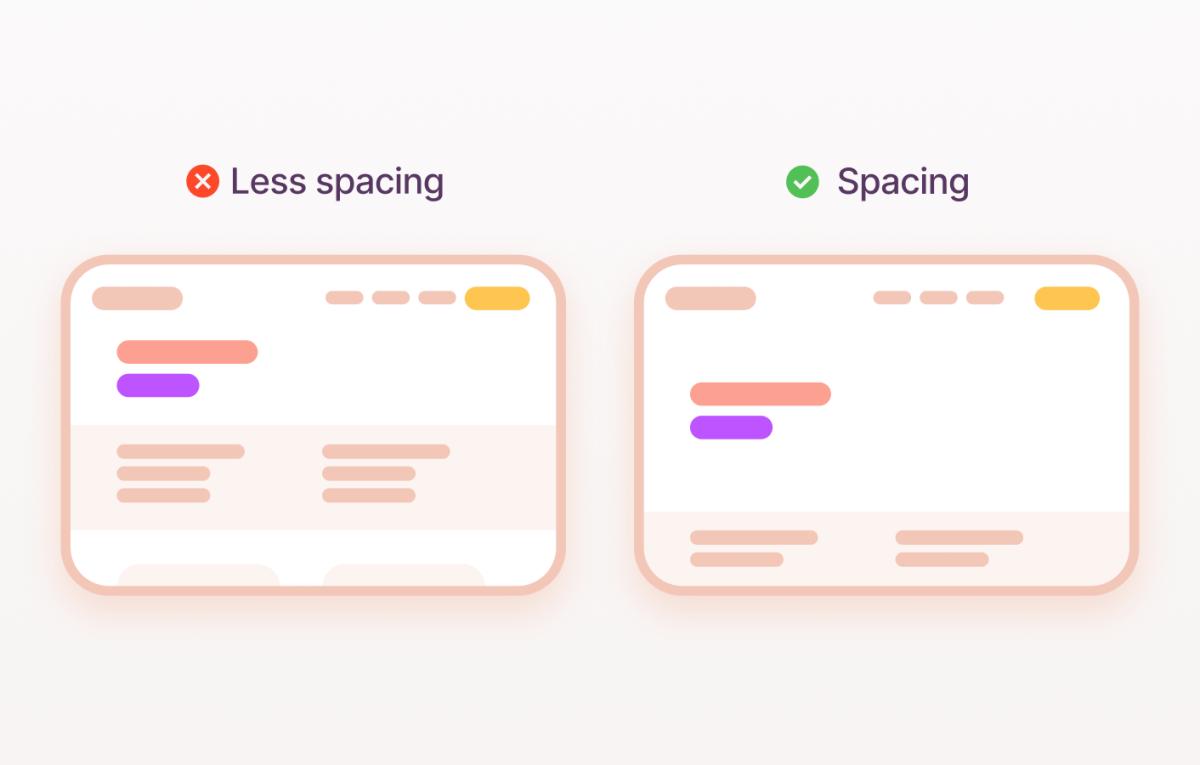
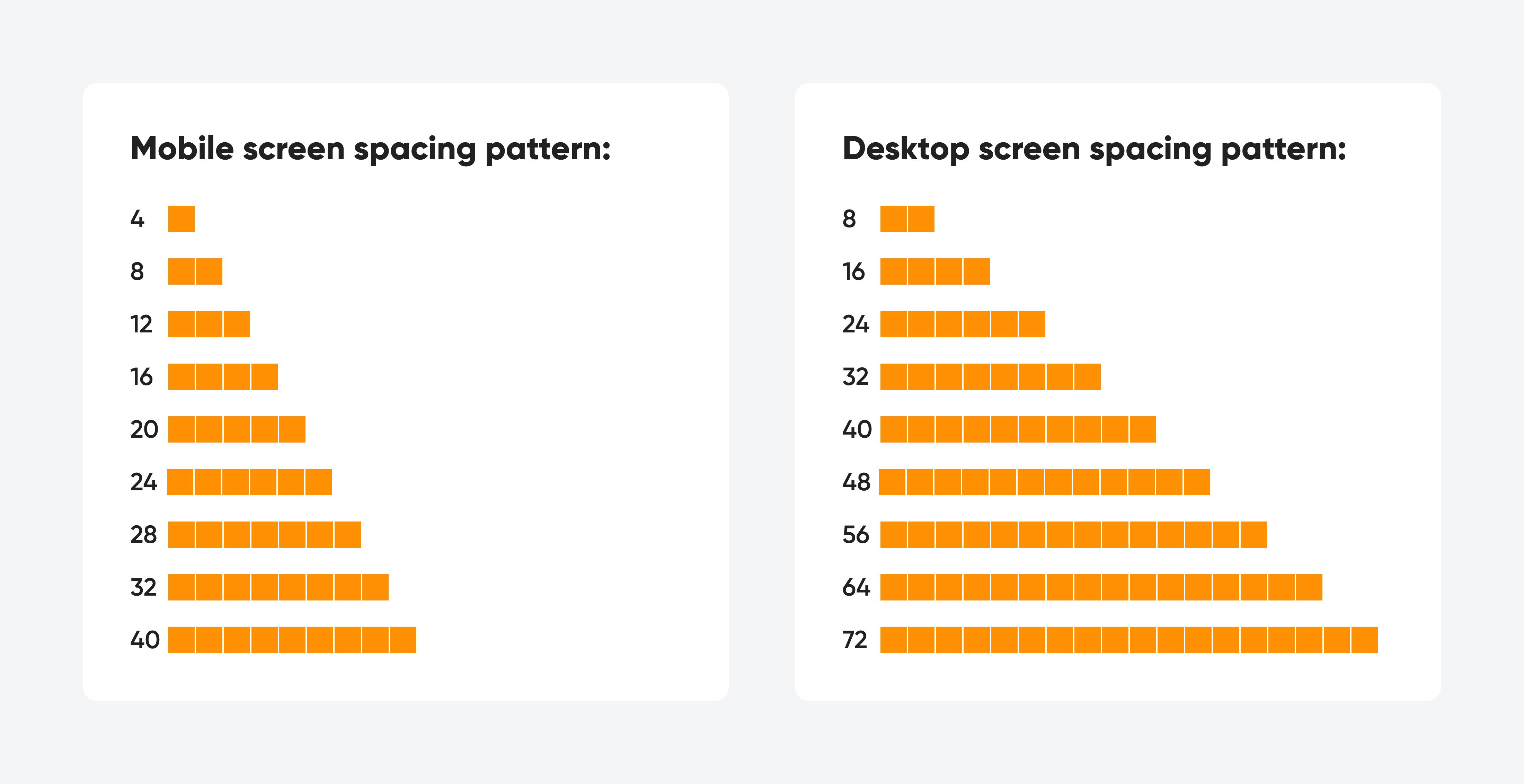
Theme Tokens: The Foundation Layer

Your system defines:

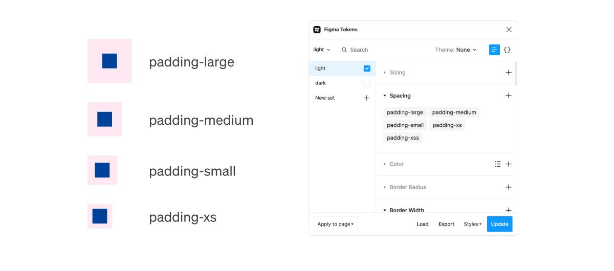
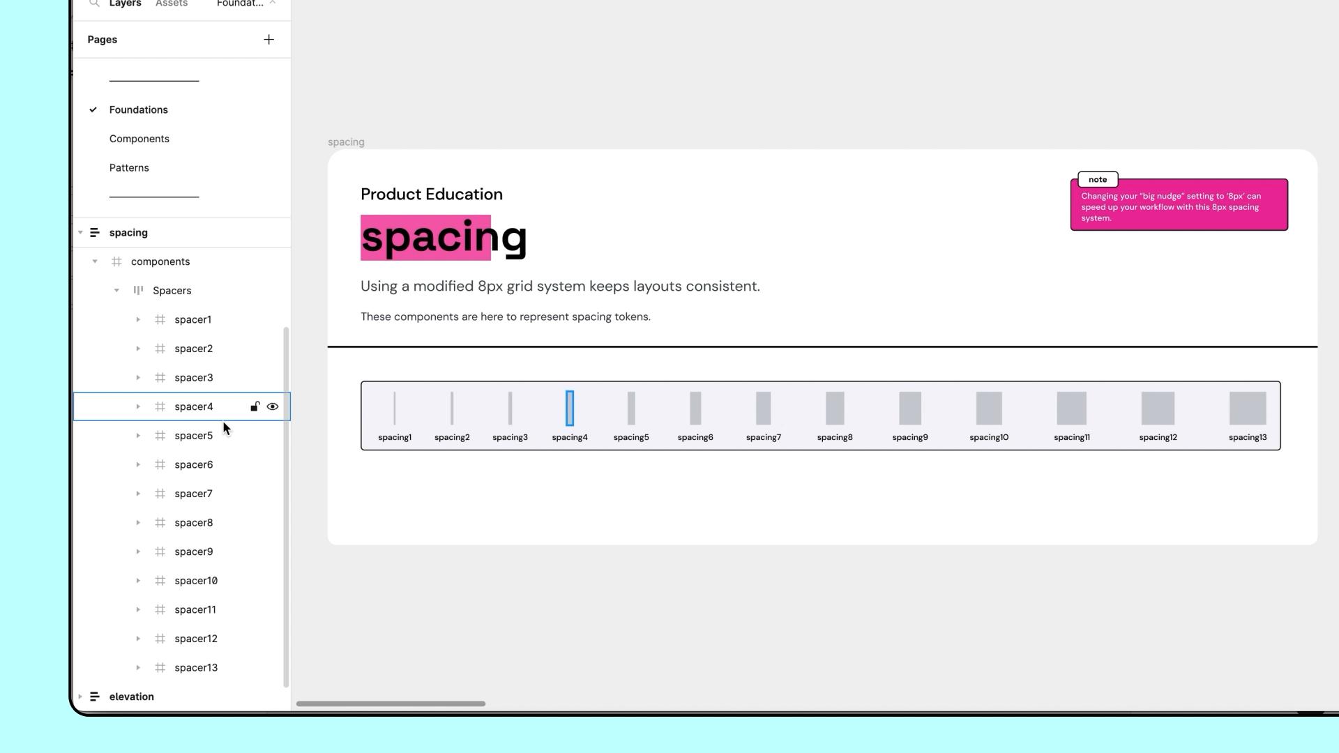
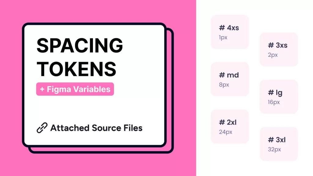
  • Spaces-None
  • Spaces-Micro
  • Spaces-XS → Spaces-20XL

With:

👉 structured scale
👉 consistent increments

───────────────────────────────────────────────────────────────────────────────
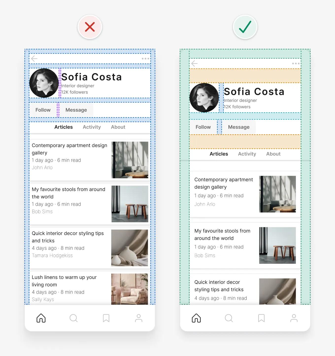
Semantic Tokens: Meaning Without Guesswork

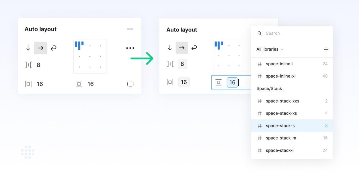
Instead of numbers, you define:

  • Inline Spacing
  • Component Spacing
  • Stack Spacing
  • Layout Spacing
  • Section Spacing

Now spacing has:

👉 purpose

───────────────────────────────────────────────────────────────────────────────

Component Tokens: Real UI Mapping

Spacing is mapped to:

  • buttons
  • inputs
  • cards
  • layouts

So designers don’t ask:

“What value?”

They ask:

“What type of space?”

───────────────────────────────────────────────────────────────────────────────

All States. All Surfaces. Zero Guessing

Spacing works across:

  • states
  • layouts
  • surfaces

No overrides.
No hacks.

───────────────────────────────────────────────────────────────────────────────

Let Me Say This Clearly

You are not bad at spacing.

You were just never given:

👉 a real spacing system

───────────────────────────────────────────────────────────────────────────────

What the System Actually Contains

ZemryX Spaces includes:

  • 20+ scale levels
  • multiple spacing types
  • responsive mapping
  • component integration

───────────────────────────────────────────────────────────────────────────────

The Real Power: Semantic Mapping and Aliasing

This is where it becomes powerful:

👉 spacing is not raw values
👉 it’s mapped logic

───────────────────────────────────────────────────────────────────────────────

Alias → Component → State

Example:

  • Token → Spaces-MD
  • Alias → Stack-Medium
  • Component → Card List
  • State → Default

Everything connects.

───────────────────────────────────────────────────────────────────────────────

What Most People Do Not Realize

Spacing is:

👉 the most repeated decision in UI

Fix spacing →
You fix rhythm →
You fix perception →
You fix quality

───────────────────────────────────────────────────────────────────────────────

The 5-Second Workflow

With ZemryX:

  • Copy component
  • Paste in Figma
  • Spacing already applied

Done.

───────────────────────────────────────────────────────────────────────────────

Same Scenario, New Reality

Before:

  • guess spacing
  • tweak endlessly
  • inconsistent UI

After:

  • pick space type
  • system applies value
  • consistent UI

───────────────────────────────────────────────────────────────────────────────

Systems as Styling vs Systems as Infrastructure

Most teams treat spacing as:

👉 styling

ZemryX treats it as:

👉 infrastructure

That’s the shift.

───────────────────────────────────────────────────────────────────────────────

Behind the Scenes: The ZemryX Reality

Under the hood:

  • token-driven
  • semantic-first
  • component-mapped

Not random numbers.

───────────────────────────────────────────────────────────────────────────────

The Emotional Truth Behind the System

Good spacing feels:

  • calm
  • clean
  • premium

Bad spacing feels:

  • noisy
  • messy
  • tiring

Users don’t know why.

They just feel it.

───────────────────────────────────────────────────────────────────────────────

The Real Win Is Not Speed

Yes, it’s faster.

But the real win is:

👉 confidence

───────────────────────────────────────────────────────────────────────────────

Why Subscription Matters

You’re not buying:

❌ spacing tokens

You’re getting:

✅ a decision system

Across:

  • spacing
  • typography
  • colors
  • radius
  • shadows
  • components

───────────────────────────────────────────────────────────────────────────────

Final Takeaway

Spacing is invisible.

But it defines everything.

───────────────────────────────────────────────────────────────────────────────

Closing Line

Great UI is not made of components.

It is made of decisions.

And the best systems remove the need to make them repeatedly.

───────────────────────────────────────────────────────────────────────────────

CTA Block

🚀 Start designing rhythm with confidence

Use ZemryX.
Use the Spaces system.

Build interfaces that feel:

  • cleaner
  • calmer
  • more intentional

Without guessing every gap, stack, and section.