UX
Icon Ready
The Icon Problem Designers Face Every Day (But Rarely Talk About)

Mohan vanjarapu
April 29, 2026
It’s the Moment Your Product Is Judged There is a moment in every product that decides more than most teams realize. It is quiet. It lasts less than a second. And yet it can decide trust, conversion, and momentum. A user fills the form. Uploads the file. Adds products to cart. Reviews the details. Gets all the way to the end. Then they pause. Their cursor hovers over a button. That button. That tiny rectangle most teams draw in a few seconds is suddenly carrying the emotional weight of the entire product. Because at that moment, the user is no longer judging your spacing, typography, or color palette. They are judging one thing: “Do I feel safe enough to click this?” And if the answer is no, the product loses.

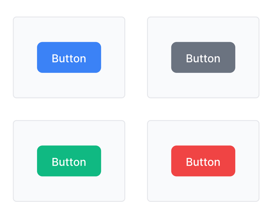
Let’s not start with “a button is a clickable UI element.”
That sounds correct.
It is also deeply unhelpful.
Because in real products, buttons are not abstract components.
They are where:
A button is not the end of design.
It is the place where design gets judged.
───────────────────────────────────────────────────────────────────────────────
You finish a screen.
It looks clean.
The hierarchy is decent.
The spacing is nice.
The typography feels sharp.
You zoom out and think:
“Nice. Done.”
Then you reach the action area.
And suddenly:
So you try one version.
Then another.
Then another.
And after 14 tiny changes you say:
“Okay… this looks fine.”
That is the problem.
Not because the button is bad.
But because you had to guess.
───────────────────────────────────────────────────────────────────────────────
Most products do not lose conversions because they lack features.
They lose conversions because users hesitate at the action moment.
A vague CTA can slow decisions.
A weak hierarchy can create abandonment.
A missing loading state can trigger duplicate actions.
A destructive action that feels too casual can break trust.
A payment button that feels unclear can increase anxiety.
That is why button design is not decoration.
It is business logic made visible.
───────────────────────────────────────────────────────────────────────────────
The real problem is not that teams “spend time making buttons.”
The real problem is that they keep re-deciding what should already be systemized.
Every time a team debates:
…they are not designing one button.
They are rebuilding a behavior system from scratch.
Again.
And again.
And again.
───────────────────────────────────────────────────────────────────────────────
Before buttons, users had to remember commands.
That was normal in early computing.
Also slightly hostile.
The rise of graphical interfaces changed that. Research work at Xerox PARC in the 1970s and systems like the Xerox Alto helped establish the visible, mouse-driven interaction model that made action controls easier to understand without memorizing syntax. Later GUI systems carried that idea forward into mainstream personal computing.
That shift was huge.
Because the promise of the GUI was not just beauty.
It was relief.
“You don’t need to remember the system. You can see what to do.”
And that is the philosophical birth of the button.
───────────────────────────────────────────────────────────────────────────────
Buttons did not stay frozen.
Interfaces changed.
Input methods changed.
Expectations changed.
So buttons had to grow up.
Buttons became visible action targets instead of hidden syntax.
Once interfaces moved to mobile, buttons had to become easier to hit, easier to scan, and safer to tap. NHS guidance, for example, explicitly notes that on smaller screens buttons stretch across width to make them easier to press.
Flat design removed heavy visual depth, but that also weakened clickability cues when done badly. Nielsen Norman Group has repeatedly warned that overly flat interfaces can hide affordance and create uncertainty.
Modern systems treat buttons as structured, stateful components with explicit emphasis, behavior, accessibility, and usage rules. Apple, Material, Carbon, GOV.UK, and NHS all document button types and states in system terms, not as random rectangles.
───────────────────────────────────────────────────────────────────────────────
A modern button system must do more than “look consistent.”
It must reduce uncertainty.
That means a real system needs to communicate:
What action will happen?
Is this the main action or a supporting one?
Is this safe, destructive, reversible, or final?
What happens after click, press, focus, or loading?
Can users perceive it, understand it, and operate it across states and contexts? WCAG and major design systems all reinforce the need for clear state communication and usable contrast.
Can the same logic work across pages, flows, products, and brands?
───────────────────────────────────────────────────────────────────────────────
Amazon’s official help pages describe “Buy Now” as a quick checkout option that reviews order details before purchase. That matters because it compresses the path from intent to transaction. Less wandering. Less second-guessing. Faster commitment.
Why it worked:
The button reduced path length and clarified the next action.
Reference links:
Netflix’s signup flow centers around a clear progression: choose a plan, create an account, continue. Its public signup pages keep the action language straightforward and highly visible.
Why it worked:
One strong CTA keeps the user moving instead of negotiating with the UI.
Reference links:
Booking.com consistently uses action-first booking language like “Book now” and related reservation CTAs on high-intent surfaces.
Why it worked:
The button language matches user intent at the moment they are ready to commit.
Reference links:
Public-sector systems like GOV.UK and NHS document button usage with strict clarity: when to use a button, how many variants exist, and how primary/secondary/warning behaviors should work.
Why it worked:
They treat action clarity as a service requirement, not a style preference.
Reference links:
───────────────────────────────────────────────────────────────────────────────
NN/g’s critique of Windows 8 called out hidden features, reduced discoverability, and cognitive overhead. That is classic action failure: if users cannot see the action clearly, they waste effort finding it.
Why it failed:
A button or action pattern that becomes too invisible stops feeling helpful and starts feeling like a puzzle.
Reference links:
NN/g has documented that weak flat signifiers attract less attention and require more user effort. When interfaces strip away too many cues, users stop being sure what is clickable.
Why it failed:
The UI looked cleaner than it behaved.
Reference links:
TechCrunch reported that early review data for Snapchat’s redesign showed heavy backlash, with users criticizing the confusing new structure. Axios later reported that Snapchat lost users after the controversial redesign.
Why it failed:
When action paths become less obvious, users do not become fascinated.
They become tired.
Reference links:
───────────────────────────────────────────────────────────────────────────────
Domino’s literally launched zero-click ordering: open the app, and your Easy Order starts with a countdown to cancel. Yes, that is brilliant. Yes, that is mildly terrifying.
Lesson:
Reducing friction is powerful.
Reducing all friction is also how people accidentally buy pizza while emotionally unprepared.
Reference links:
The genius of fast purchasing is also the comedy of unintended commitment. Convenience and regret are often separated by about 0.8 seconds.
Lesson:
The easier the action, the more important the confirmation logic.
Reference links:
Self-ordering flows and upsell prompts work because they feel tiny.
“Add fries?” sounds harmless.
Which is exactly why it is effective.
Lesson:
Small buttons can move surprisingly large revenue.
Reference links:
───────────────────────────────────────────────────────────────────────────────
Most button systems still fail in one of two ways:
One pretty primary button.
One secondary.
No real state logic.
No dangerous actions.
No sticky CTA patterns.
No text-link behavior.
No loading model.
No real-world coverage.
Fifty random variants.
Seven outdated masters.
Twelve near-duplicates.
A file heavy enough to develop its own weather system.
That is when a “design system” becomes a Frankenstein kit.
It looks comprehensive.
It feels exhausting.
A real system should not create more decision fatigue than designing from scratch.
───────────────────────────────────────────────────────────────────────────────
ZemryX should not behave like a loose collection of button drawings.
It should behave like a production-ready decision system.
That means:
Not “here are some buttons.”
More like:
“Here is a complete button architecture your team can actually use.”
───────────────────────────────────────────────────────────────────────────────
At the foundation level, button behavior begins with theme tokens.
These define the visual raw materials:
For ZemryX in Web Light Mode, Indigo 500 can act as the brand-primary foundation, but the architecture should not depend on only one brand. The point of theme tokens is portability.
So the question is not:
“What color is this button?”
It is:
“What token powers this button in this brand context?”
───────────────────────────────────────────────────────────────────────────────
Theme tokens define ingredients.
Semantic tokens define meaning.
Examples:
button/bg/primary/defaultbutton/bg/primary/hoverbutton/text/primary/defaultbutton/border/secondary/defaultbutton/bg/danger/defaultbutton/focus/ringbutton/bg/disabledbutton/text/disabledThis is where the system becomes intelligent.
Instead of saying:
You say:
Now the system is reasoning in product language, not guessing in pixel language.
───────────────────────────────────────────────────────────────────────────────
This is where tokens stop being abstract and start doing real work.
A component token maps semantics into actual button parts:
This is the layer that tells the product:
“This exact button, in this exact state, on this exact surface, behaves like this.”
That is real UI mapping.
───────────────────────────────────────────────────────────────────────────────
A button is not complete when the default state looks nice.
A button is complete when the behavior is complete.
That usually means:
Material and NN/g both emphasize the importance of state communication, and modern systems document these states explicitly.
Without state logic, it is not a real component.
It is a screenshot.
───────────────────────────────────────────────────────────────────────────────
A button system is not a color set.
It is not a variant list.
It is not a Figma thumbnail wall.
It is a decision engine for action clarity.
If the user still has to stop and think:
Then the button system is not finished.
───────────────────────────────────────────────────────────────────────────────
A strong button system should include, at minimum:
That is where coverage becomes practical.
───────────────────────────────────────────────────────────────────────────────
This is where most people underestimate the system.
The real power is not:
The real power is:
That is what aliasing unlocks.
You do not manually repaint the system every time branding changes.
You remap the source logic.
And the component continues behaving correctly.
───────────────────────────────────────────────────────────────────────────────
This is the button system in one line:
Alias → Component → State
Example:
Brand/Primary/500
→ maps intoSemantic/Button/Primary/BG
→ powersPrimary Button / Default
Then the rest follows:
Primary HoverPrimary PressedPrimary FocusPrimary DisabledPrimary LoadingSame structure.
Different outcome.
No chaos.
That is how consistency scales.
───────────────────────────────────────────────────────────────────────────────
The real cost of bad buttons is not visual inconsistency.
It is decision inconsistency.
When one screen teaches the user:
…but another screen teaches:
The user is not learning your system.
They are surviving it.
That survival effort is friction.
And friction is expensive.
───────────────────────────────────────────────────────────────────────────────
This is what a good ZemryX-style workflow should feel like:
That is what zero-thinking actually means.
Not no standards.
No unnecessary re-decisions.
───────────────────────────────────────────────────────────────────────────────
Same product.
Same screen.
Same user goal.
But the experience changes completely.
The button exists.
It works.
Technically.
The button leads.
It reassures.
It responds.
It reflects system logic.
It adapts across contexts.
It communicates outcome faster.
That is not a prettier button.
That is a smarter product moment.
───────────────────────────────────────────────────────────────────────────────
One is decoration.
The other is product architecture.
ZemryX should live in the second category.
───────────────────────────────────────────────────────────────────────────────
What makes a system useful is not what appears on the thumbnail.
It is what quietly saves teams from repetitive pain.
That means:
That is where the real value sits.
Quietly.
Like most valuable infrastructure.
───────────────────────────────────────────────────────────────────────────────
Designers do not just want speed.
They want relief.
They want to stop asking:
A good system removes invisible anxiety.
That matters more than most teams admit.
───────────────────────────────────────────────────────────────────────────────
Speed is great.
But speed is not the deepest win.
The deeper win is:
Speed is just the visible symptom.
The real win is confidence.
───────────────────────────────────────────────────────────────────────────────
If your team keeps rebuilding button logic from scratch, that is not craftsmanship.
That is recurring waste.
A good subscription is not paying for “more components.”
It is paying for:
In other words:
You are not subscribing to buttons.
You are subscribing to trust-ready action infrastructure.
───────────────────────────────────────────────────────────────────────────────
Your product is not judged only by how it looks.
It is judged by what happens in that one second when the user decides whether to act.
And that decision lives inside the button.
Most teams still design buttons like isolated UI pieces.
The better approach is to treat them as:
That is when buttons stop being little rectangles.
And start becoming product leverage.
───────────────────────────────────────────────────────────────────────────────
A normal button says:
“Click me.”
A great button says:
“You don’t have to think. I already made the next step obvious.”
───────────────────────────────────────────────────────────────────────────────
If your product depends on:
Then do not settle for button styling.
Build with a button system.
Build with logic.
Build with states.
Build with meaning.
Build with reuse.
Build with ZemryX.
10X Faster • Zero Tedious Work • Effortless Decisions • Minimal Manual Work