Design Systems
Colour Select
Clarity. Accessibility. Confidence. Speed. And far fewer “which shade is right?” moments.

Mohan vanjarapu
April 30, 2026
A few months ago, while building ZemryX, we faced a problem that many product teams quietly deal with.
A few months ago, while building ZemryX, we faced a problem that many product teams quietly deal with.
Our Figma file started getting slow.
Then slower.
Then the real problems started showing up.
Recovery mode.
High memory usage.
Slow searching.
Too many variants.
Pages becoming heavy.
Main components becoming harder to find.
Simple tasks taking more time than they should.
At one point, finding the right component started taking longer than designing the actual screen.
That was the moment we stepped back and asked ourselves:
Are we building a design system, or are we just creating another massive Figma file?
That question changed the direction of ZemryX.
Because the truth is simple:
Most design systems are not built for real scale.
They work well in the beginning.
They look good in screenshots.
They feel clean when the file is small.
But real products are different.
Real products grow.
Real teams scale.
Real companies manage multiple brands.
Real developers need structure.
Real AI workflows need clean naming, tokens, and logic.
That is why we built ZemryX.
Not as another UI kit.
But as a complete design system platform for modern product teams.
───────────────────────────────────────────────────────────────────────────────
Before going deeper, here is the simplest way to understand the difference.
───────────────────────────────────────────────────────────────────────────────
In the beginning, every design system feels manageable.
You create buttons.
You define colors.
You add typography.
You build inputs, cards, tabs, dropdowns, modals, and sections.
Everything looks organized.
Then the product grows.
You add more sizes.
More variants.
More states.
More pages.
More brands.
More designers.
More use cases.
And slowly, the system starts becoming harder to manage.
You begin seeing:
The problem is not Figma itself.
Figma is powerful.
The real problem is that many design systems are still treated like one giant file.
That approach does not scale for modern product teams.
───────────────────────────────────────────────────────────────────────────────
This is one of the biggest mistakes teams make.
They think a design system means:
But those are only the visible parts.
A real design system also needs:
Without that foundation, the system may look complete, but it will break when the product grows.
───────────────────────────────────────────────────────────────────────────────
ZemryX was built from this real frustration.
We did not want to create another beautiful but heavy Figma file.
We wanted to build something more useful:
A design system platform that helps teams explore, copy, customize, and ship faster.
ZemryX combines:
Everything is connected with one goal:
reduce chaos and help teams build real products faster.
───────────────────────────────────────────────────────────────────────────────
The ZemryX workflow is intentionally simple.
Instead of opening huge Figma files, searching through pages, fixing variants, and rebuilding patterns manually, teams can simply:
This is the kind of workflow product teams actually need.
Fast.
Clear.
Repeatable.
Less thinking.
Less searching.
Less manual fixing.
That is why we call it a zero-thinking workflow.
Not because designers should stop thinking.
But because designers should not waste energy on repetitive decisions that a system can already solve.
───────────────────────────────────────────────────────────────────────────────
One of the most annoying problems in large design systems is discoverability.
You know the component exists somewhere.
But where?
Inside which page?
Inside which section?
Inside which variant group?
Inside which file?
That is why ZemryX is organized around clear categories like:
Instead of hunting through a huge file, teams can explore components in a structured way.
This makes the system easier to understand, easier to use, and easier to scale.
───────────────────────────────────────────────────────────────────────────────
Large Figma files can become painful over time.
When everything lives inside one massive file, teams often face:
ZemryX was designed with a different mindset.
Instead of forcing teams to depend only on one overloaded file, ZemryX provides a platform-based way to explore and use the system.
The goal is not just to give more components.
The goal is to make the system easier to access, easier to manage, and easier to scale.
───────────────────────────────────────────────────────────────────────────────
Real products need more than default components.
A button is not just a button.
It needs:
The same applies to inputs, tabs, dropdowns, toggles, cards, alerts, forms, and many more patterns.
ZemryX keeps states and supporting elements organized clearly, so teams can understand how a component behaves before using it.
This helps designers, developers, and product teams stay aligned.
───────────────────────────────────────────────────────────────────────────────

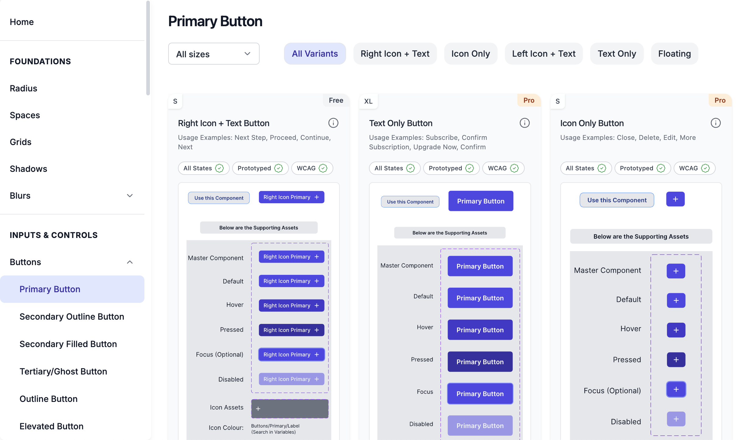
Most UI kits stop at static visuals.
But real products are interactive.
ZemryX includes fully prototyped components and states so teams can understand how patterns behave, not just how they look.
This helps with:
A design system should not only look good.
It should behave like a real product system.
───────────────────────────────────────────────────────────────────────────────
Typography becomes messy faster than most teams expect.
One designer uses 14px.
Another uses 15px.
Someone creates a new heading style.
Someone else duplicates a caption style.
Slowly, typography becomes inconsistent.
Typography Plus helps solve this by giving teams a structured typography system with connected variables, scalable naming, and production-ready usage patterns.
So instead of guessing, teams can choose the right typography style and move faster.
───────────────────────────────────────────────────────────────────────────────

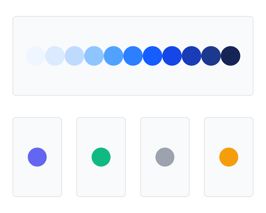
Colors are not just hex values.
A modern color system needs:
Colour Select helps teams manage colors as a system, not just a palette.
This is especially important when products need multiple themes, multiple brands, or consistent accessibility rules.
───────────────────────────────────────────────────────────────────────────────
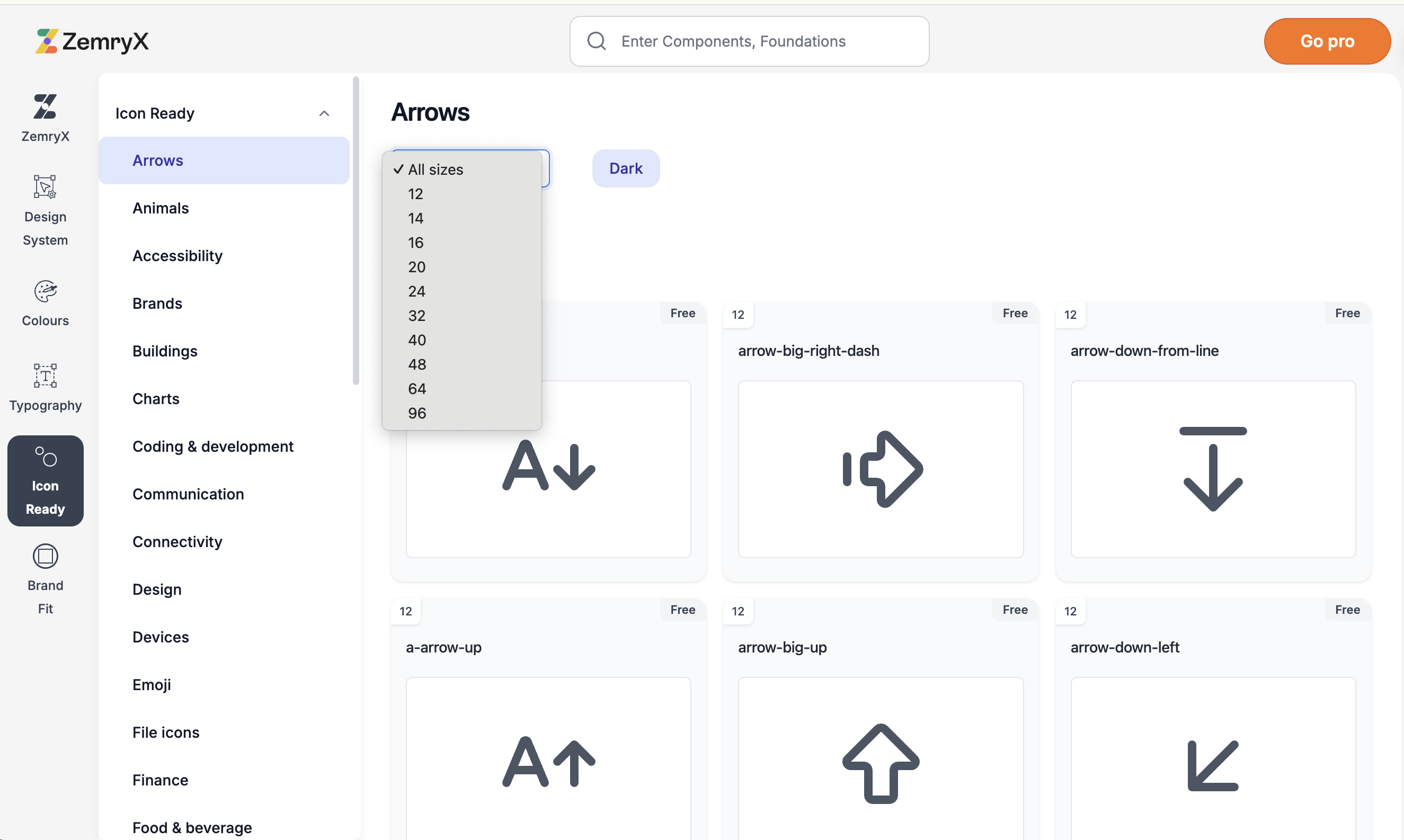
Icons look simple until they start scaling across a product.
Then small issues appear:
Icon Ready helps teams use icons with better consistency across product interfaces.
The goal is simple:
no more fixing icons manually every time.
───────────────────────────────────────────────────────────────────────────────
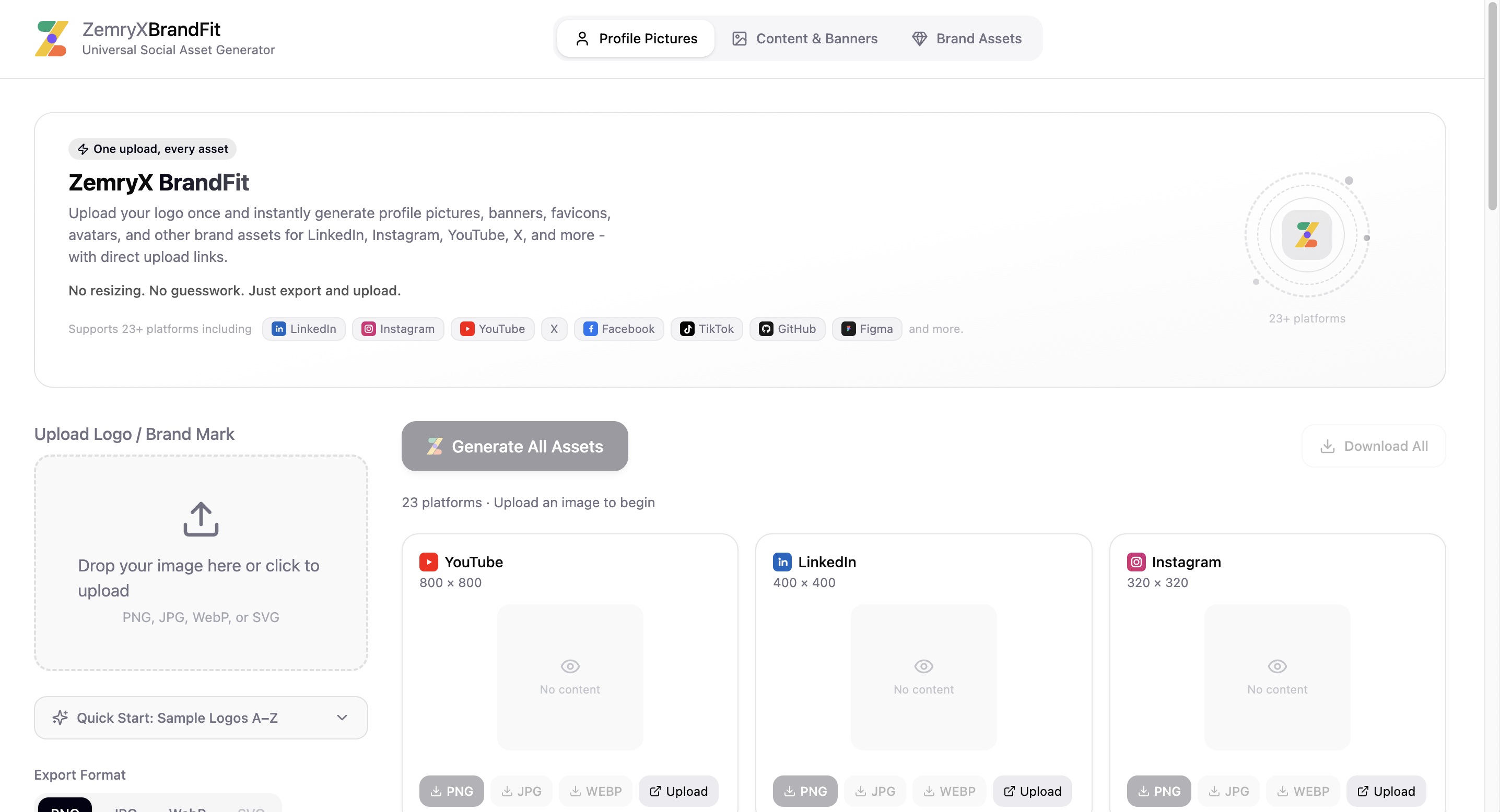
Brand assets are another repetitive task teams keep doing again and again.
Every company needs:
BrandFit helps generate brand-ready assets from one logo.
One logo.
Every size.
Every platform.
This saves time for product teams, founders, designers, and marketing teams.
───────────────────────────────────────────────────────────────────────────────
Modern products rarely stay as one brand forever.
Companies often need:
Most design systems struggle here.
ZemryX is built with multi-brand architecture from the beginning, so teams can manage brand changes without destroying the entire system.
This is a big difference.
A design system should not break when a second brand enters the picture.
───────────────────────────────────────────────────────────────────────────────
ZemryX also supports custom branding through Figma plugin workflows.
Teams can use branding workflows to:
This is especially useful for agencies, SaaS teams, enterprises, and white-label products.
Instead of rebuilding the same system for every brand, teams can manage branding more systematically.
───────────────────────────────────────────────────────────────────────────────
This is one of the strongest parts of ZemryX.
Companies can use ZemryX as their own branded design system platform.
That means a company can manage its design system with its own brand experience, while still using ZemryX infrastructure.
This helps teams:
For companies that do not want to build a design system platform from scratch, this becomes a powerful shortcut.
───────────────────────────────────────────────────────────────────────────────
AI is changing how products are designed and built.
But AI works best when systems are structured.
AI does not understand messy design files well.
It understands:
That is why ZemryX focuses on structure, naming, token logic, and connected systems.
The more structured your design system is, the better AI workflows can support your team.
───────────────────────────────────────────────────────────────────────────────
Accessibility should not be added at the end.
It should be part of the system from the beginning.
ZemryX focuses on WCAG-conscious foundations across:
Because real products need to work for real people.
Accessibility is not a bonus feature.
It is part of good product design.
───────────────────────────────────────────────────────────────────────────────
ZemryX is useful for different types of teams.
For designers, it reduces repetitive setup work.
For developers, it provides more structured logic.
For founders, it helps move faster without starting from zero.
For agencies, it supports client branding and reusable workflows.
For enterprises, it helps manage scale, consistency, and multi-brand complexity.
That is why ZemryX is not positioned as just a UI kit.
It is a design system platform.
───────────────────────────────────────────────────────────────────────────────


───────────────────────────────────────────────────────────────────────────────
Most UI Kits help you design faster, but very few are built to help product scale.
Traditional UI kits focus primarily on visual speed.
ZemryX is different.
ZemryX is a design system built for product scalability, brand flexibility, and AI- powered workflows.
It allows designers to import components directly into Figma, customize them with Figma Variables, and adapt them to any brand or product ecosystem.
But ZemryX goes far beyond reusable components.
It is designed around how product teams actually work:
- Structured for scale
- Easy to search and import
- Powered by Figma Variables
- Built for multi-brand customization
- Optimized for Ai workflows with Cluade and other tools
- Designed to accelerate collaboration between design and development.
The result?
Faster design execution, strong consistency, and quicker product delivery.
A UI kit helps you design screens
ZemryX helps you build product systems.
───────────────────────────────────────────────────────────────────────────────
We do not believe the future of design systems is about adding more and more components into heavier files.
The future is about making systems easier to:
That is the future ZemryX is building.
A design system should not slow teams down.
It should remove friction.
It should make product building feel clearer, faster, and more structured.
───────────────────────────────────────────────────────────────────────────────
Explore ZemryX:
https://www.zemryx.com
Explore the platform:
https://suite.zemryx.com
Book a demo call:
https://cal.id/zemryx/demo-call
───────────────────────────────────────────────────────────────────────────────
The best product teams in the next decade will not win because they have the biggest Figma file.
They will win because they have better systems.
Better structure.
Better workflows.
Better accessibility.
Better brand management.
Better AI readiness.
Better speed.
That is what we are building with ZemryX.