Design Systems
Colour Select
Clarity. Accessibility. Confidence. Speed. And far fewer “which shade is right?” moments.

Mohan vanjarapu
April 30, 2026
The Invisible Detail That Quietly Changes How Professional Your UI Feels


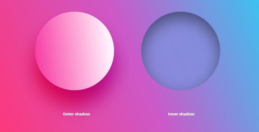
Let’s talk honestly.
Not like a design token file.
Not like a style guide.
Not like someone reading “0px 4px 8px -2px” and expecting excitement.
Just you and me.
There’s a small detail in every product…
that most people don’t notice consciously.
But they feel it instantly.
👉 That detail is shadow.
───────────────────────────────────────────────────────────────────────────────
You design a card.
Then you pause.
“Should this have shadow?”
“Maybe very light?”
“Maybe stronger?”
“Why does this still feel flat?”
So you try one.
Then another.
Then another.
And eventually:
“Okay… this looks decent.”
😄
That’s the problem.
Not because the shadow is wrong.
But because you had to guess it in the first place.
───────────────────────────────────────────────────────────────────────────────
Users don’t analyze shadows.
They don’t say:
They say:
👉 “This feels premium”
👉 “This feels clean”
👉 “This feels confusing”
👉 “Something feels off”
That “something”… is often shadow.
And that feeling directly impacts:
───────────────────────────────────────────────────────────────────────────────
Most designers don’t lack skill.
They lack:
👉 decision clarity
Because shadows are not defined as a system.
Instead, the workflow becomes:
Multiply that across:
Now shadow becomes a decision problem.
───────────────────────────────────────────────────────────────────────────────
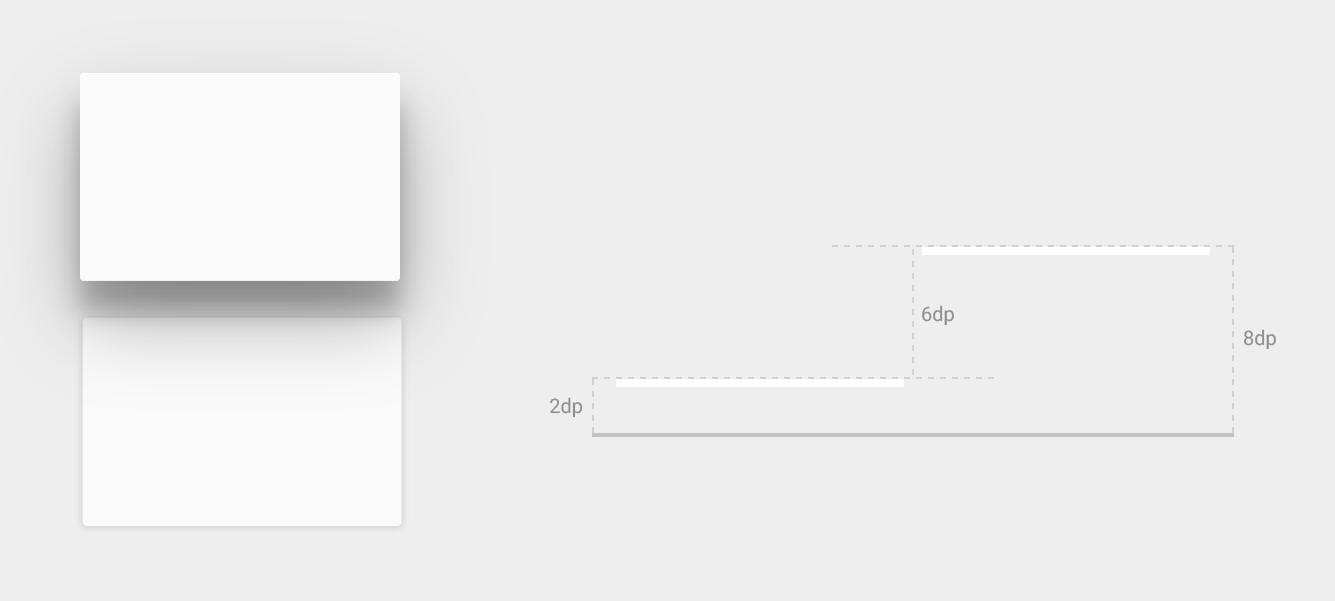
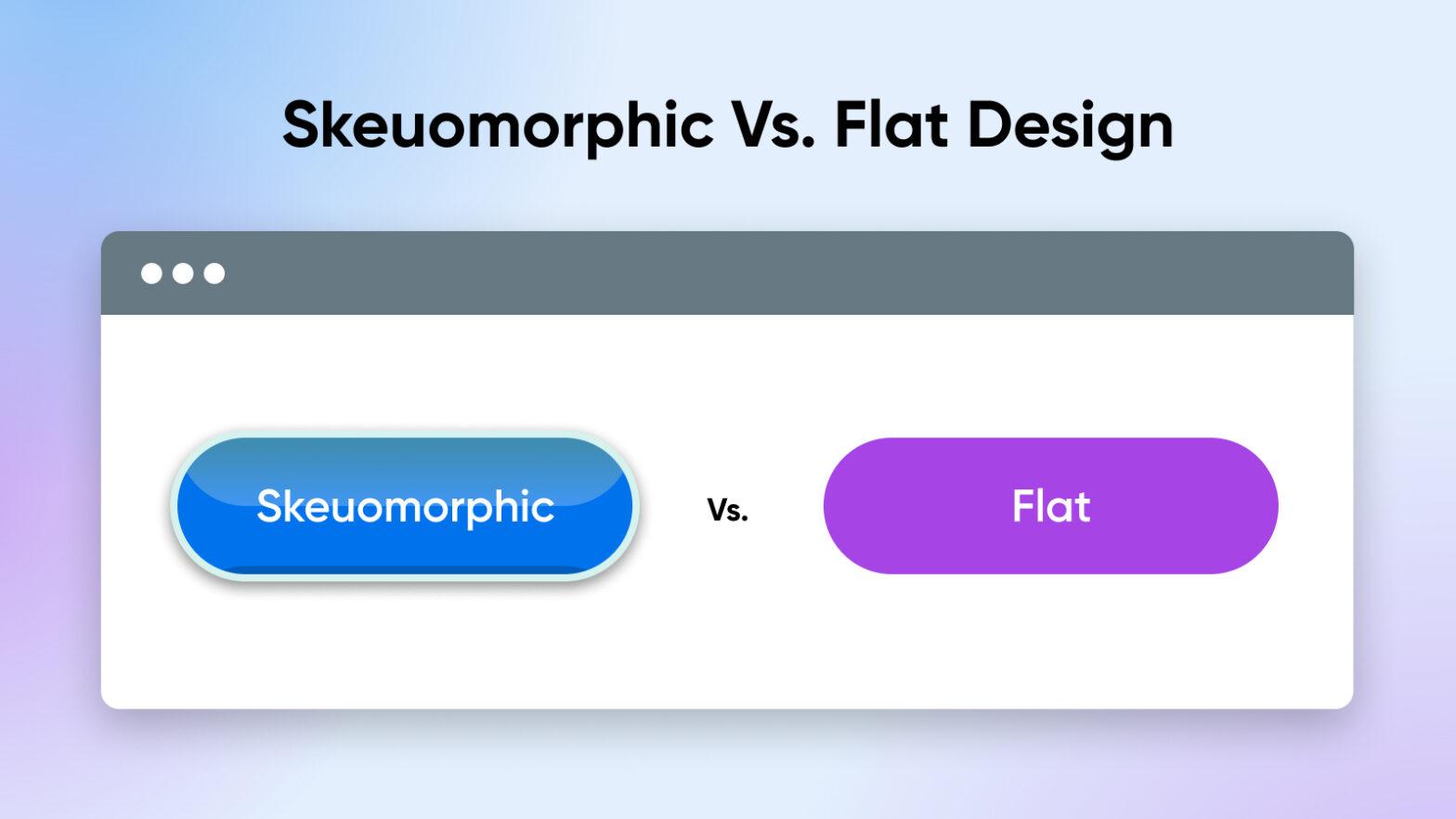
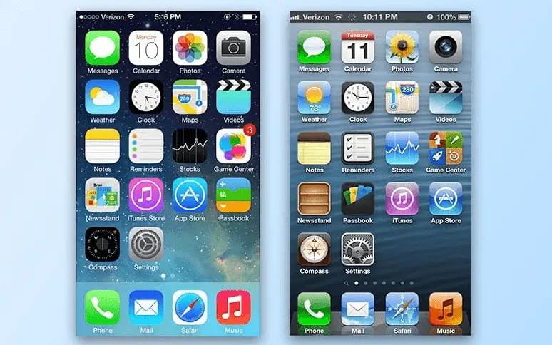
Shadows didn’t start as decoration.
They started as understanding.
Early interfaces needed to mimic reality.
👉 Raised buttons
👉 Deep shadows
👉 Glossy layers
Look at early Apple iOS.
Everything looked physical.
Because users needed:
👉 visual clues
👉 interaction hints
Google introduced Material Design.
Not just style — but logic.
Now shadows meant:
👉 1dp → subtle
👉 8dp → floating
👉 24dp → modal
For the first time:
👉 shadow became a system
───────────────────────────────────────────────────────────────────────────────
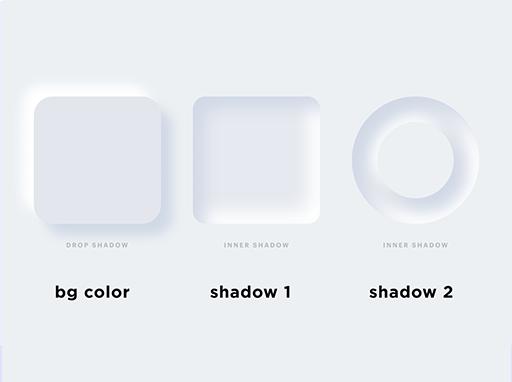
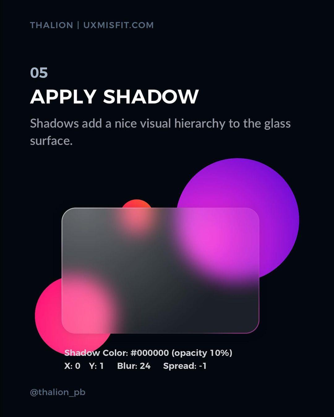
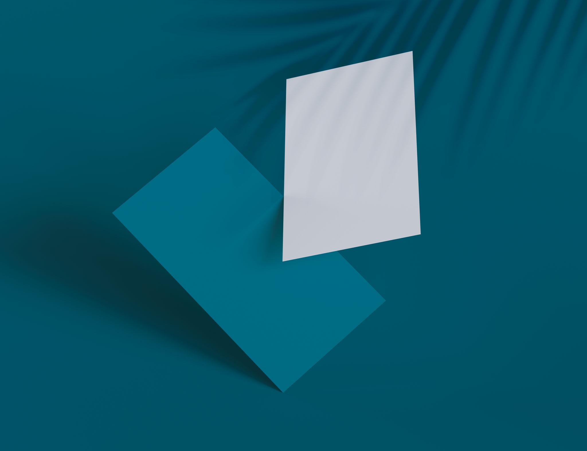
Interfaces became:
Flat design removed shadows.
But usability dropped.
So modern UI evolved:
👉 subtle shadows
👉 layered depth
👉 soft elevation
Not decorative.
👉 communicative
───────────────────────────────────────────────────────────────────────────────
A real system must define:
Not:
“Here are shadows”
But:
“Here is when to use them”
───────────────────────────────────────────────────────────────────────────────
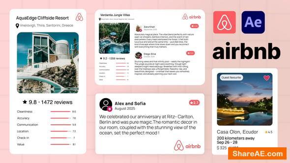
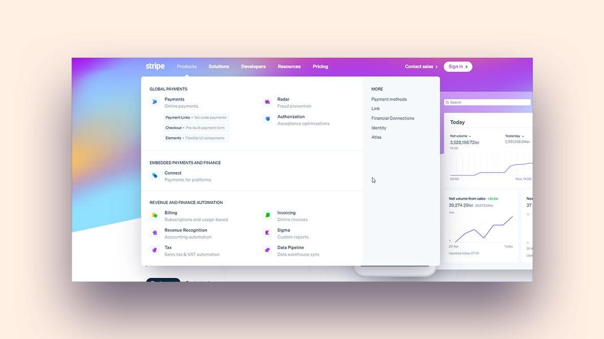
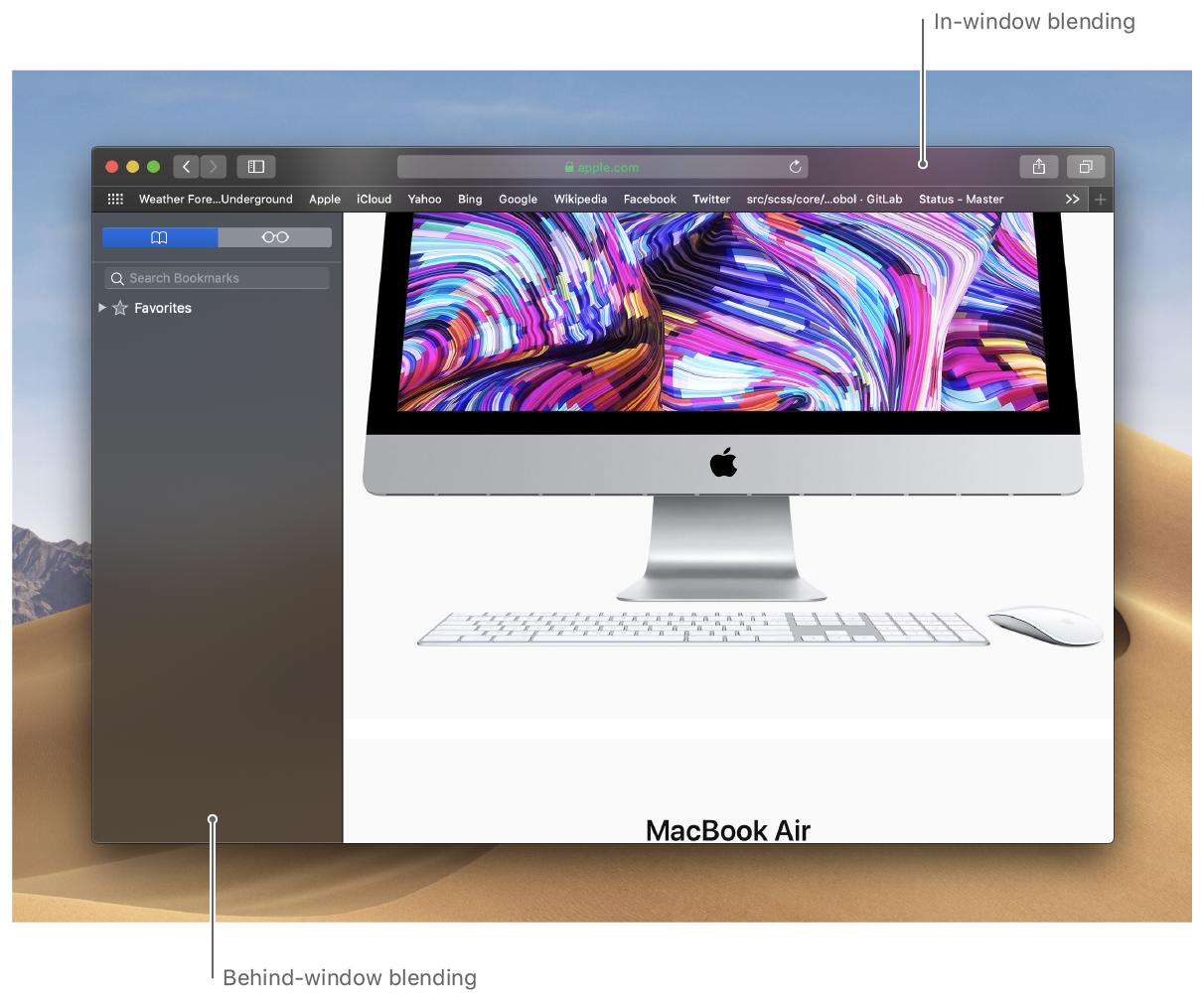
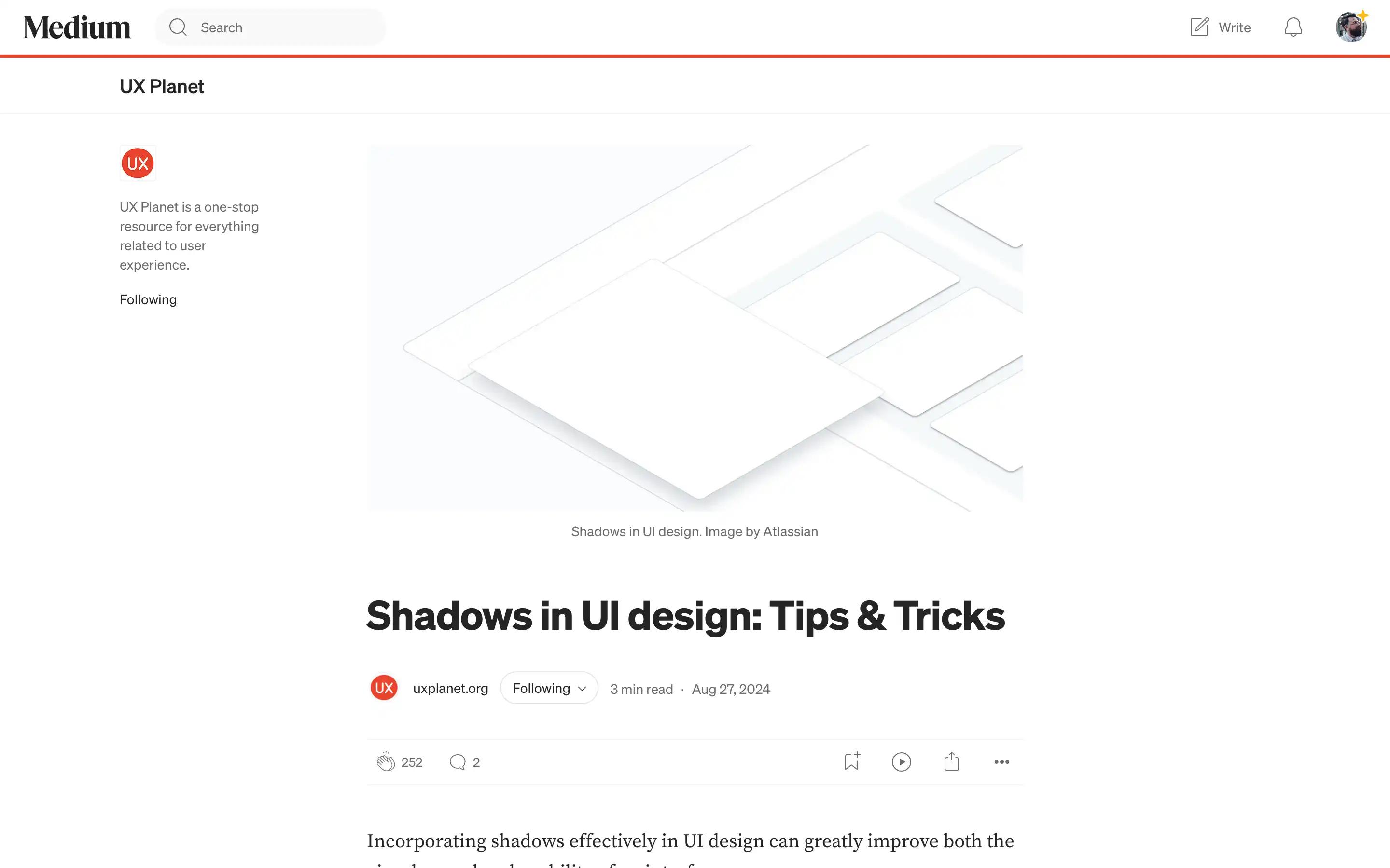
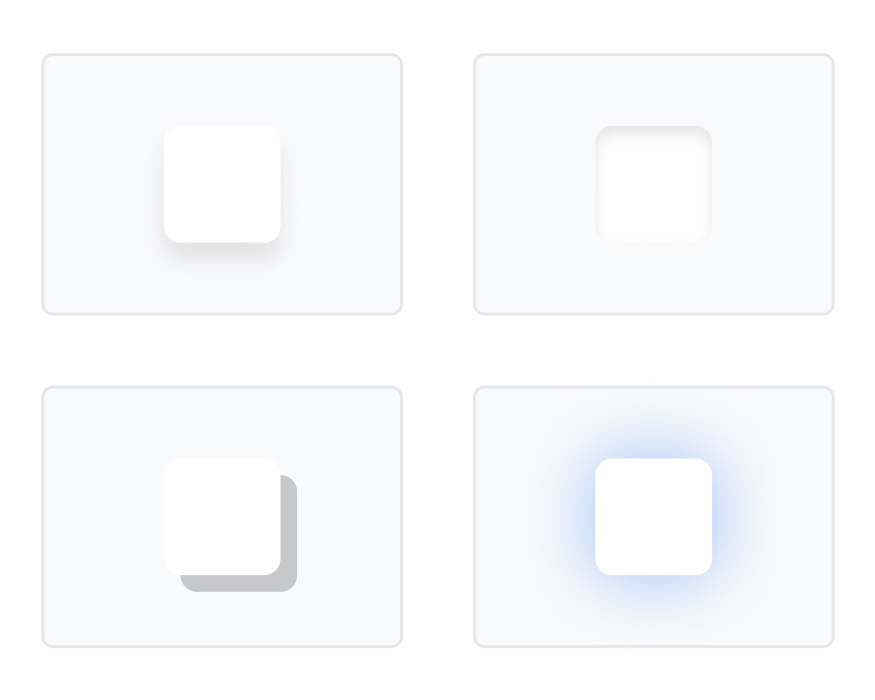
Soft shadows → cards feel real
Hover elevation → feels clickable
👉 Result: trust + interaction confidence
Consistent shadow scale across dashboards
👉 Result: clarity in complexity
Almost invisible shadows
👉 Result: premium feel
───────────────────────────────────────────────────────────────────────────────
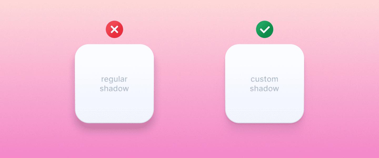
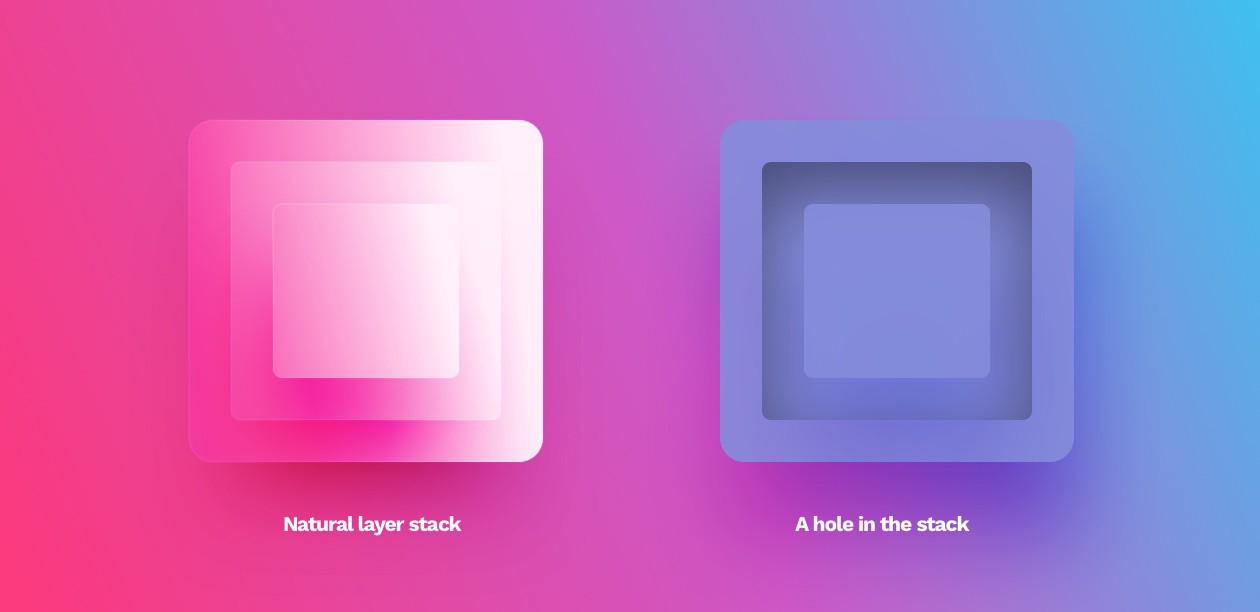
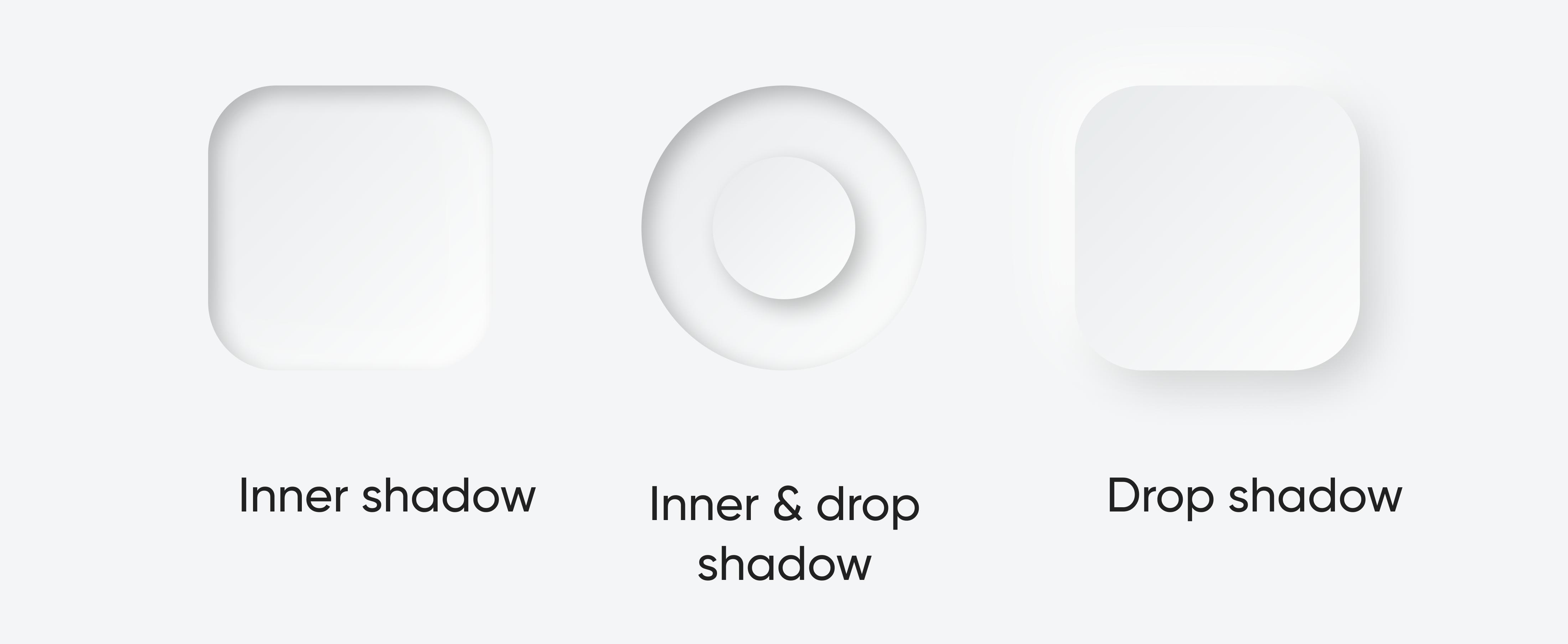
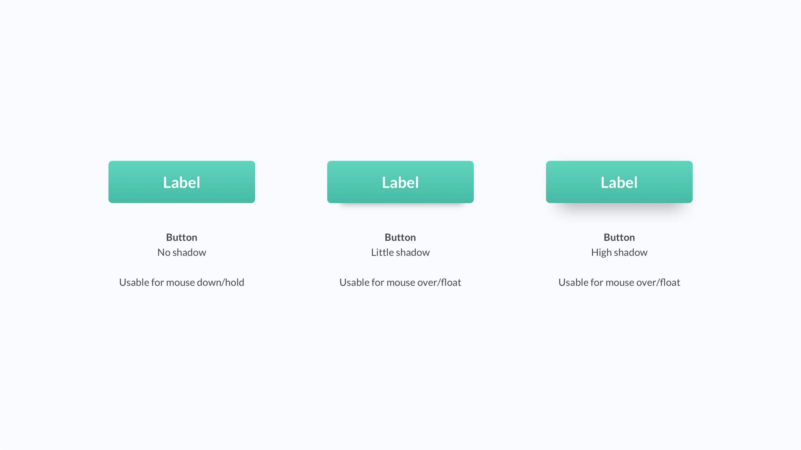
Users don’t complain about shadows.
They say:
👉 “Something feels off”
───────────────────────────────────────────────────────────────────────────────
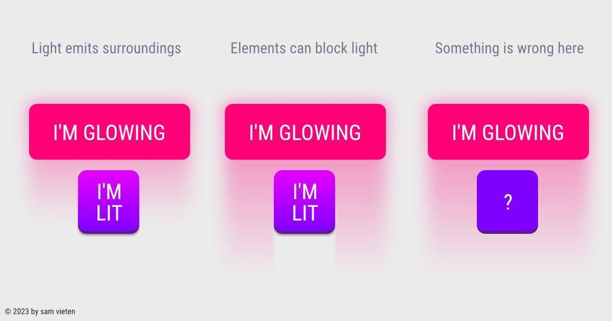
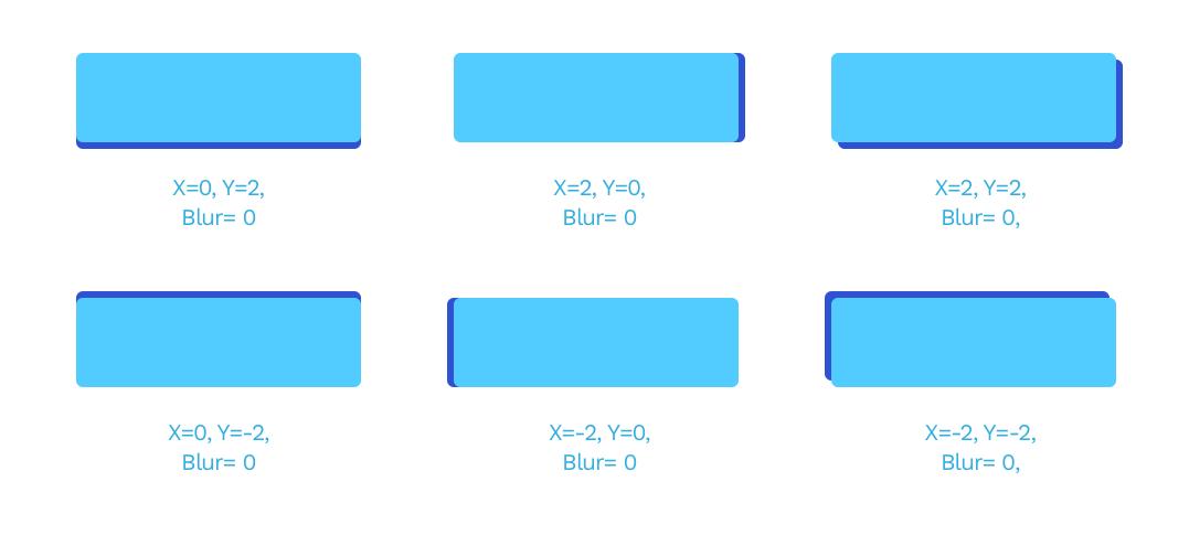
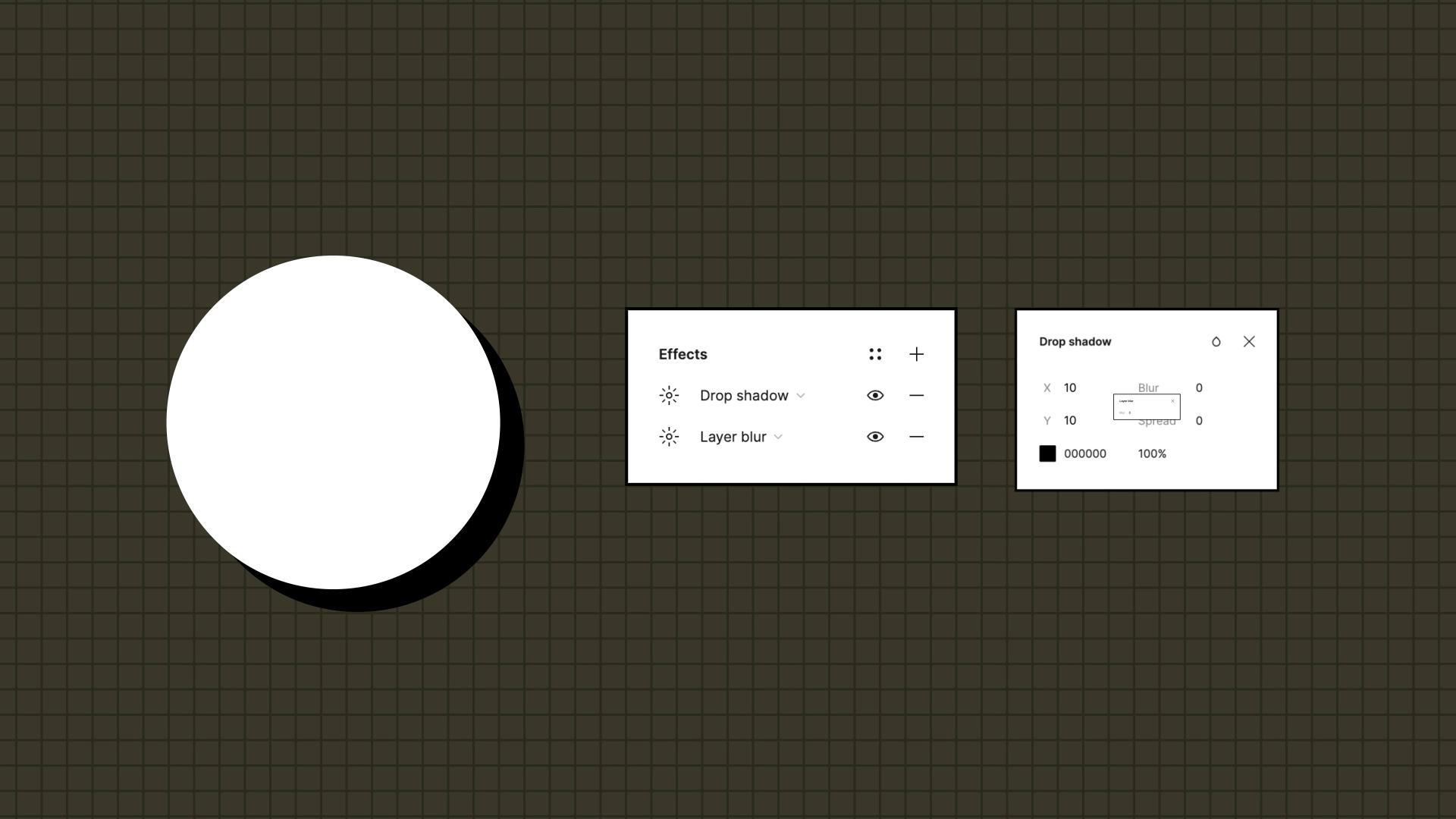

👉 Not your fault.
👉 No system → guessing.
───────────────────────────────────────────────────────────────────────────────
───────────────────────────────────────────────────────────────────────────────
ZemryX changes this.
Not:
👉 “Here are shadows”
But:
👉 “Here is the correct depth for the situation”
───────────────────────────────────────────────────────────────────────────────
Base shadow tokens:
───────────────────────────────────────────────────────────────────────────────
Instead of raw values:
👉 Meaning > numbers
───────────────────────────────────────────────────────────────────────────────
Each component gets:
───────────────────────────────────────────────────────────────────────────────
States include:
Each mapped to correct shadow behavior.
───────────────────────────────────────────────────────────────────────────────
You don’t need to decide shadows.
You need to:
👉 understand the component
System handles the rest.
───────────────────────────────────────────────────────────────────────────────
───────────────────────────────────────────────────────────────────────────────
Everything connects:
👉 Theme → Semantic → Component
No duplication.
No inconsistency.
───────────────────────────────────────────────────────────────────────────────
Example:
surface-card → Card → Hover
surface-overlay → Modal → Active
───────────────────────────────────────────────────────────────────────────────
Shadow is not styling.
👉 It’s communication.
───────────────────────────────────────────────────────────────────────────────
Copy component
Paste into Figma
Done
No tweaking.
───────────────────────────────────────────────────────────────────────────────
Before:
👉 trial and error
After:
👉 instant clarity
───────────────────────────────────────────────────────────────────────────────
Old:
👉 visual decoration
New:
👉 system infrastructure
───────────────────────────────────────────────────────────────────────────────
Built for:
───────────────────────────────────────────────────────────────────────────────
Less guessing
Less frustration
More confidence
───────────────────────────────────────────────────────────────────────────────
Speed is a byproduct.
Real win:
👉 clarity
───────────────────────────────────────────────────────────────────────────────
You’re not buying shadows.
You’re getting:
👉 decisions solved
───────────────────────────────────────────────────────────────────────────────
You are not bad at shadows.
👉 You were never given a system.
───────────────────────────────────────────────────────────────────────────────
Great products don’t feel great by accident.
They feel great because:
👉 decisions were already made
───────────────────────────────────────────────────────────────────────────────
🚀 Start designing depth with confidence
Use ZemryX.
Use the Shadow system.
Build interfaces that feel:
Without guessing every blur and opacity.