Design Systems
Typography
Time. Confidence. Clarity. Revenue. And your sanity.

Mohan vanjarapu
May 13, 2026
Clarity. Accessibility. Confidence. Speed. And far fewer “which shade is right?” moments.
There are parts of a product people notice instantly.
The hero illustration.
The motion.
The CTA button.
The shiny dashboard card.
And then there is color.
The part everybody uses.
The part almost nobody structures properly.
The part many systems reduce to a palette and call complete.
And yet
color quietly decides whether a product feels clear or chaotic, premium or patchy, trustworthy or slightly off.
You do not just see color in UI.
You respond to it.
If it is wrong, the product feels inconsistent.
If it is right, the product feels effortless.
Color is not decoration.
It is decision logic disguised as visuals.
Nobody says:
“This system has beautifully resolved semantic-state color mapping.”
But they definitely say:
That “something” is often color.
───────────────────────────────────────────────────────────────────────────────
You are designing an input field.
Nothing dramatic.
Just one field.
You need:
Simple.
And then the questions begin.
Should the border be Neutral 200 or 300?
Should hover be slightly darker gray or a soft brand tint?
Should focus use Indigo 500 border, or only focus ring?
Should the icon turn red in error?
Should disabled text be lower contrast or just lower emphasis?
Should success use green text only, or also a green border?
Why does this dropdown use a different hover shade than the input?
Who chose that?
Why did they choose that?
Why does every team have six slightly different “subtle gray” borders?
And then somebody says:
“Can we make the state feel a little more premium?”
Which is the color version of being handed a mystery box with no instructions.
Congratulations.
You just spent 40 minutes deciding what should have taken 4 seconds.
Now multiply that by:
Suddenly this is not color selection anymore.
It is state management by exhaustion.
───────────────────────────────────────────────────────────────────────────────
Most teams think color is a visual layer.
It is not.
Color is a product behavior layer.
Because color influences:
When color is strong, interfaces feel intuitive.
When color is weak, interfaces feel inconsistent.
That inconsistency matters.
A weak hover state can reduce clarity.
A low-contrast error state can create mistakes.
An unclear disabled state can confuse actionability.
An inconsistent brand application can make the product feel unfinished.
No crash.
No broken layout.
No dramatic bug.
Just friction.
And friction compounds.
A product does not need to fail loudly to lose trust.
It only needs to feel slightly unreliable across repeated moments.
That is the hidden cost of weak color systems.
───────────────────────────────────────────────────────────────────────────────
Yes, bad color systems waste time.
Without a real system, teams spend hours doing things that should already be solved:
WorkWithout a systemChoose component colorsRepeatedlyCheck states manuallyConstantlyFix inconsistenciesFrequentlyReview accessibilityAgain and againFinal confidenceUnstable
And after all that, someone still says:
“Can we try a slightly darker blue?”
But time is not the deepest problem.
The deeper problem is confidence.
The feeling that:
That is what weak color systems create:
low-confidence product design
And low-confidence design spreads.
It affects design quality.
It affects developer implementation.
It affects consistency.
It affects accessibility.
It affects brand trust.
───────────────────────────────────────────────────────────────────────────────
Before color became a token, a variable, or a semantic style, it was a signal.
In print, signage, dashboards, maps, industrial controls, and public systems, color existed to communicate quickly.
It helped people distinguish:
That truth did not disappear when software arrived.
It became more important.
Because interfaces are full of fast decisions.
Now color is not just paint.
It is:
Your UI is full of color decisions, whether you systemize them or not.
The question is not whether color shapes product behavior.
It does.
The question is whether your system controls that logic — or leaves it to chance.
───────────────────────────────────────────────────────────────────────────────
Interfaces evolved.
Components evolved.
Responsive systems evolved.
Tokens evolved.
Variables evolved.
The complexity of products evolved.
But many color systems still behave like this:
That is like handing a team a paint box and calling it product infrastructure.
Real interfaces do not need colors in isolation.
They need color logic.
Not just:
They need:
Modern color systems must do more than provide options.
They must provide answers.
───────────────────────────────────────────────────────────────────────────────
A modern color system must do five things at once.
Color should tell users what is happening without needing explanation.
Every component must know how color changes in default, hover, focus, active, disabled, and feedback states.
Contrast and readability should be built into the system, not added later.
The same logic should hold across screens, teams, and components.
As the product grows, the system should reduce decisions — not create more.
That is why color feels harder than it looks.
Because it is not just a palette.
It is product logic.
───────────────────────────────────────────────────────────────────────────────
[Image Placeholder — Stripe surfaces, accents, and clear states]
Suggested image links:
Stripe’s interfaces feel calm because their visual system reduces noise.
Color is used with discipline:
That makes complex payment and infrastructure workflows feel trustworthy.
The lesson is simple:
Color helps complexity feel manageable.
[Image Placeholder — Airbnb system surfaces and branded restraint]
Suggested image links:
Airbnb does not let brand color overpower usability.
That matters.
In products where trust drives conversion, color cannot feel accidental.
It must feel deliberate.
Airbnb shows how brand, surface, emphasis, and usability can work together instead of competing.
[Image Placeholder — Clear semantic color use in product systems]
Suggested image links:
Google’s best product surfaces rely on recognizable meaning.
Blue feels interactive.
Green often feels positive or confirmed.
Red gets used carefully for warnings or destructive meaning.
Neutral surfaces stay out of the way.
That familiarity lowers cognitive load.
And lower cognitive load improves product speed.
───────────────────────────────────────────────────────────────────────────────
[Image Placeholder — Muted low-contrast dashboard UI]
Suggested image links:
Many enterprise dashboards try to look modern by reducing contrast too far.
The result:
It looks clean in a still frame.
It feels frustrating in real use.
That is color solving aesthetics while failing usability.
[Image Placeholder — Mismatched states across product pages]
Suggested image links:
A common failure is not one wrong color.
It is many slightly different right colors.
Different hover blues.
Different disabled grays.
Different selected states.
Different border tones across flows.
Users may not name the issue.
But they feel the inconsistency.
And inconsistency reduces trust.
[Image Placeholder — UI overloaded with brand color]
Suggested image links:
Some systems overuse their brand color because they confuse recognition with repetition.
If everything is primary:
A brand color is most powerful when it is used with restraint.
───────────────────────────────────────────────────────────────────────────────
At some point, every design team debates:
“Should hover be 5% darker or 8% darker?”
This is one of design’s great traditions.
It sounds trivial.
It is trivial.
And yet it happens constantly.
Because when there is no system, every tiny state becomes a fresh philosophy discussion.
Every large product eventually discovers it has:
This is not color strategy.
This is archaeological layering.
Nothing unites a team faster than discovering a beautifully polished interface fails contrast checks in twelve places the week before launch.
Suddenly everyone becomes extremely interested in WCAG.
A good system prevents that panic by design.
───────────────────────────────────────────────────────────────────────────────
Most systems stop at palettes.
They give you:
And then they quietly hand decision-making back to the team.
You still have to decide:
That is not enough.
A real system should not merely provide color inventory.
It should provide usable logic.
───────────────────────────────────────────────────────────────────────────────
Most systems give you colors.
ZemryX gives you decisions made in advance.
Instead of asking:
“Which color should I pick?”
You choose:
Component + State
And the system gives you the correct color.
That is the shift.
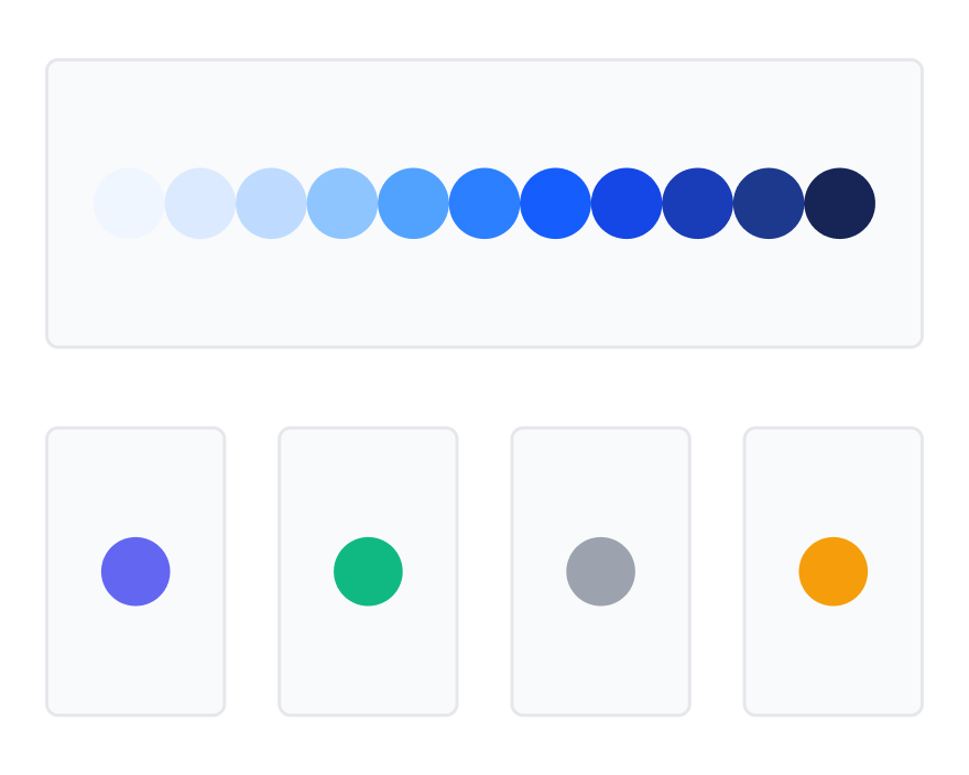
From color as a palette
to color as product infrastructure.
───────────────────────────────────────────────────────────────────────────────
This is the base layer.
It includes:
Every color is:
This is not just a color library.
It is a foundation.
───────────────────────────────────────────────────────────────────────────────
The next layer maps color to intent.
That means:
No ambiguity.
No semantic improvisation.
No “this kind of feels warning-ish.”
The system defines meaning so teams do not have to renegotiate it.
───────────────────────────────────────────────────────────────────────────────
This is where Colour Select becomes practical.
Every component already knows how to use color.
Everything is mapped.
That is the difference.
───────────────────────────────────────────────────────────────────────────────
Colour Select does not stop at base colors.
It defines behavior across:
So instead of saying:
“Let’s try a slightly darker blue for hover…”
the system says:
“Hover state → use predefined token.”
That is how a system removes friction.
───────────────────────────────────────────────────────────────────────────────
What you created is not:
This is a fully engineered color system.
───────────────────────────────────────────────────────────────────────────────
At the foundation level, it includes:
That alone is strong.
But the real strength is that it all connects.
The system does not just store color.
It directs it.
───────────────────────────────────────────────────────────────────────────────
This is where most teams fail.
They create colors.
They maybe create semantic labels.
Then real product work begins, and everything drifts.
Color aliases tied to component logic change that.
When a color is connected through semantic mapping and state logic, the system holds.
That means:
That is what makes the system production-ready.
───────────────────────────────────────────────────────────────────────────────
This is the core pattern.
Alias → Component → State means the logic survives real use.
Not just on a token page.
Not just in a design file.
In actual product work.
It holds across:
That is where system quality becomes visible.
───────────────────────────────────────────────────────────────────────────────
What you built solves:
Reduced.
Controlled.
Mapped.
Structured.
Reduced dramatically.
You did not just create better color organization.
You removed decision fatigue at scale.
───────────────────────────────────────────────────────────────────────────────
The workflow becomes:
StepActionTime1Search the component2 sec2Copy1 sec3Paste into Figma2 sec
Done.
No guessing.
No testing random shades.
No manual state improvisation.
Just:
Search → Copy → Paste → Done
───────────────────────────────────────────────────────────────────────────────
Before:
“Should this hover be slightly darker?
Maybe use another gray?
Let’s check the border again.”
With ZemryX:
Search the component.
Use the mapped state.
Done.
No color debate.
No guesswork.
No rework.
───────────────────────────────────────────────────────────────────────────────
This is the real shift.
From:
Color as styling
To:
Color as decision infrastructure
A palette gives you options.
A system gives you outcomes.
───────────────────────────────────────────────────────────────────────────────
While most teams are still:
ZemryX built:
So designers do not manually solve color every time.
They apply a system.
───────────────────────────────────────────────────────────────────────────────
This kind of work is invisible when done well.
Nobody sees the hours spent:
And that is exactly the point.
The best systems hide their complexity.
You build the logic once so users do not have to rebuild it every screen.
That is not just efficiency.
That is respect for the team’s time.
───────────────────────────────────────────────────────────────────────────────
Speed is great.
But the bigger win is confidence.
The shift from:
“I think this color works…”
to:
“This is already the correct state token.”
That is what changes workflows.
Because teams are not only slow from lack of skill.
They are slow because they keep reopening solved problems.
Colour Select closes that loop.
───────────────────────────────────────────────────────────────────────────────
Color systems are not static.
Brands evolve.
Products expand.
States increase.
Accessibility expectations grow.
Teams scale.
A useful system must evolve too.
That is why the value is not just in one palette file.
It is in an ecosystem of maintained, product-ready decisions.
You are not subscribing to colors.
You are subscribing to:
───────────────────────────────────────────────────────────────────────────────
Color is not just:
Color is product behavior infrastructure.
It shapes:
It does not just make products look good.
It helps products work well.
───────────────────────────────────────────────────────────────────────────────
If your team is still choosing hover shades by instinct, checking contrast manually at the end, and ending up with five slightly different neutral borders—
you do not have a color system yet.
You have color storage.
Colour Select changes that.
It turns color from guesswork into infrastructure.
───────────────────────────────────────────────────────────────────────────────
Search the component.
Copy it.
Paste it into Figma.
Apply your brand.
Let the system do the hard part.
Explore Colour Select in ZemryX.
Upgrade to ZemryX Pro and design like a real product team.