Design Systems
Colour Select
Clarity. Accessibility. Confidence. Speed. And far fewer “which shade is right?” moments.

Mohan vanjarapu
April 30, 2026
Time. Confidence. Clarity. Revenue. And your sanity.
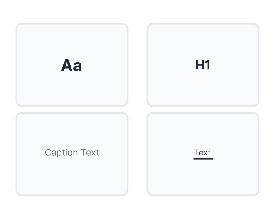
There are parts of a product people remember.
The hero image.
The onboarding animation.
The bold CTA.
The fancy dashboard chart.
And then there is typography.
The part nobody compliments.
The part almost nobody screenshots.
The part most teams treat like a finishing touch.
And yet -
typography quietly decides whether your product feels clear or confusing, premium or messy, trustworthy or slightly suspicious.
You do not really see typography.
You feel it.
If it is bad, users leave.
If it is good, users barely notice.
Typography is like oxygen in interface design.
Nobody says, “Wow, amazing typography.”
But they absolutely say:
That “something” is often typography.
[GIF Placeholder — Search → Copy → Paste → Done]
Suggested sequence to show:
Suggested placement: directly below the intro.
───────────────────────────────────────────────────────────────────────────────
You open Figma.
You are designing a billing screen. Nothing dramatic. Nothing glamorous. Just one small piece of text:
Payment method expired
Simple.
And then your brain begins its daily theatre performance.
Is this 12px or 14px?
Regular or Medium?
Is it warning text or helper text?
Gray or red?
Should the spacing be 4px or 8px?
Why does it look fine next to the input in one frame and weird in another?
Why does it feel slightly off in the table?
Why does it somehow look both too small and too loud depending on how tired you are?
You zoom in.
You zoom out.
You try 12px. Too small.
You try 14px. Too loud.
You try 13px. Dangerous optimism.
You message someone:
“Hey quick check… does this look fine?”
They reply:
“Maybe slightly bigger?”
Perfect.
Now two people are confused.
Congratulations.
You just spent 45 minutes on one sentence.
Now multiply that by:
Suddenly this is not typography anymore.
It is death by a thousand micro-decisions.
───────────────────────────────────────────────────────────────────────────────
Most teams think typography is a visual detail.
It is not.
Typography is a business layer disguised as design.
Because typography quietly influences:
When typography is strong, products feel easier.
When typography is weak, everything takes longer.
That delay matters.
A pricing page with unclear hierarchy causes hesitation.
A dashboard with similar-looking text styles slows decisions.
A form with weak labels increases mistakes.
A settings page with poor contrast quietly increases cognitive load.
No crash.
No obvious bug.
No dramatic error message.
Just friction.
And friction is expensive.
A product does not need to look broken to lose revenue.
It only needs to feel slightly harder than it should.
That is the hidden cost of weak typography.
───────────────────────────────────────────────────────────────────────────────
Yes, bad typography wastes time.
Without a real system, teams often spend:
WorkWithout a systemDefine typography logic1–2 daysApply across screens2–4 daysFix inconsistencies2–6 daysTeam debatesEndlessFinal confidenceRare
And after all that, someone still says:
“Let’s try 1px bigger.”
But time is not the deepest problem.
The deeper problem is confidence.
The feeling that:
That is what weak typography creates:
low-confidence design
And low-confidence design spreads.
It affects reviews.
It affects handoff.
It affects velocity.
It affects brand trust.
It affects how seriously users take your product.
───────────────────────────────────────────────────────────────────────────────
Typography existed long before product design, design systems, and people using the phrase “user-centric” in every meeting.
It came from print.
Books. Newspapers. Editorial layouts. Public information.
Back then, typography was not decoration. It was infrastructure.
If the text was hard to read, the message failed.
If the hierarchy was unclear, meaning got lost.
If the page was dense or chaotic, people disengaged.
That truth never changed.
The medium changed.
Now the page is a screen.
The paragraph is a product flow.
The headline is a dashboard summary.
The footnote is a pricing disclaimer.
The caption is a warning state.
The label is the difference between success and abandonment.
Your UI is now your printing press.
And typography is still doing what it has always done:
Helping people understand, decide, and move forward.
───────────────────────────────────────────────────────────────────────────────
Buttons evolved.
Layouts evolved.
Responsive systems evolved.
Tokens evolved.
Components evolved.
But typography in many design systems still looks like this:
That is useful in theory.
But in practice, it is like giving someone flour, water, and salt, then saying:
“Great. Build a bakery.”
Real products do not need abstract labels alone.
They need role-based clarity.
Not just “Body / Small.”
They need:
Modern typography must do more than define a scale.
It must answer real product questions.
It must reduce choices, not multiply them.
It must make good decisions automatic.
───────────────────────────────────────────────────────────────────────────────
Modern typography must serve five masters at the same time.
People should read without effort.
The important thing should feel important instantly.
The product should feel like one coherent company, not seven conflicting opinions.
The text should work for real humans, not idealized mockups.
It should be reusable, scalable, and dependable across screens, components, and teams.
That is why typography feels hard.
Because it is not just visual styling.
It is engineering disguised as design.
───────────────────────────────────────────────────────────────────────────────
[Image Placeholder - Medium clean reading layout]
Suggested image links:
Medium did not win because it was the loudest product in the room.
It won because reading felt effortless.
Its typography choices made articles feel calm, breathable, and serious:
That experience changed behavior.
People stayed longer.
They read more deeply.
The platform felt premium.
Writers and readers both benefited from the experience.
Typography did not just improve aesthetics.
It improved time on platform.
And time on platform is one of the quiet engines of monetization.
Medium is a reminder that when typography respects the reader, the reader stays.
[Image Placeholder — Airbnb typography / Cereal system]
Suggested image links:
Airbnb’s typography evolution was not just about taste.
It was about trust.
When a platform asks you to book a stay in another city, another country, maybe even another continent, clarity matters. A lot.
A more unified typographic system helped Airbnb create:
When typography is fragmented, the experience feels fragmented.
When typography is unified, the company feels more trustworthy.
And trust is not a nice bonus in travel.
It is part of conversion.
Typography helped Airbnb feel less like an interface and more like a reliable decision partner.
[Image Placeholder — Stripe calm UI / pricing / dashboard]
Suggested image links:
Stripe deals with complexity:
Yet its interfaces often feel calm.
That is not an accident.
Stripe’s typography helps complexity feel structured rather than intimidating. It creates clarity through readable hierarchy and disciplined presentation.
The result is not just a nice design language.
It is reduced cognitive load.
And reduced cognitive load improves decision speed.
When people understand faster, they trust faster.
When they trust faster, they move faster.
When they move faster, conversion improves.
Typography, once again, is quietly doing business work.
───────────────────────────────────────────────────────────────────────────────
[Image Placeholder — Early Windows dense interface]
Suggested image links:
Early desktop interfaces often had a very specific problem:
Everything looked equally important.
Same font.
Same size.
Same visual intensity.
The result was predictable:
When hierarchy disappears, users have to create hierarchy mentally.
That is a terrible trade.
The product should do that job for them.
When every line shouts, nobody knows where to look.
[Image Placeholder — Old Yahoo cluttered homepage]
Suggested image links:
Old Yahoo is a classic lesson in what happens when visual density starts fighting the user.
The pages had everything:
And when everything asks for attention, nothing wins it.
The interface felt overwhelming.
Navigation felt heavier.
Scanning became work.
Meanwhile, Google went in the opposite direction: simpler, clearer, lighter.
The contrast mattered.
Attention is a business asset.
Typography influences attention more than many teams realize.
Lose attention, and you often lose the market right after.
Yahoo did not just suffer from too much content.
It suffered from a presentation model that made clarity harder than it needed to be.
[Image Placeholder — Form friction / unclear hierarchy]
Suggested image links:
The Healthcare.gov launch had multiple issues, but one overlooked lesson remains highly relevant to product teams:
Poor readability and weak hierarchy make already-complex tasks even harder.
When forms contain:
users hesitate.
They misread.
They abandon.
They make mistakes.
Typography does not need to be the only problem to become a major multiplier of failure.
When a flow is already stressful, poor typography adds invisible weight.
That weight becomes abandonment.
When the job is serious, typography is serious too.
───────────────────────────────────────────────────────────────────────────────
[Image Placeholder — Design team debating tiny changes]
Suggested image links:
Every serious design team eventually reaches a point where adults with full-time jobs debate whether something should be 14px or 15px as if national security depends on it.
This is not a joke.
Well, it is a joke.
But it is also real.
Typography debates often become strangely philosophical:
Sometimes all four statements are about a 1px change.
The funny part?
Users usually do not notice the debate.
They only notice the outcome.
That is the lesson: if your team is constantly debating tiny text decisions, you probably do not have a system. You have a group project with good intentions.
[Image Placeholder — Dense but high-converting commerce UI]
Suggested image links:
Amazon is a useful reminder that typography is not a beauty contest.
Its interface has often been described as dense, crowded, and aggressively practical.
And yet it converts.
Why?
Because even in all that density, the hierarchy around decision-making is strong enough to do its job.
It may not look like a design award winner.
But it behaves like a revenue machine.
The lesson is uncomfortable and important:
Typography is not primarily about looking elegant.
It is about helping users act.
In other words, a product can be visually polite and commercially weak, or slightly loud and brutally effective.
Amazon chose effective.
[Image Placeholder - Invisible typography / effortless feed reading]
Suggested image links:
Nobody opens Facebook and says:
“Incredible typographic craft.”
And that is exactly the point.
Its typography largely disappears into behavior.
People scroll.
They read.
They skim.
They respond.
They keep going.
Good typography often becomes invisible because it removes itself as a problem.
The product flow stays in front.
The reading experience stays effortless.
The lesson is simple:
The best typography is often the typography users forget exists.
───────────────────────────────────────────────────────────────────────────────
Most design systems stop too early.
They give you styles.
They give you a type scale.
They give you token names.
And then they quietly hand the real work back to the designer.
You still have to decide:
That is not enough.
A real system should not merely document decisions.
It should remove the need to remake them.
───────────────────────────────────────────────────────────────────────────────
Most design systems give you:
And leave the rest to you.
ZemryX does not.
It gives you a fully mapped typography ecosystem built for real UI, real use cases, and real products.
───────────────────────────────────────────────────────────────────────────────
They are:
You still ask:
Which means you are still designing typography manually.
ZemryX solves this differently.
It does not just give you styles.
It gives you structured categories mapped to real usage.
This is the base intelligence layer.
It covers:
This is not a loose set of options.
It is a foundation.
Fully tokenized.
Fully aliased.
Fully structured.
───────────────────────────────────────────────────────────────────────────────
This is where ZemryX becomes powerful.
Instead of guessing usage, you pick context.
Used in:
Used in:
Used in:
Used in:
Used in:
Used in:
Used in:
Used in:
───────────────────────────────────────────────────────────────────────────────
ZemryX does not stop at categories.
Every category supports a real scale:
SizeUse CaseXXXSDense data, micro labelsXXSHelper text, captionsXSSecondary UI textSMDefault UI textMDStandard bodyLGEmphasis bodyXLSection headers3XLMajor headings6XLHero / Display
Every size is:
───────────────────────────────────────────────────────────────────────────────
What you created is not:
This is a fully engineered typography system.
───────────────────────────────────────────────────────────────────────────────
At the foundation level, it includes:
That alone is production-grade.
But the deeper work is where it becomes elite.
You did not stop at:
“Here are sizes.”
You built a mapped size system across the whole product surface.
You created a structure where:
And it stays consistent across light and dark.
That is enterprise-grade thinking.
───────────────────────────────────────────────────────────────────────────────
This is where the difference becomes meaningful.
ZemryX is not just a visual style pack.
It is powered by 6000+ variables with aliasing.
That means when someone applies something like Table Value, they are not just pasting styled text.
They are applying a connected decision system that already defines:
And because everything is aliased, that decision stays structured.
No raw values leaking.
No random overrides.
No local styling hacks.
No “close enough” typography decisions hiding inside components.
In human language, this means:
You are no longer designing typography from scratch each time.
You are plugging into a system that already knows what the right answer looks like.
───────────────────────────────────────────────────────────────────────────────
This is where most teams fail.
They create tokens.
They maybe create styles.
Then reality happens.
People override things.
Components drift.
Spacing gets tweaked.
Text roles blur.
Consistency quietly dies.
But an aliased, use-case-driven system changes that.
Alias → Component → Use Case means the system holds.
It holds across components.
It holds across use cases.
It holds across scale.
It holds across brand evolution.
It holds across team growth.
That is the kind of hidden structure people admire without realizing why.
───────────────────────────────────────────────────────────────────────────────
What you built solves:
Gone.
Reduced dramatically.
Handled.
Structured from the beginning.
Much lower than most teams expect.
You did not just save time.
You eliminated decision fatigue at scale.
That is the actual value.
───────────────────────────────────────────────────────────────────────────────
The workflow becomes:
StepActionTime1Search the use-case2 sec2Copy1 sec3Paste into Figma2 sec
Done.
No tweaking.
No guessing.
No debate.
No “maybe slightly bigger.”
Just:
Search → Copy → Paste → Done
That moment is powerful because it creates a very specific realization:
“Why was I doing this manually all these years?”
───────────────────────────────────────────────────────────────────────────────
Before:
“Payment method expired… maybe 13px?”
With ZemryX:
Search: Error Message
Copy.
Paste.
Done.
No philosophical crisis.
No emergency typography summit.
No Slack archaeology.
Just a correct decision, already made.
───────────────────────────────────────────────────────────────────────────────
This is the real shift.
From:
Typography as styling
To:
Typography as decision infrastructure
That is the difference between a library and a system.
A library gives you pieces.
A system gives you outcomes.
───────────────────────────────────────────────────────────────────────────────
While most teams are still:
ZemryX built:
So designers do not design typography anymore.
They apply it.
───────────────────────────────────────────────────────────────────────────────
This kind of work is invisible when it is done well.
Nobody sees the hours spent naming, structuring, mapping, validating, aligning, and aliasing.
Nobody sees the weeks of reducing chaos into logic.
Nobody sees the discipline required to build something teams can trust without rethinking every screen.
But that is exactly the point.
The best systems hide their complexity.
You spent:
So your users do not spend even five seconds thinking about typography.
That is not just efficient.
That is generous design.
───────────────────────────────────────────────────────────────────────────────
Speed is nice.
But the bigger win is confidence.
The shift from:
“I think this is right…”
to:
“This is already right.”
That is what changes the design experience.
Because most teams are not slow only because they lack talent.
They are slow because they keep reopening solved problems.
Typography is one of the biggest examples of that.
ZemryX closes that loop.
───────────────────────────────────────────────────────────────────────────────
Typography is not a one-time setup.
Products evolve.
Patterns evolve.
Accessibility expectations evolve.
Teams evolve.
Platforms evolve.
A useful system must keep evolving too.
That is why the value is not just in a static library of styles.
It is in an ecosystem of maintained, usable, production-ready decisions.
You are not subscribing to text presets.
You are subscribing to:
───────────────────────────────────────────────────────────────────────────────
Typography is not just:
Typography is clarity infrastructure.
It shapes:
It does not usually win awards.
It wins outcomes.
More reading.
More trust.
More conversion.
Fewer errors.
Fewer drop-offs.
Less confusion.
Same UI pattern.
Very different business results.
───────────────────────────────────────────────────────────────────────────────
Designers spend weeks deciding typography.
ZemryX lets them apply it in seconds.
And if your typography still depends on endless tweaks, second guesses, and 1px debates—
you probably do not have a real system yet.
Most design systems give you styles.
ZemryX gives you decisions.
───────────────────────────────────────────────────────────────────────────────
Search the use-case.
Copy the right pattern.
Paste it into Figma.
Let the variables do the work.
ZemryX turns typography from a repeated design task into a solved system.